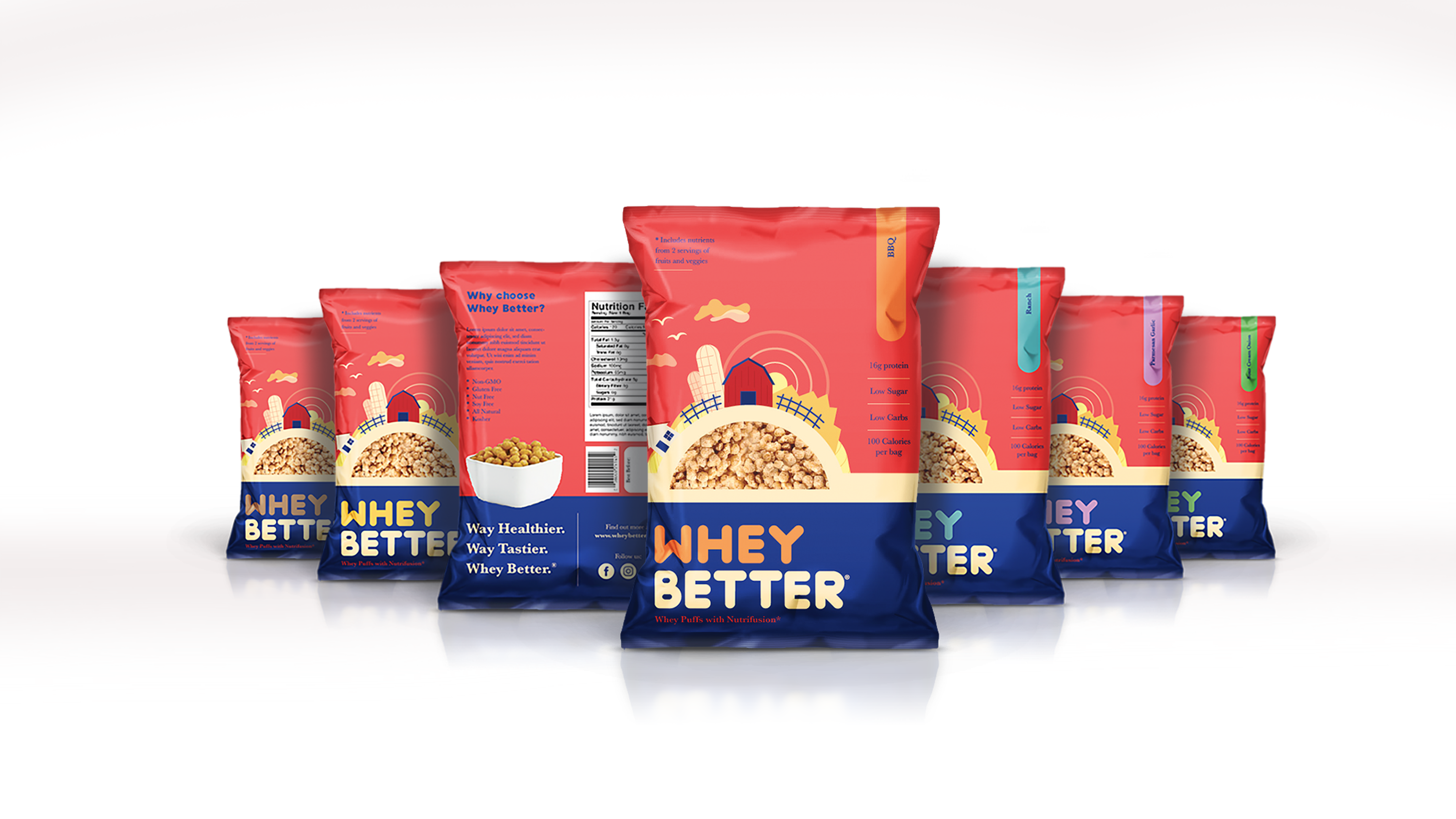
Creative Chameleon Studio was tasked with designing a branding and packaging option for a food product, a healthy whey-based snack. The desired art direction was a style that would fit on the shelves of Whole Foods and appeal to health-concious mothers.
Logo Design
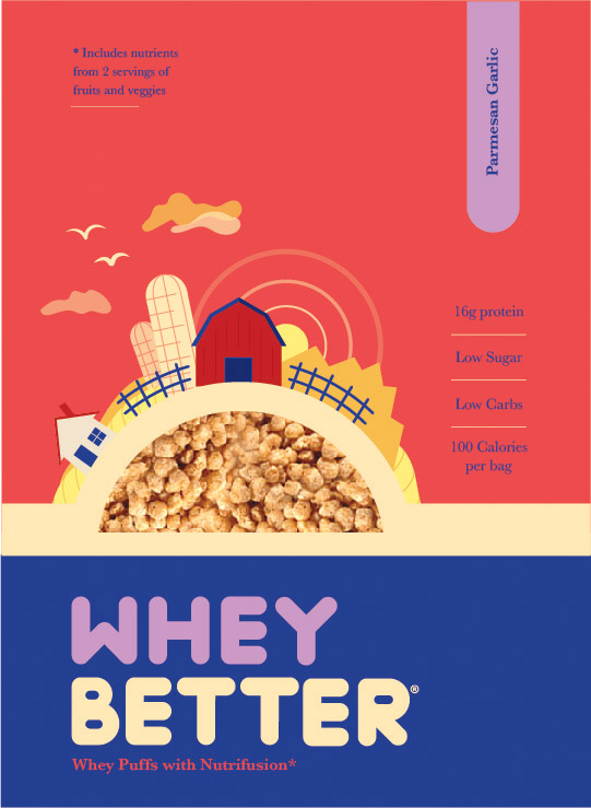
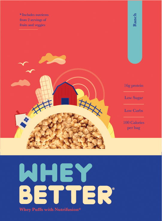
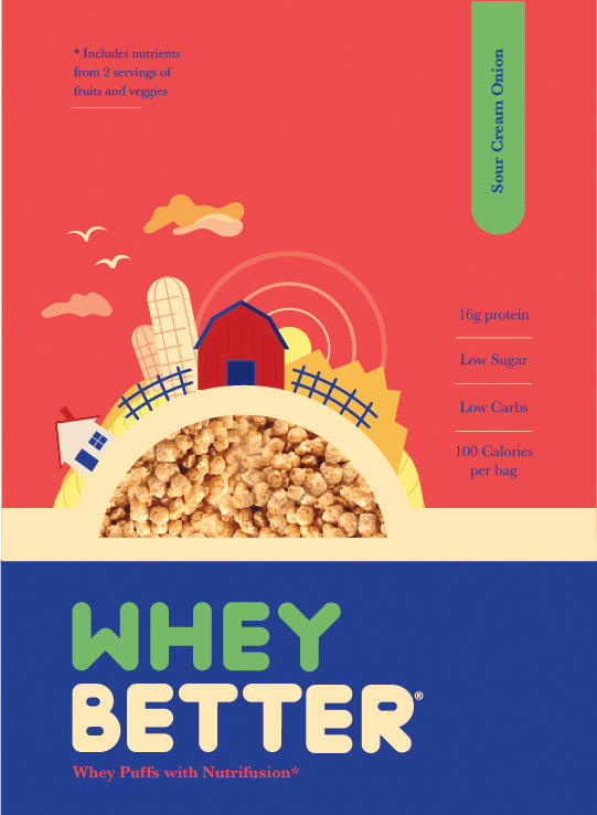
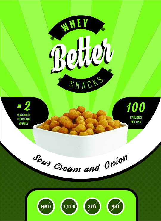
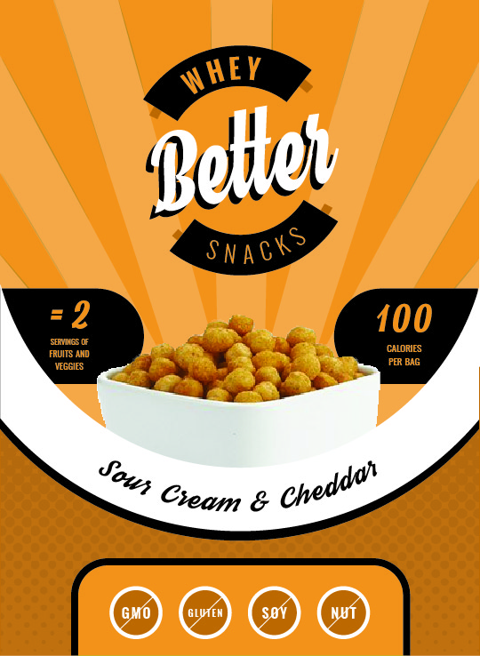
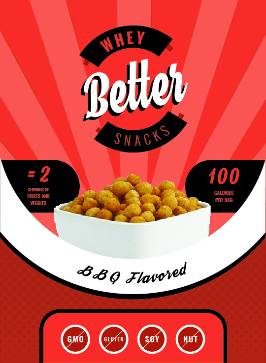
The original name was too lengthy for this type of product, so I proposed a name change: Whey Better. It incorporated the type of food product and was short and memorable. The logo design reflect the simplicity and wordplay of the name. I designed a font that was bold, while reflecting the form of the whey puffs with the rounded corners. In keeping with the vintage style of the illustrations, Baskerville was selected as the accompanying font.
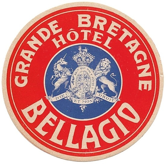
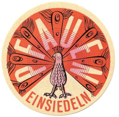
DESIGN INSPIRATION
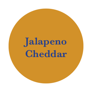
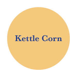
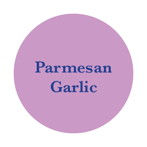
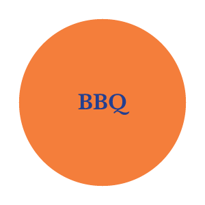
The style of illustration for the packaging was inspired by the design of vintage luggage tags. They utilized bold fonts and contrasting colors. This was paired with a more modern trend of flat illustration. It culminated in a design that showcased an old-fashioned homestead and used pastel colors to highlight different flavors.
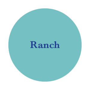
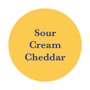
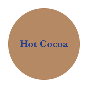
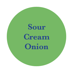
Alternative concept
In order to test the designs in a focus group, an alternative concept was provided. This concept had a style that aligned more with Whey Better’s competition. The same parameters were in place, and also needed a design that could reflect the variety of flavors.