We crafted a unique, personable logo for a neurosurgical specialist.
THE PROCESS
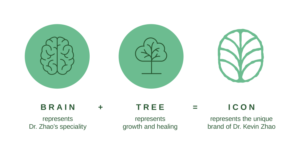
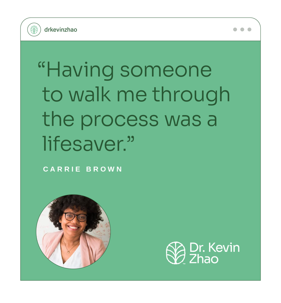
The goal of a practitioner’s logo is two-fold: convey the purpose of the practice, and paint an approachable picture. For Dr. Kevin Zhao, it was important to create a logo that touched on his speciality of neurosurgical care, while avoiding the sterile and off-putting nature people often associate with a doctor’s office.
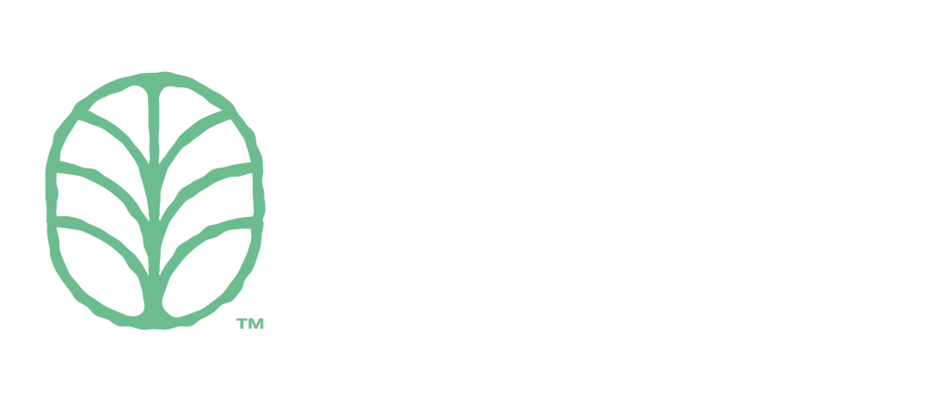
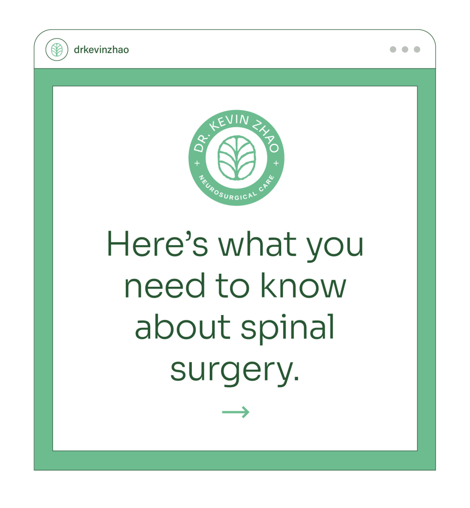
After exploration, we landed on a simple, hand-drawn icon that married the image of a brain and a sprouting tree. The brain emphasizes his speciality, and the tree the caring and nurturing atmosphere he provides.
THE RESULT
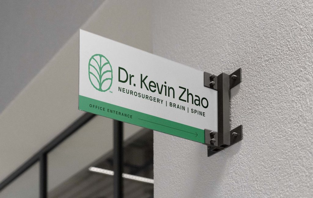
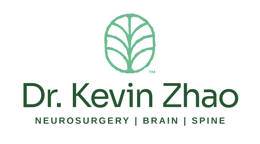
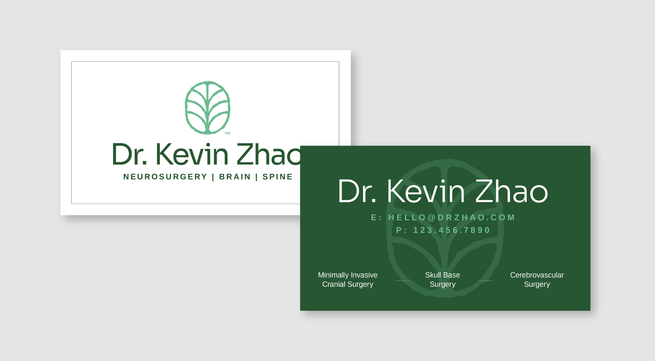
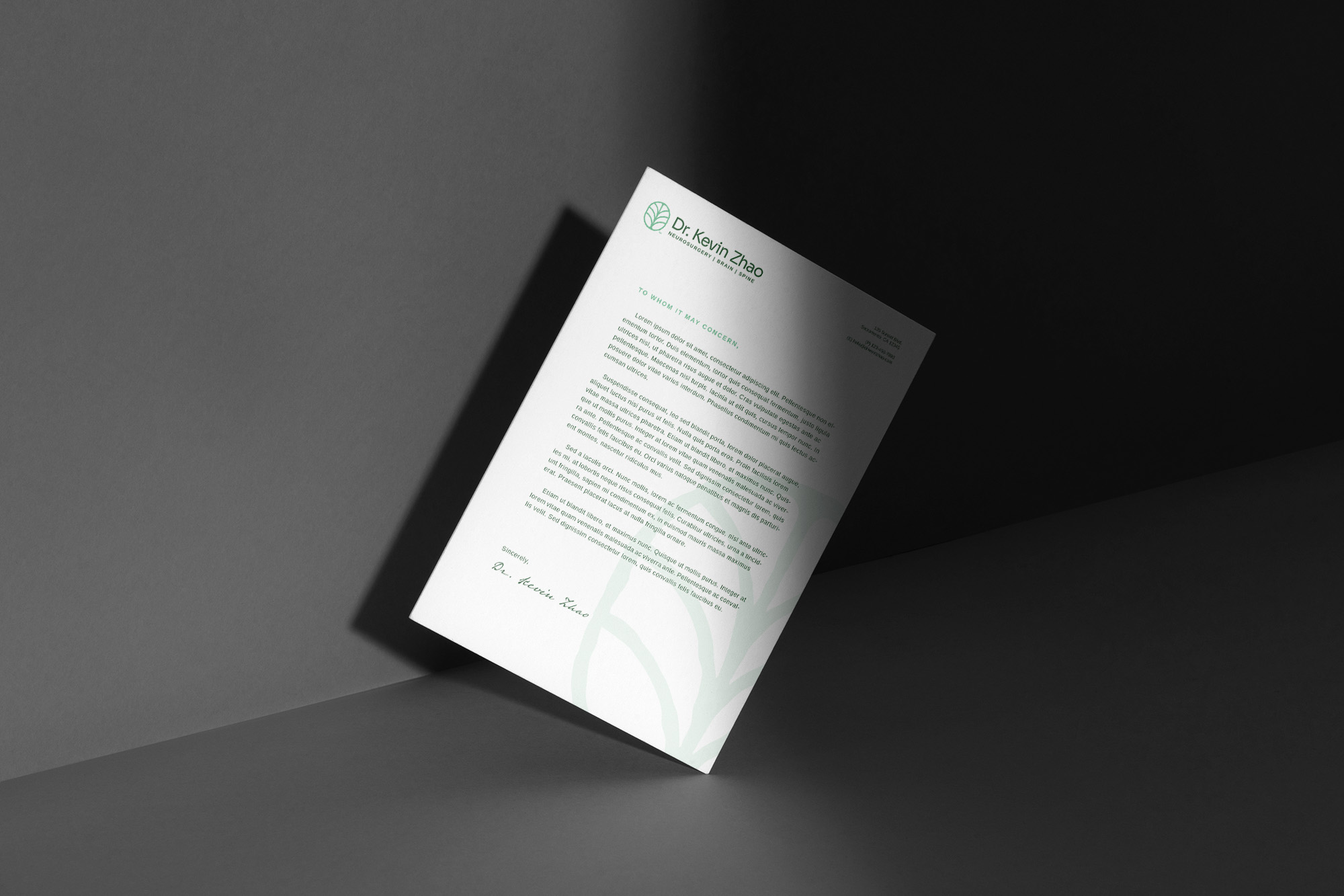
Once the logo was refined, we paired it with a slender, modern sans serif wordmark that is the headline font for the identity. A secondary font family was selected for the services & tagline.
The color palette is simple, only utilizing two greens and plenty of pure white. Using the soft greens amplifies the sense of warmth and growth, and the limited palette results in a clean aesthetic that properly reflects a doctor’s office.