BRANDING STRATEGY & DESIGN

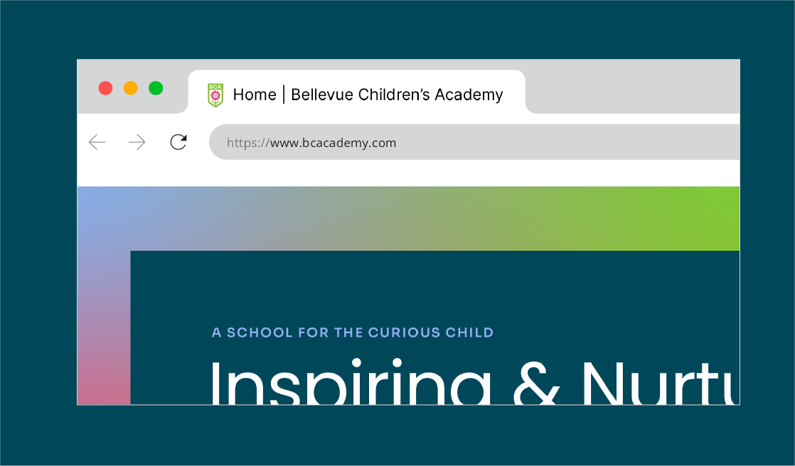
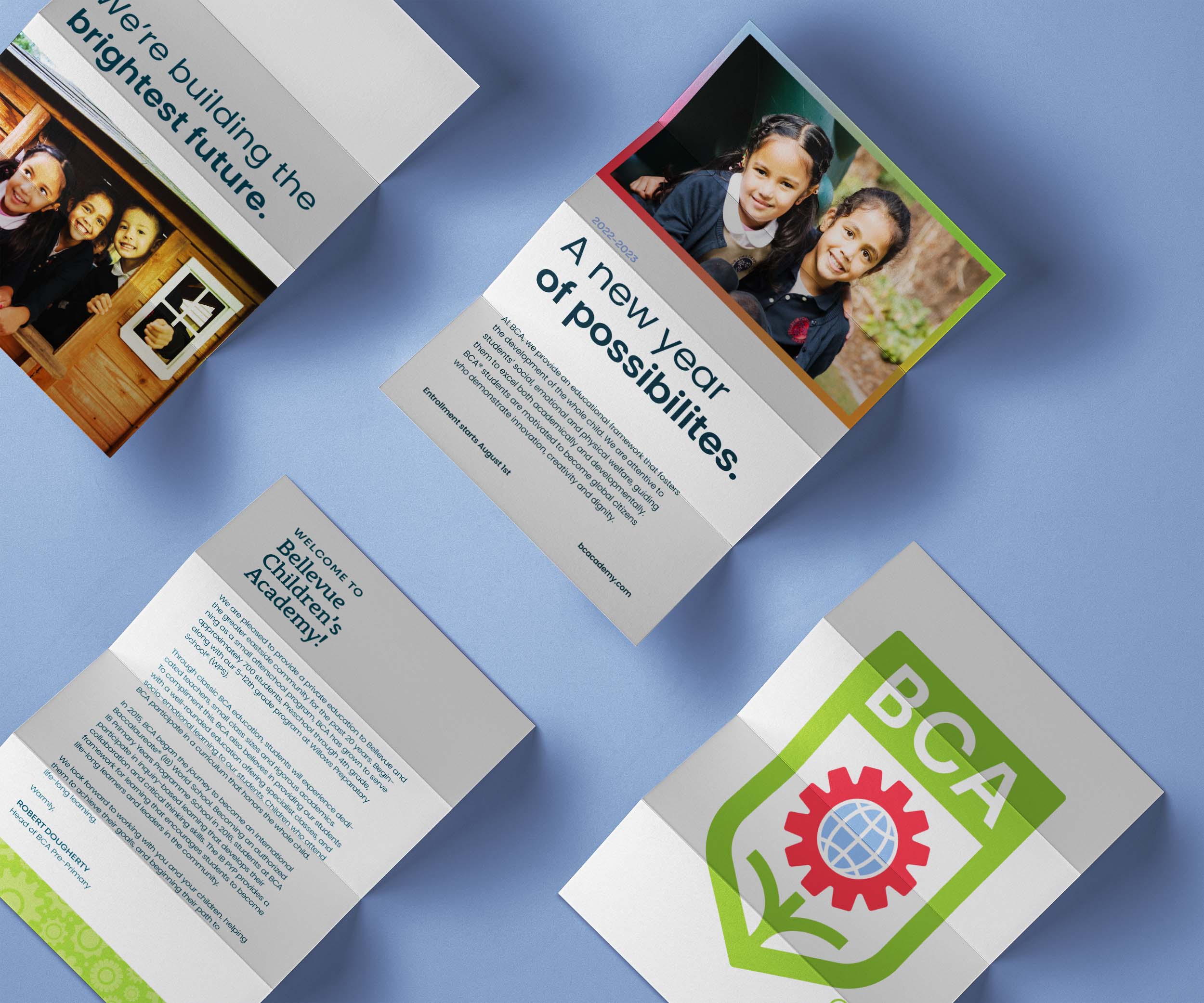
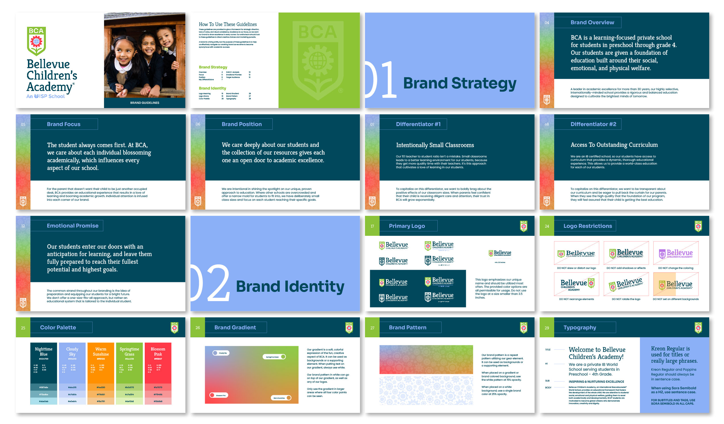
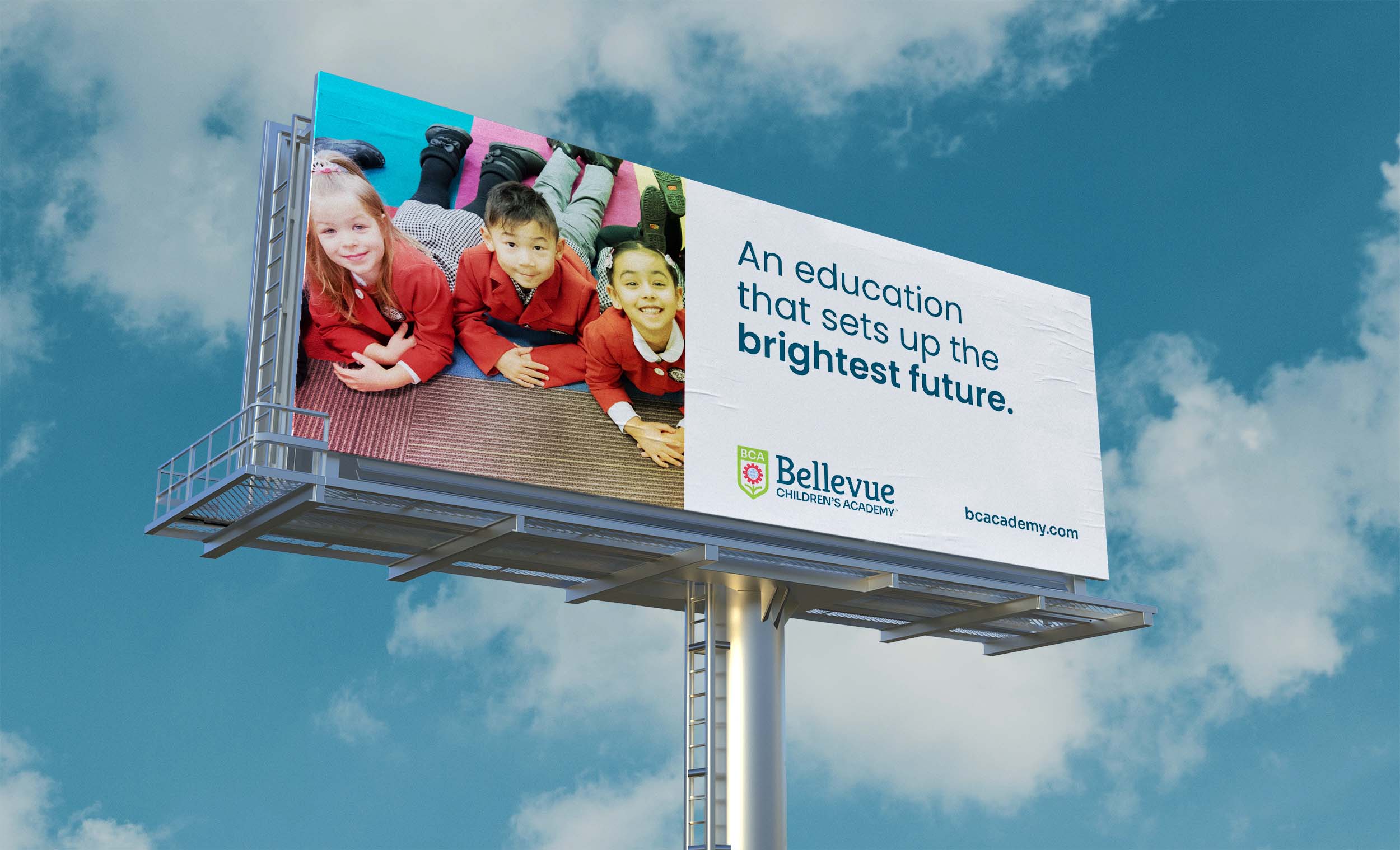
We crafted a brand that helped this academy show why they're the best in the area.

THE CHALLENGE

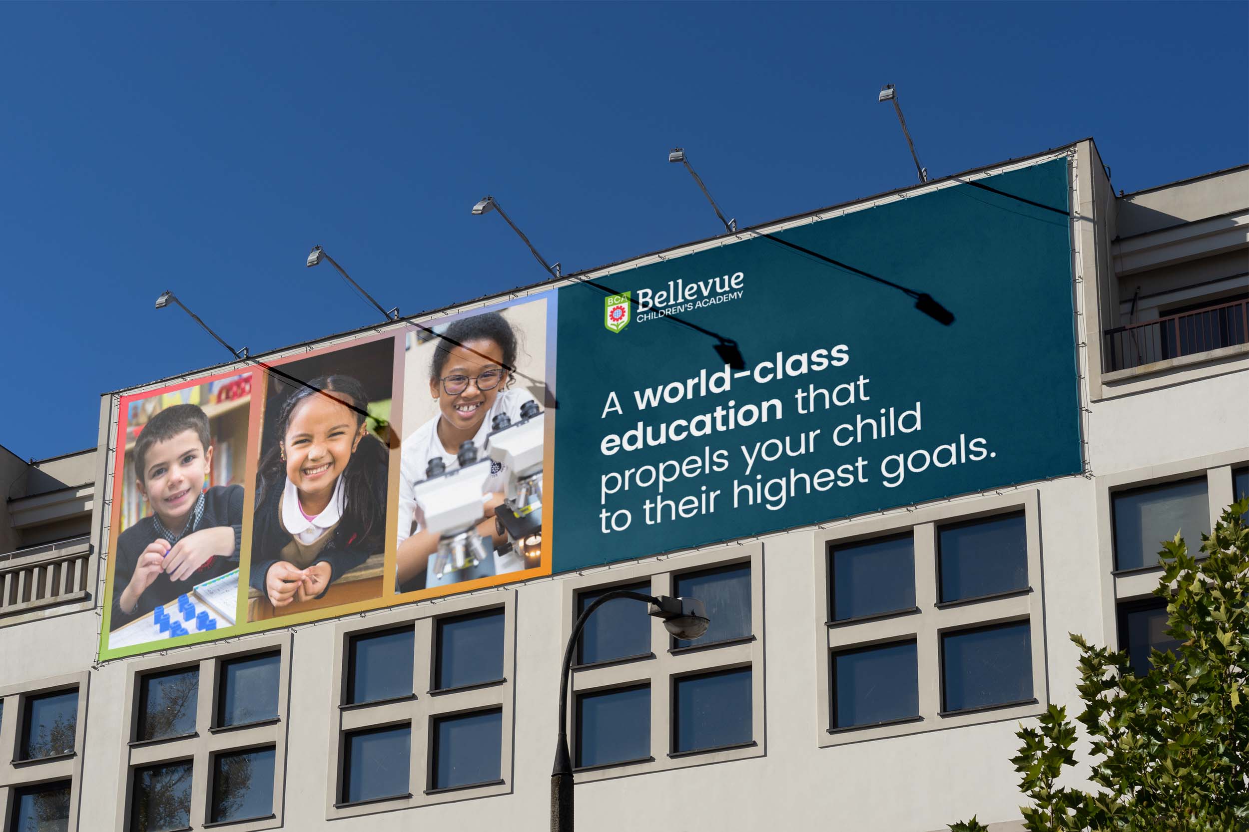
Bellevue Children’s Academy (BCA) is a private K-4 school with an IB curriculum and a student population with backgrounds from over 35 different countries. At the heart of BCA is curiosity and cultivating a love for learning. It was time for their brand to reflect that.

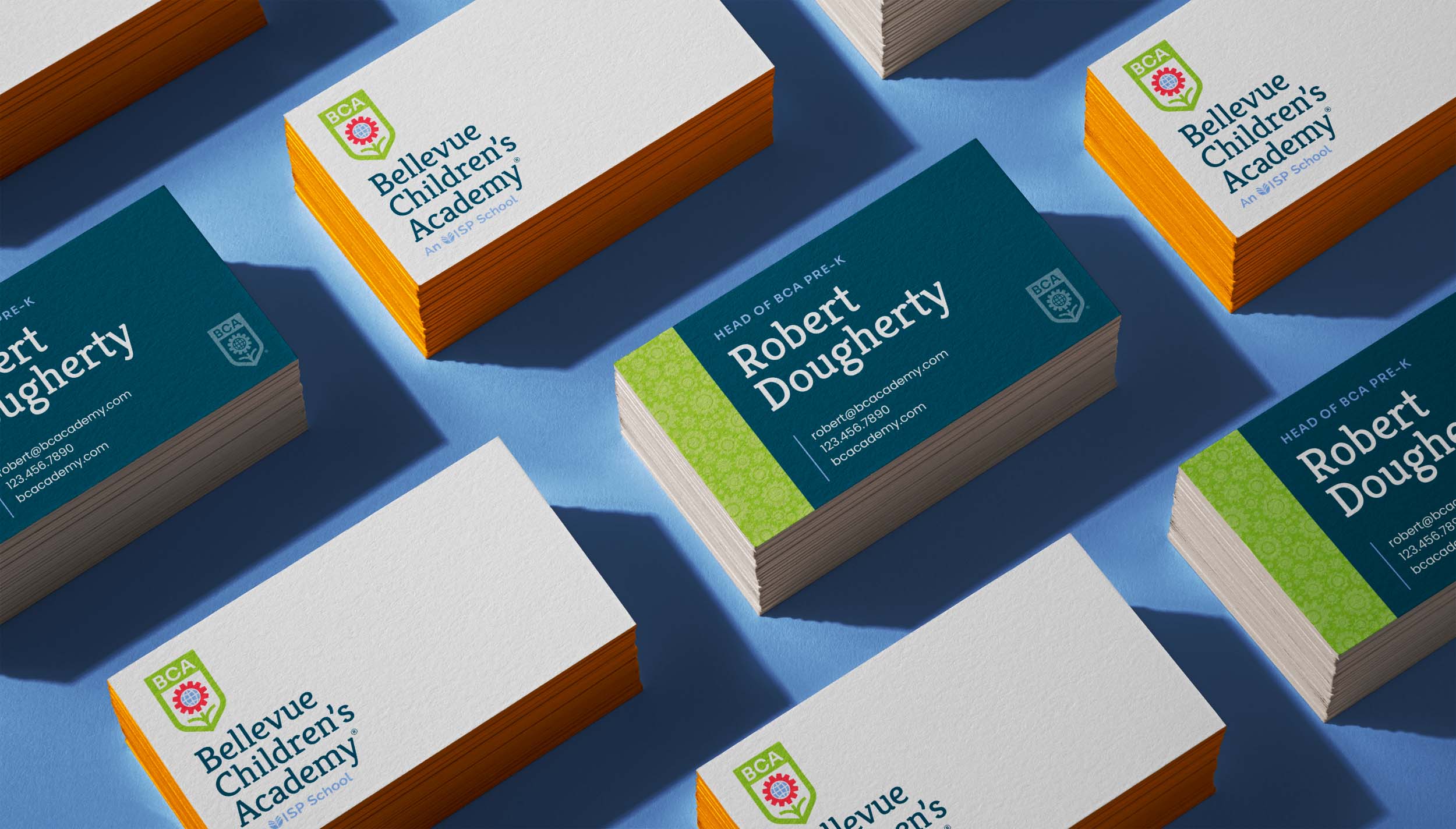
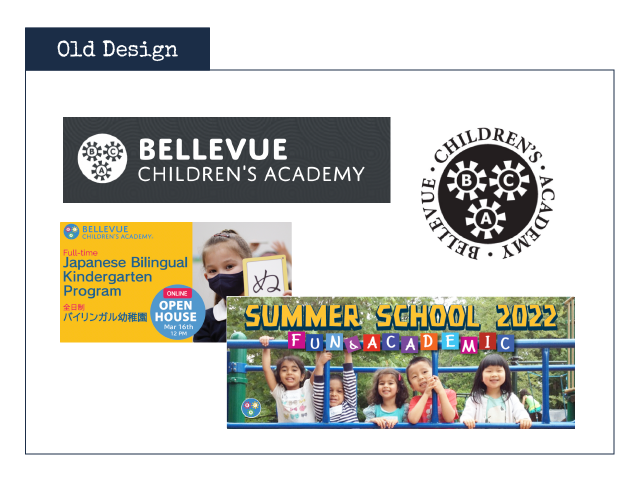
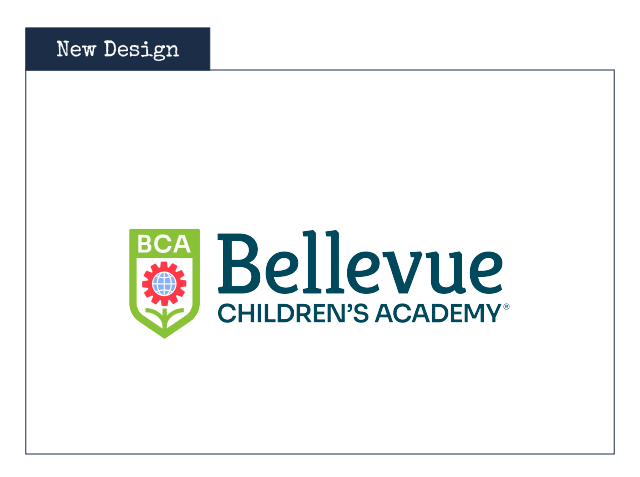
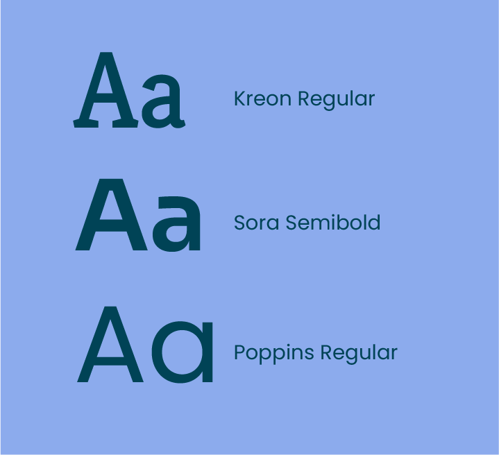
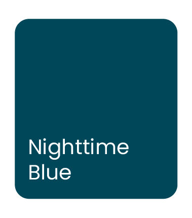
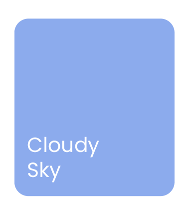
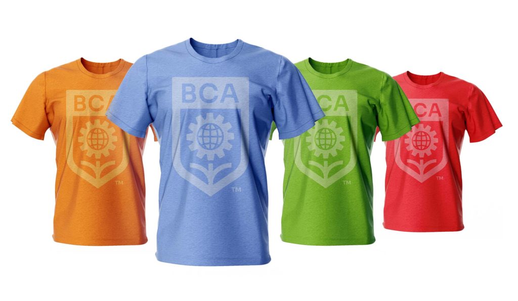
Their old logo didn’t convey the combination of creativity and foundational tools that each student receives. We crafted a layered logo that touches on the unique attributes that makes BCA desirable for so many future-focused families.

OLD IDENTITY

THE SOLUTION

Flexible and functional, the new logo sets the right mood for the school. Even at a glance, it’s crystal clear that BCA is an exciting place of learning that is built with experience and quality.

FULL LOGO

STACKED LOGO

A school designed for the curious child should speak to the vibrant way children view the world. We equipped BCA with a thoughtfully expressive color palette, typography, and pattern. All of the strategy and design work is defined and documented in their new brand guidelines. As they produce a myriad of marketing and internal collateral, the new identity system will allow them to have cohesion at every brand touchpoint.

For private schools that need branding help, check out our free booklet, Schools & Branding

BCA focuses on K-4, while it’s sister school, Willows Preparatory School, works with grades 5-12. We rebranded both schools at the same time, allowing them to continue to build off the success of one another. A full case study of rebranding WPS can be viewed here.

Are you tired of a lackluster brand?

We're in the business of injecting life into brands.
Book a free call, because great things are ahead.