In a world that’s oversaturated with services and products for consumers to choose from, you have to utilize every strategy to stand out from your competition. While big companies can spend millions of marketing dollars in defining and conveying their brand, smaller businesses and entrepreneurs often neglect this very important strategy. But how can you establish and harness your brand to make it work for you and help direct consumers to your doorstep? Through having designs that support your brand! There are three initial steps any company can do that will help them build brand recognition and loyalty, even if you don’t have an internal marketing team.
But before we can launch into those steps, we need to quickly define what a brand is and why it’s important for any company. We often think of a “brand” as a big company, sometimes calling them a name-brand. But a brand isn’t the actual entity of a company. Rather, a brand is the feelings or promises associated with a company or product. When defining your company’s brand, you are defining what feelings or promises you want consumers to attach to you.
Brands Have Feelings, Too
A quick example is Allstate Insurance. You might be able to hear and see in your mind Dennis Haysbert looking straight at you through your TV, asking “Are you in good hands?” Allstate built their marketing campaigns on this concept of being in good hands, which is also their slogan. They’re rather directly telling consumers what promise they want associated with their company. Allstate promises safety. As an insurance company, they promise their customers security, no matter what life throws at them. Everything they say and do reflects that promise, and after a while, they have their brand established in the minds of the everyday consumer.

There are three general ways a company can control and establish a brand: the way they look, the way they speak, and the way they act. We can call these brand visuals, brand voice, and brand actions. If any one of these three areas don’t align with the company’s desired brand, (the way they want the public to feel about them,) then they’ll struggle with establishing an effective brand.
Let’s Make A Brand Roadmap
When broken down to these three areas, you can see that any company can control their brand. You don’t need a full marketing team and a place in the stock market to have a quality brand. The first step is finding out what your desired brand is. For a full strategy development, most companies bring in a branding agency. But even if you’re a one-man show, you can have some general direction for your brand. Sit down with a pen and paper and write down the feelings or promises you want people to associate with your company. Then try and find the common points and combine that into a sentence or two. The more specific, the more effective! When you have a desired brand direction, then look at the way your company looks, speaks, and acts. Does it align with what you want your brand to be?
The visuals of the brand is an important component in establishing a brand and creating recognition. Consumers are visually based, so even if your company is the most eloquent in the words you use, you still will be missing out if your visuals don’t match your brand or aren’t consistent. There are three things any company can control in their visuals to start to create brand recognition and have their brand position shine through.
1. Color
Color is so powerful, but most people don’t realize it! The first way we recognize companies is through their colors. Coca-cola has a specific red that they use everywhere, and if you see it on a shelf amongst all the other pop brands, you can recognize it without even seeing the logo.
Color can help dictate how people should feel about your company. A basic example is to look at the colors of spas or beauty salons. Most of the colors will be purples, pinks, light greens or shades of tan. They’ll be soft colors, not over-saturated or loud, and there won’t be jarring color pairings, such as neon yellow and bright blue. This is because a business that offers relaxing services want you to associate the feelings of serenity with them. They also want to look luxury, because they often charge high prices for their services.
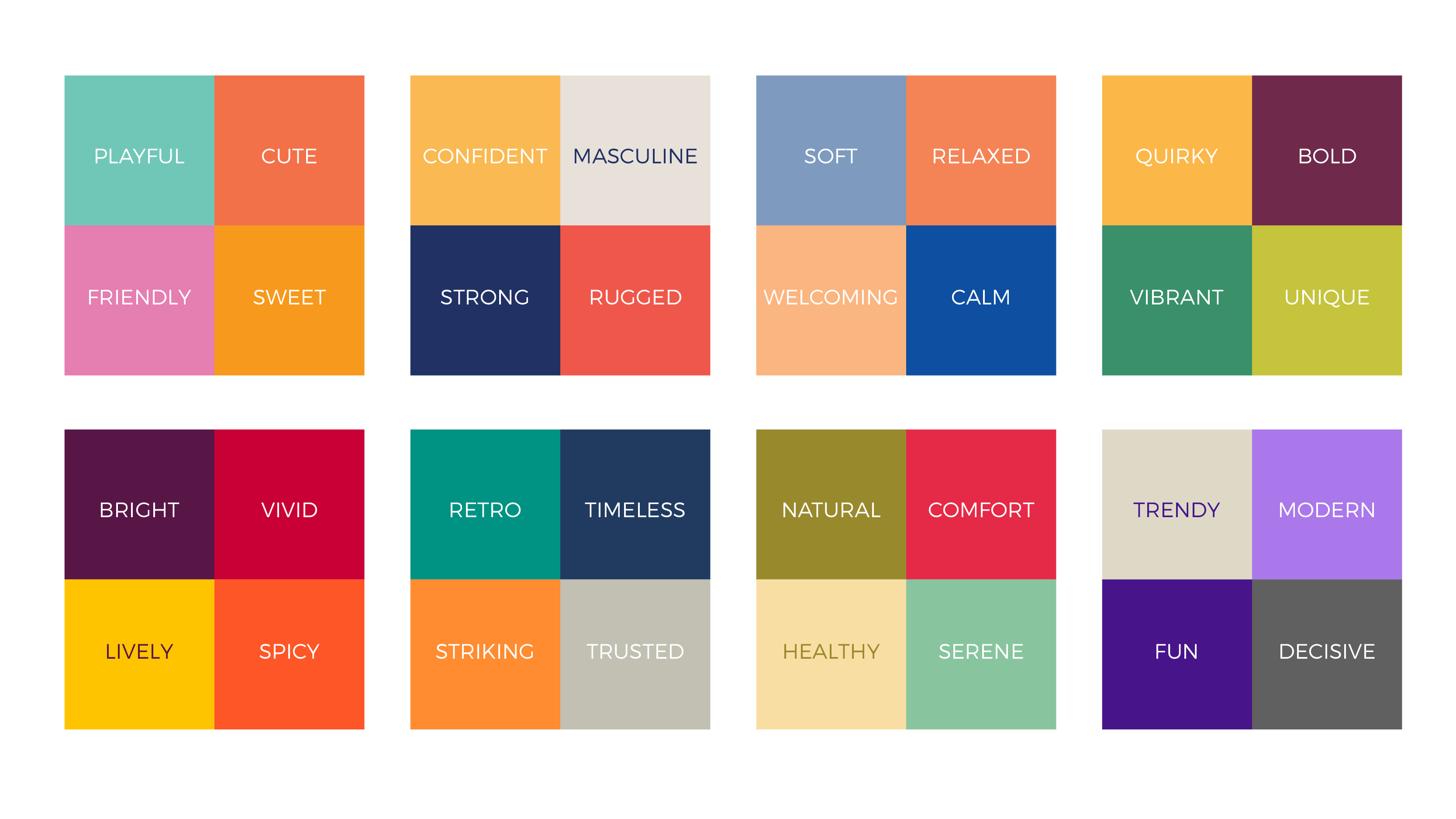
Does your company’s colors reflect your desired brand position? A good test is to take the 1-5 colors you use and ask friends and family what feelings they have when they look at the color palette. When uninfluenced by your logo or other designs, there should still be a feeling or aesthetic that people associate with the colors. If the responses don’t match your desired brand, that signals that your brand visuals aren’t aligning and it could be time for a rebrand.
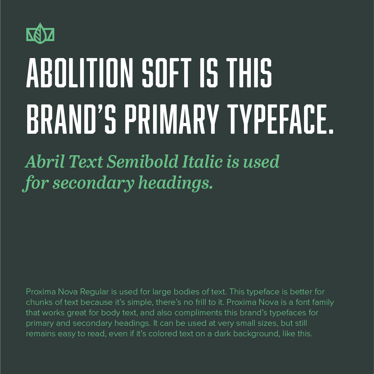
2. Typography
This is harder to identify, but typography plays a big role in showing your brand. If you run a car repair service, but all the fonts you use are frilly, cursive fonts, consumers will be rather confused about your service and your brand. When you take your car to be repaired, you want to feel secure your mechanic. Thin, handwritten fonts don’t convey security. The better option would be bold, sturdy fonts that are assertive and trustworthy.
If you haven’t spent a lot of time with typography, this is a more challenging aspect of your brand visuals to work with. An experienced designer is a great resource when it comes to developing your brand visuals, because of their knowledge and eye for colors and typography. But even without a designer, you can avoid some big typography mistakes.
The first step is making sure you don’t use too many fonts. A company should ideally use up to 3 fonts. You want one font for headlines and big, emphasized text. Another font will be used for subheadings, taglines, or secondary text. And then you need a font for body text, or large paragraphs. Pairing fonts is a developed skill, but a simple approach any company can implement is picking one font family, such as Avenir. Use Avenir Bold for headlines and emphasized text, Avenir Italic for subheadings and secondary text, and Avenir regular for all body text. This established consistency, creates hierarchy, and will immediately look more professional than using a range of fonts throughout your company.
3. Photography
Not everyone thinks of photography as part of their brand visuals, because it’s not designs in the traditional sense. But photography is a great way to showcase your brand, especially if your company regularly puts out content on social media platforms. You can show behind-the-scenes, works in progress, the faces behind your team, interactions with your clients, and so much more. This is a wonderful way to add personality to your brand. You still want to keep your desired brand position in mind, even in the photos you share. If you run a financial company, and put out photos of your team members 3 pints deep in happy hour every week, it can clash with the feelings of safety and security people want in those who manage their finances! But if you are a personal coach and want to be approachable, then sharing a picture of your messy living room and screaming children will make people feel camaraderie with you.
In order to truly harness photography in strengthening your brand, you’ll want a game plan of how the photos you share are reflecting your desired brand. Sit down and write out some do’s and don’ts for the photography your company uses. This will help you and any team members maintain consistency and further support your brand.
Don’t Neglect Your Brand!
Every company of every size can improve their brand. Figuring out your desired brand position is the first step, and from there you can align your brand visuals, voice, and actions. These techniques are not reserved for the big companies, and by implementing these mindsets towards your branding, you can get a leg up on your competition and see tremendous growth in your business.