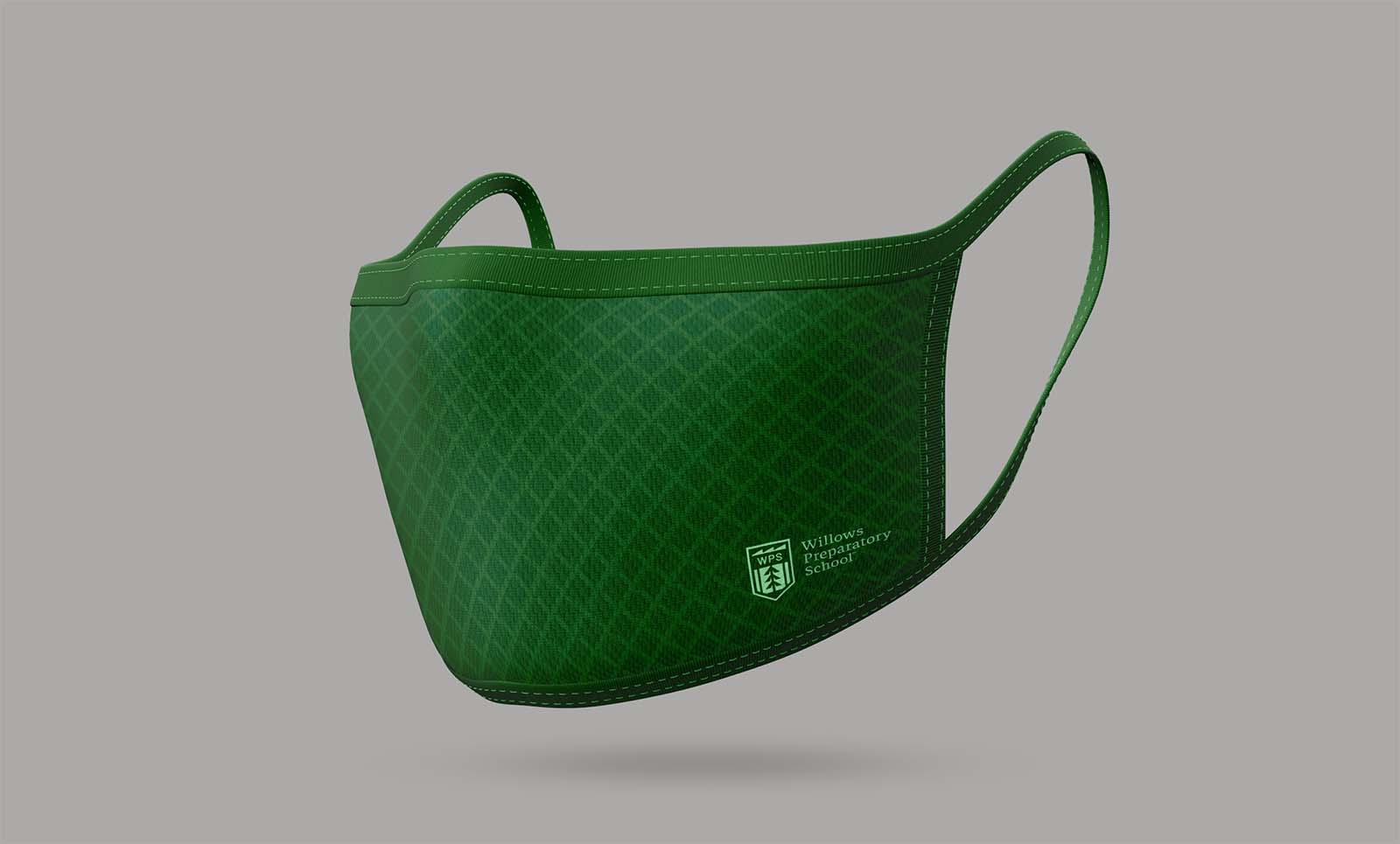
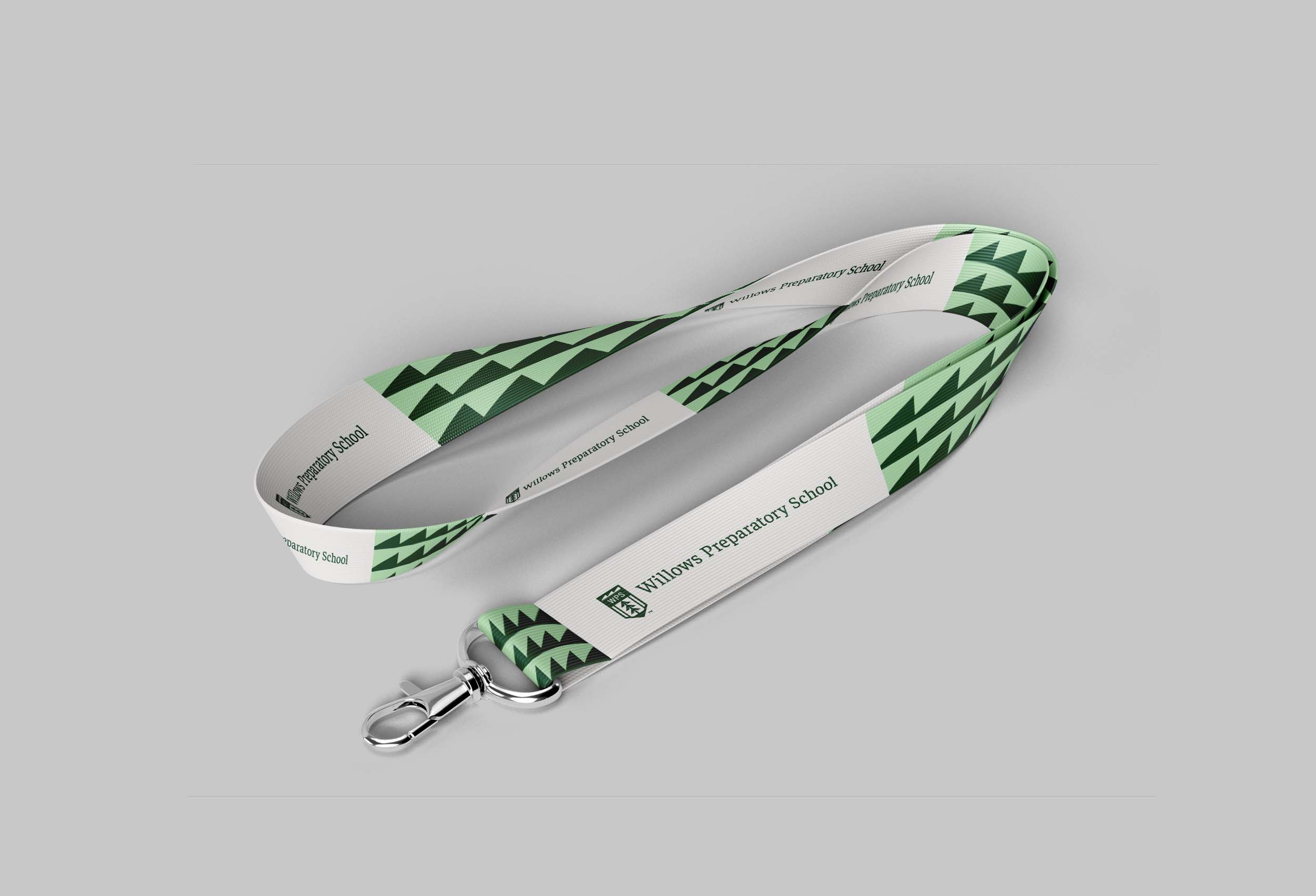
We designed a school’s brand that’s as distinguished as the education they provide.
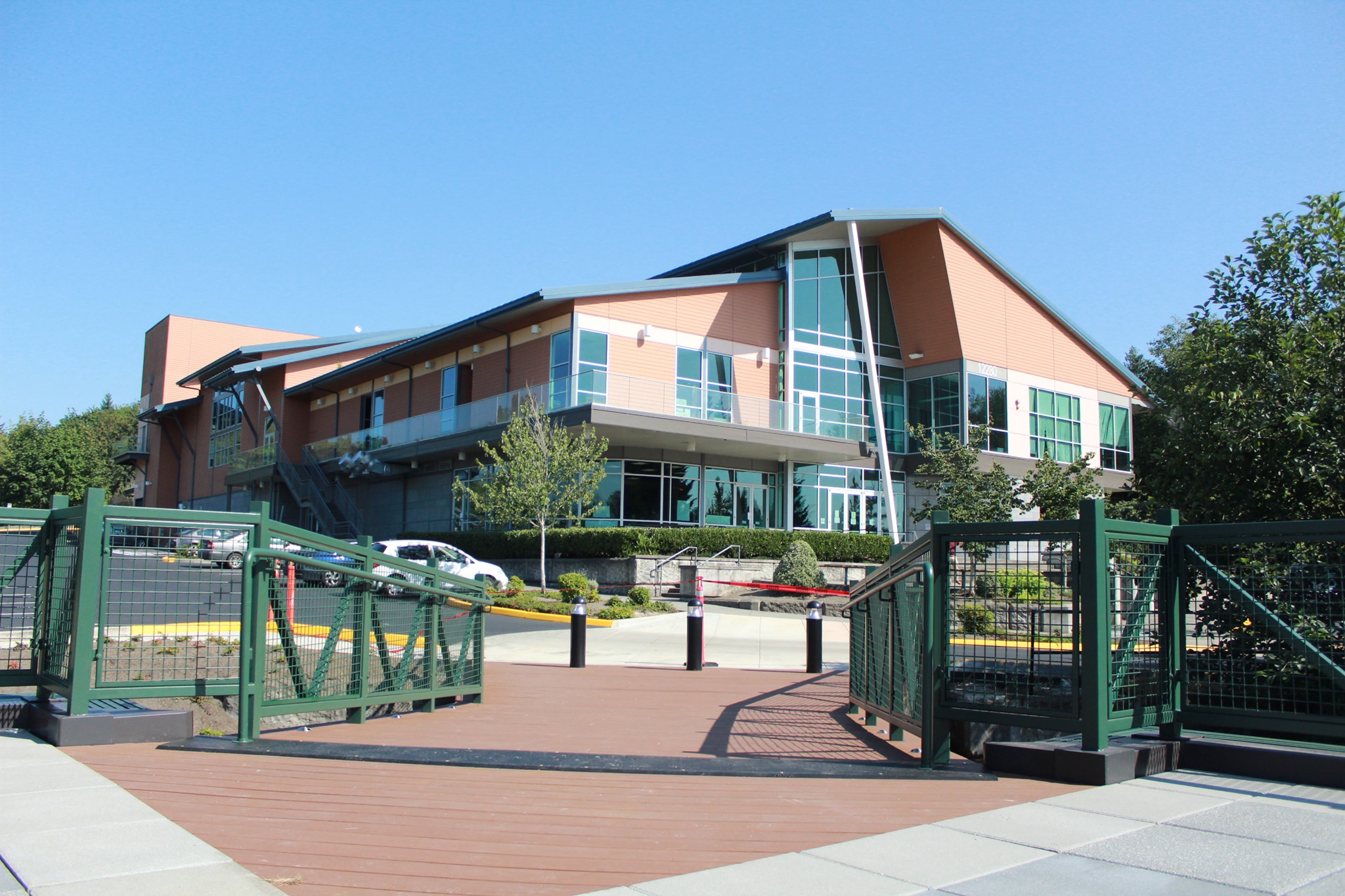
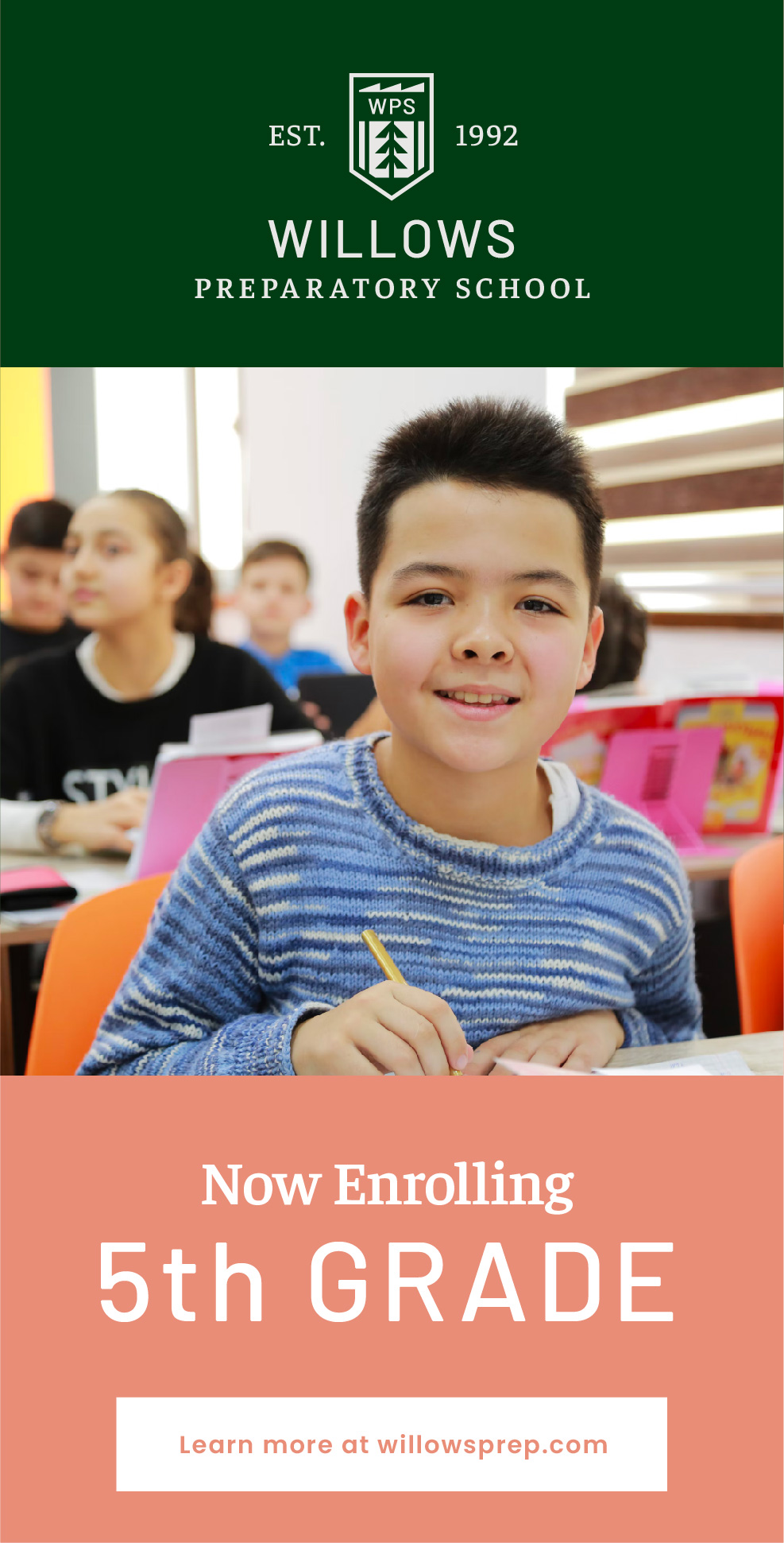
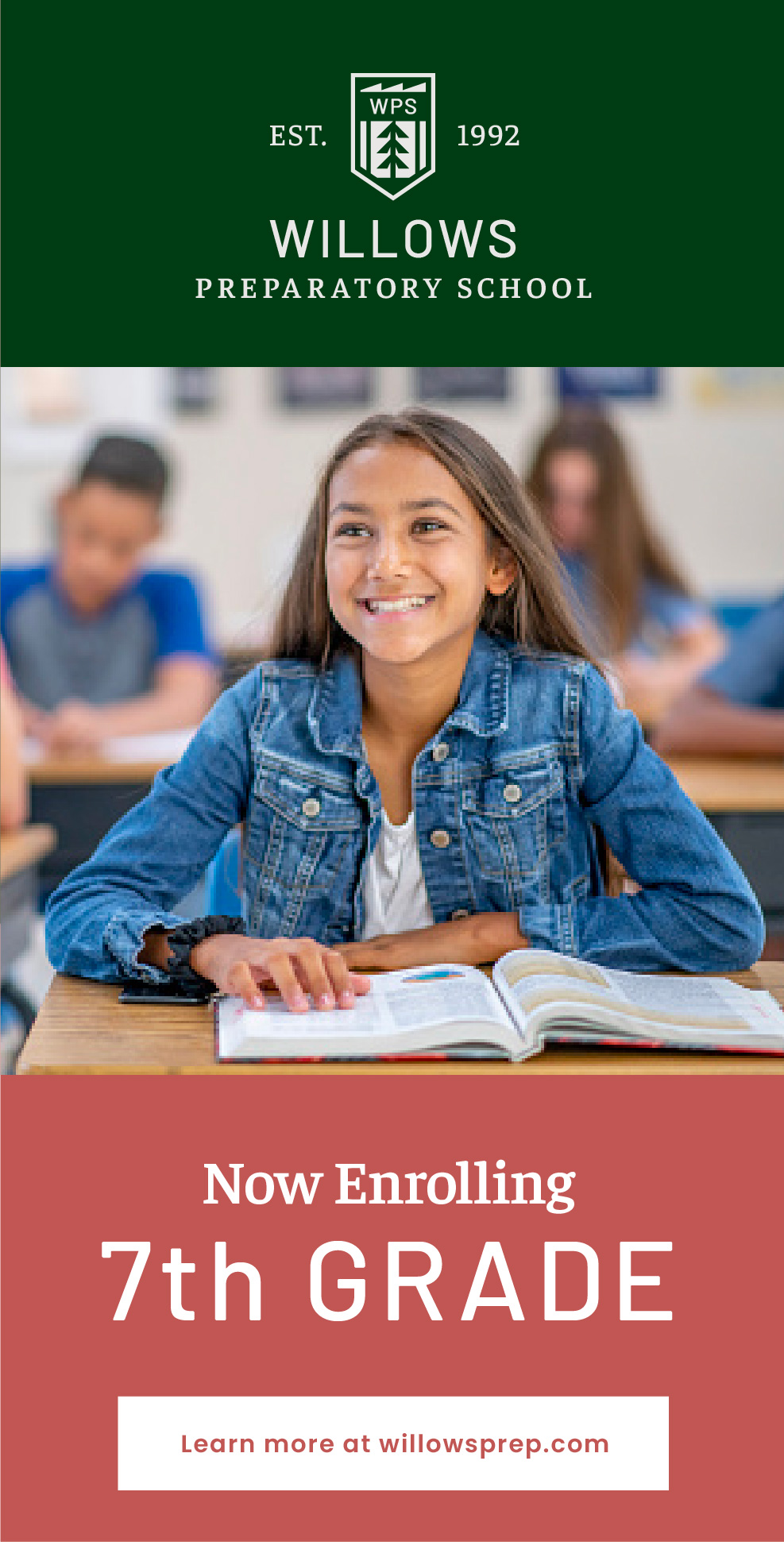
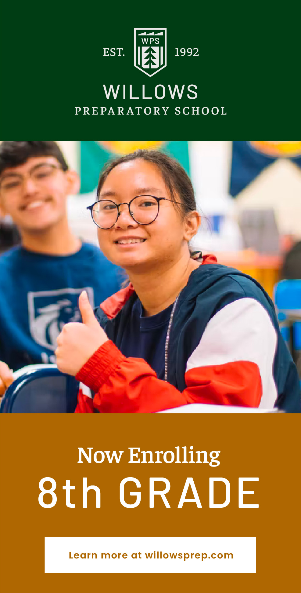
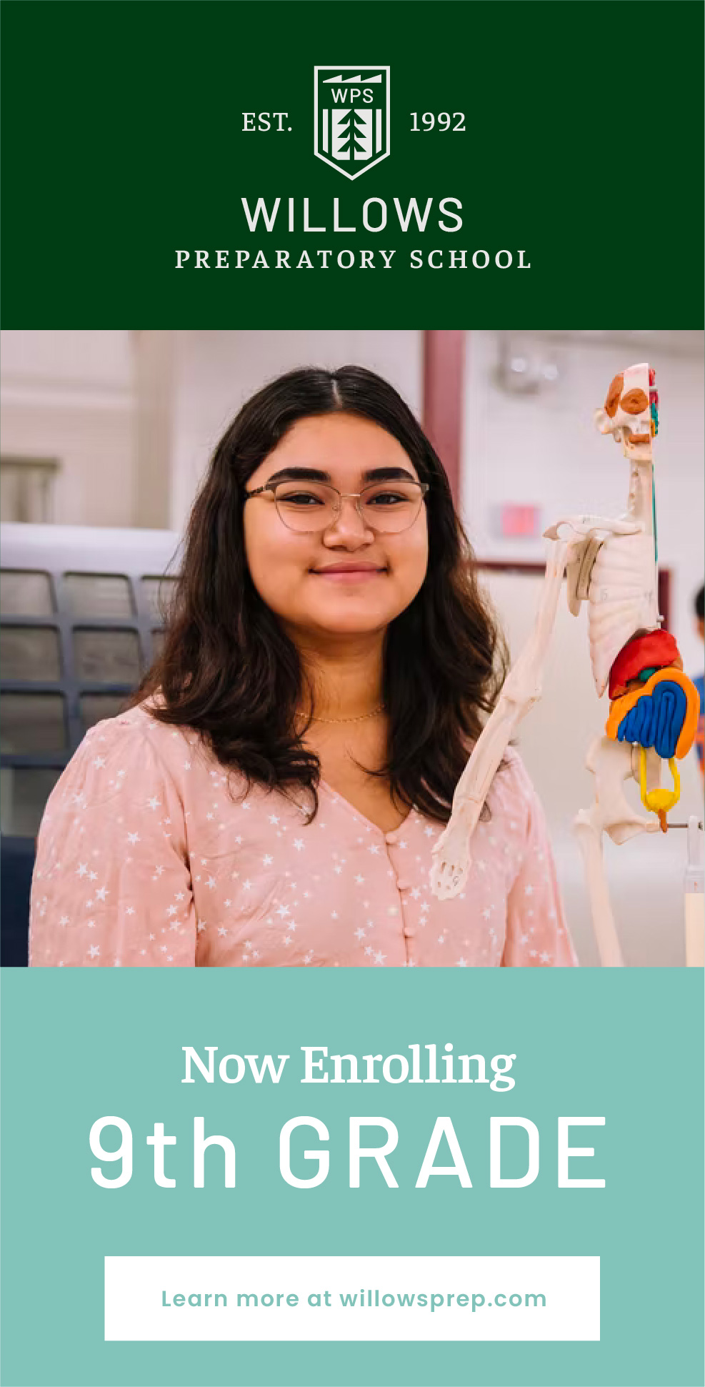
Nestled in the lush pine-tree landscape of North Redmond, Washington, Willows Preparatory School (WPS) is a private grades 5-12 school with an IB curriculum and a student population with backgrounds from over 35 different countries.
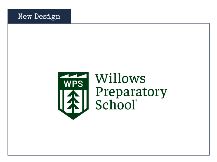
WPS offers a top-notch education, but their outdated brand identity failed to communicate the diversity and excellence they foster. Together, we recreated it.
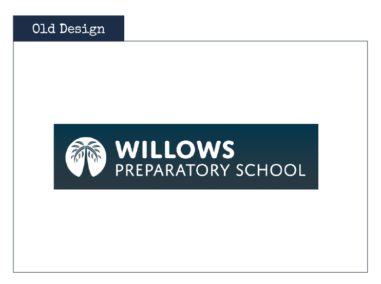
As the years ticked by, WPS continued its prestigious operation while its brand became sidelined and antiquated. Often, the most successful brands fail to update their brand strategy and identity as they lack the time and creative efforts to do so.
The old WPS brand was unpolished and undeveloped, not indicative of the first-rate education landing WPS students at terrific universities and into prominent jobs in the STEM fields.
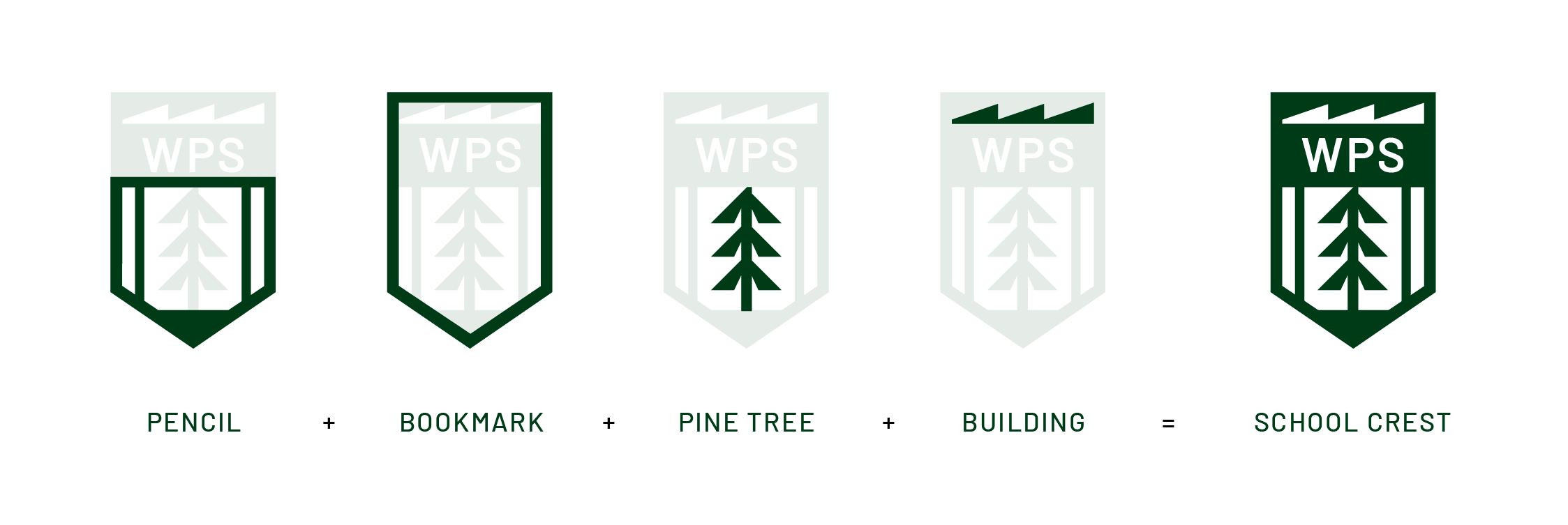
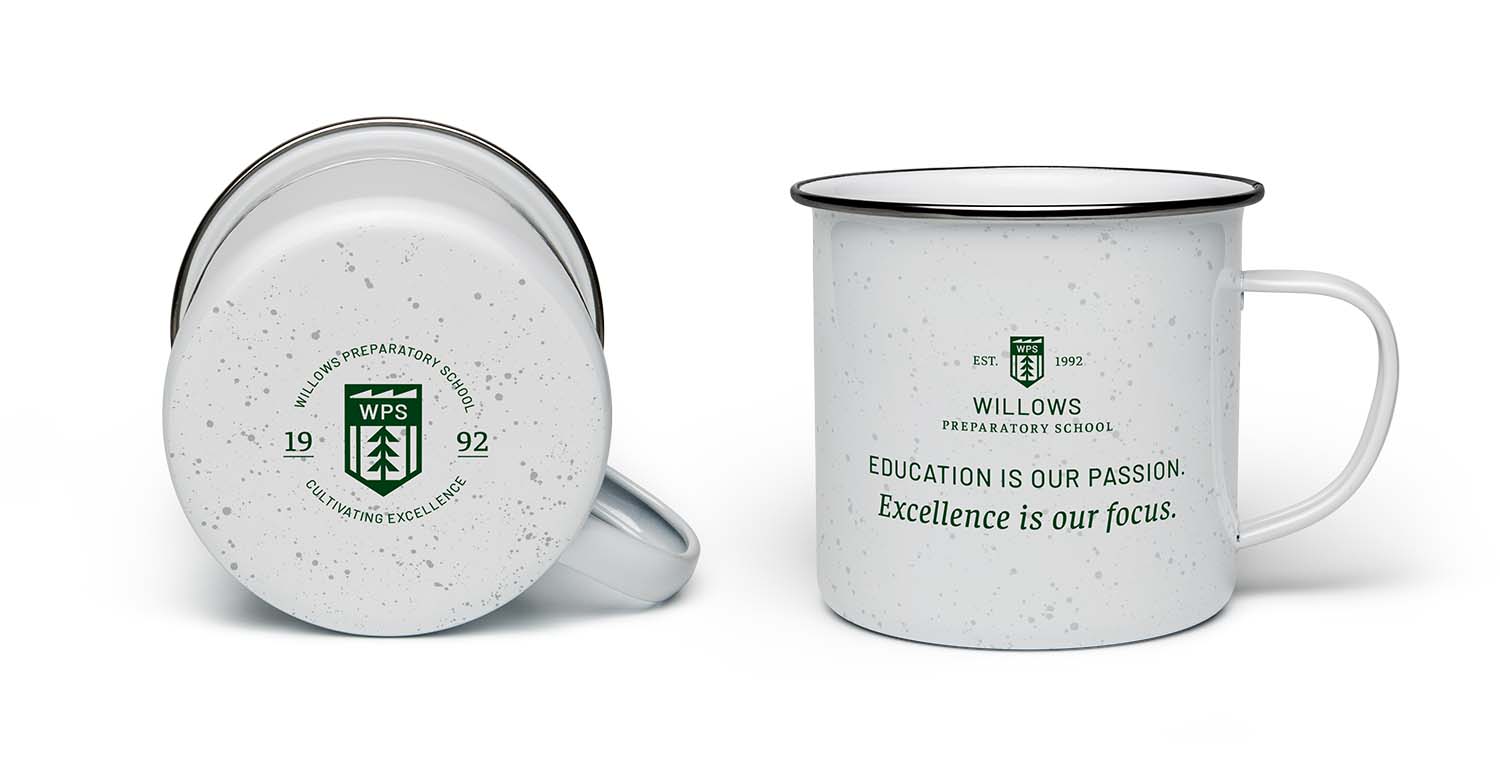
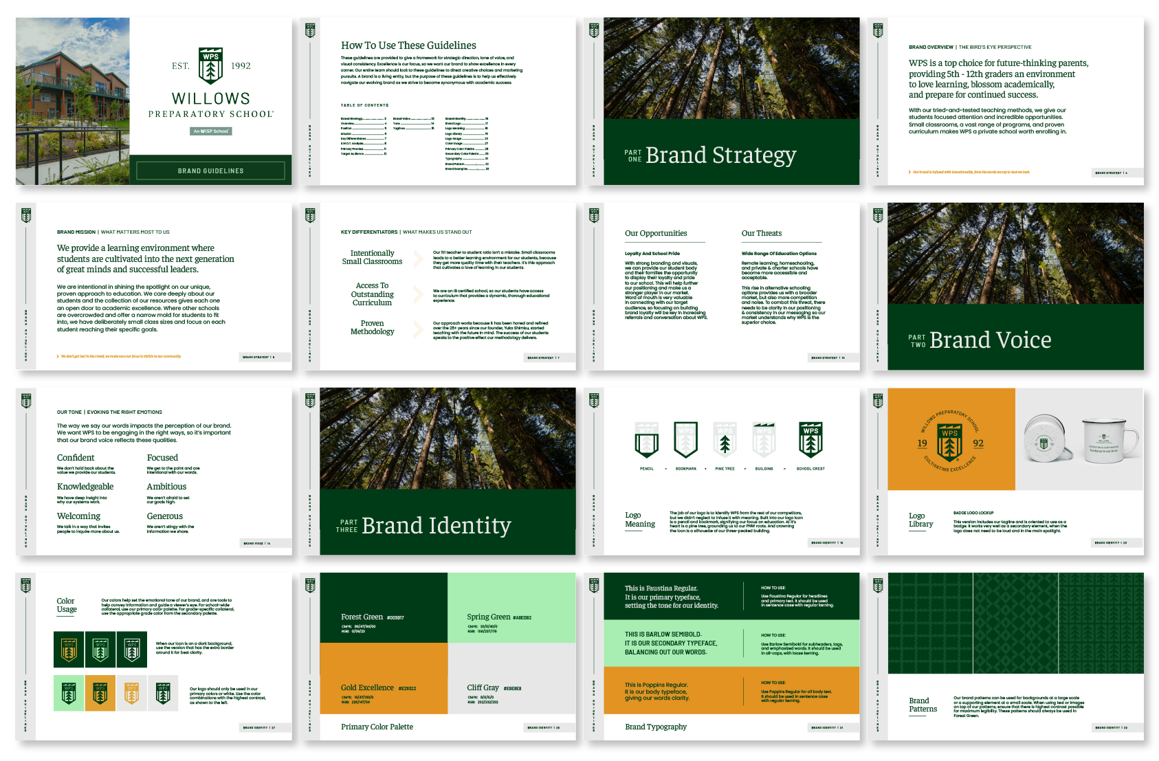
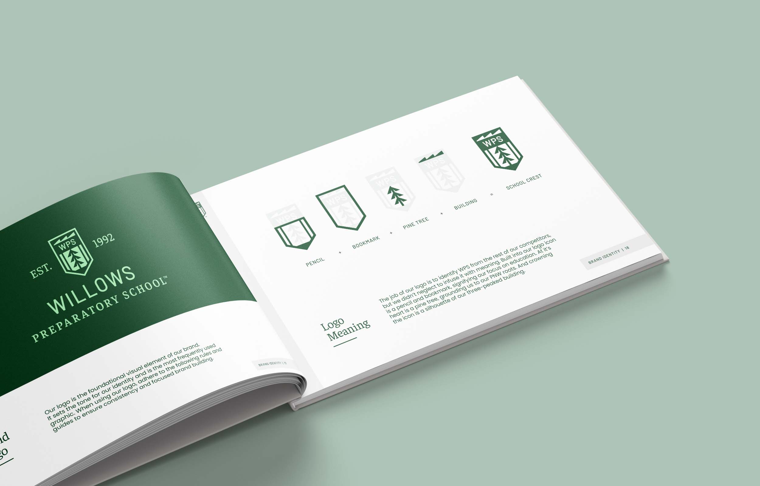
The Meaning Behind The Crest
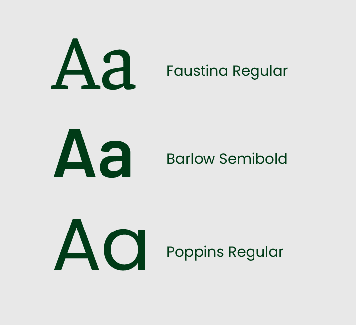
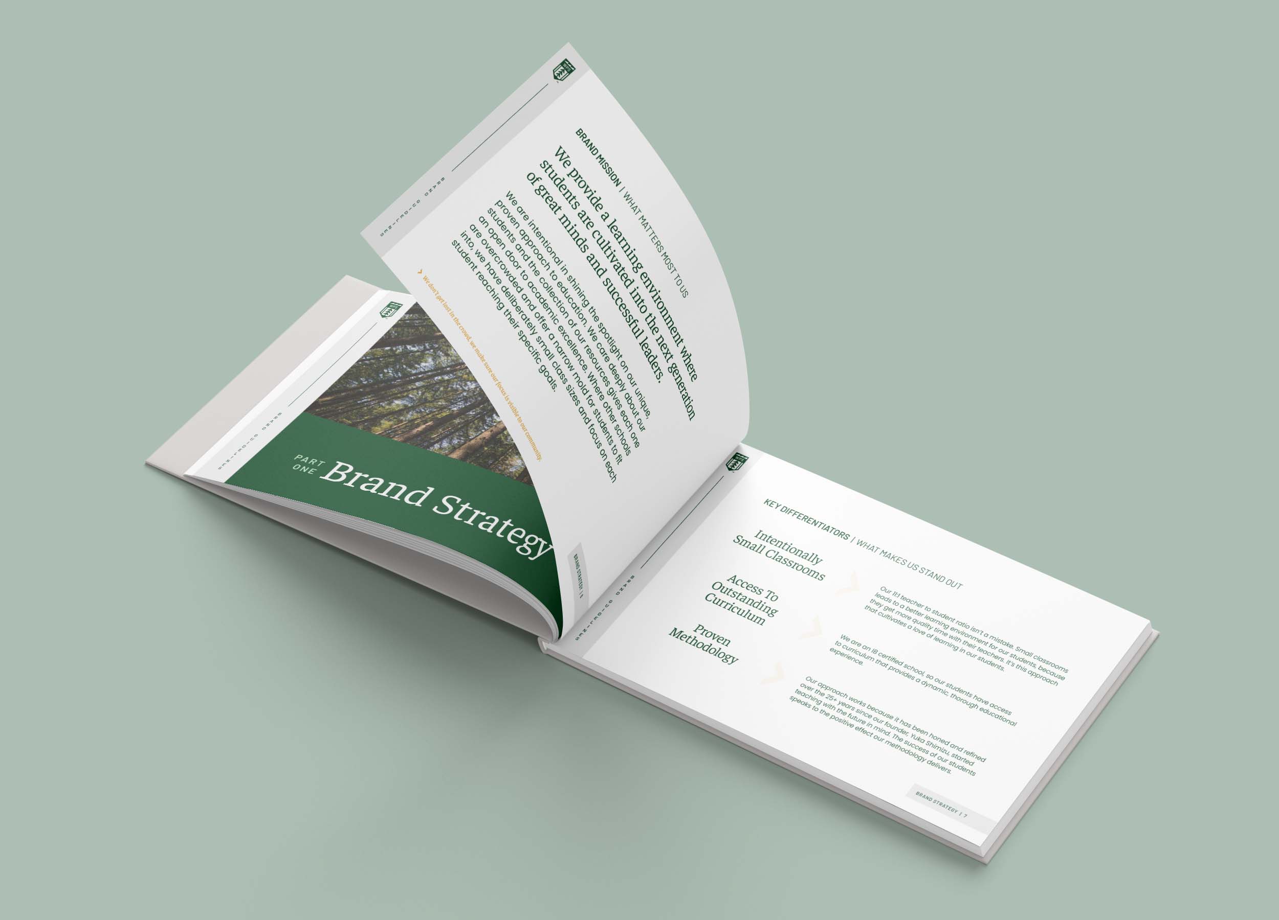
In the discovery phase, we identified clear goals for the project. The new WPS brand identity needed to emphasize the school’s rich legacy, capture a sense of school pride, ground WPS in its location in Redmond, and exude a sleek, high-end feel.
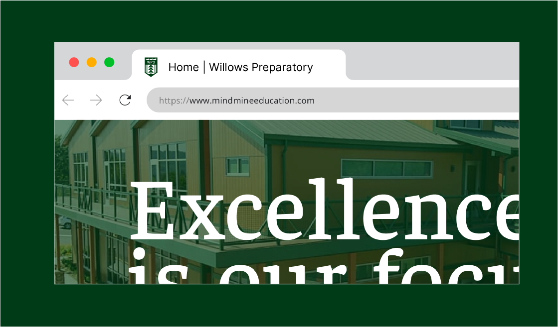
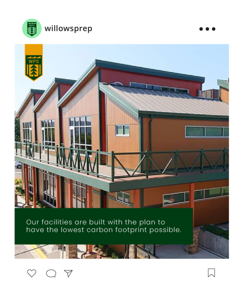
In Redmond, Washington, just north of Seattle, WPS is situated as a uniquely distinct three-peaked building edged by a thick forest of pine trees. The new logo ties together the ideals of education, the iconic sharp-edged rooftops of WPS’s building, and the enriching location where the school has proudly planted its roots.
A pencil and bookmark, two images that instantly evoke the idea of education, are built into the logo’s icon. At its heart lies a pine tree, grounding the school in its Pacific Northwest roots. Crowning the icon is a silhouette of the school’s three-peaked building. Together, these elements compose a powerful and recognizable school crest that’s simple, yet deeply layered and nuanced.