Designing an adaptable beer label for a growing brewery.
Bristol-based brewery, State Street Brewing, has flavorful, unique beers and needed packaging that reflects their personality.
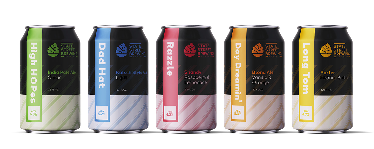
PACKAGING DESIGN SYSTEM
“Creative Chameleon Studio was so easy and fun to work with. Madison was very attentive to detail and delivered exactly what I requested. The final design was the perfect blend of eye catching, uniqueness, and simplicity that I was looking for.”
– Kent Pierson, Owner
Products need to look appealing to capture the attention of customers. Bristol-based brewery, State Street Brewing, felt like their packaging did not reflect the quality and personality of their products. They approached Creative Chameleon Studio, wanting a brand new look that stood out on the shelves.
Their old packaging lacked visual excitement, and it was difficult for the viewer to quickly understand important information. The goal of the new design was a look that felt energetic and high-end, and had a clear hierarchy of content.
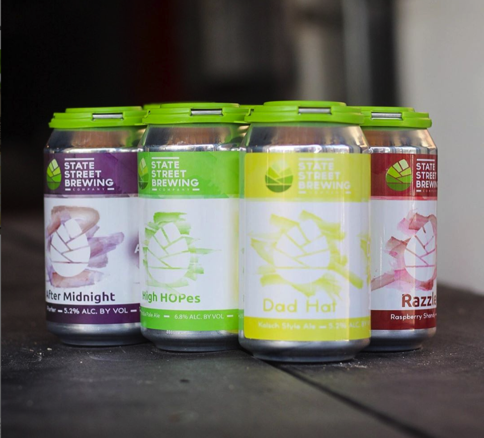
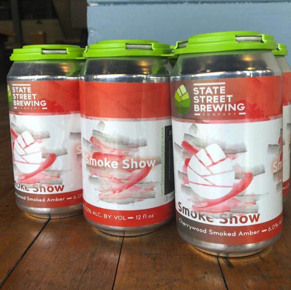
Examples of old packaging
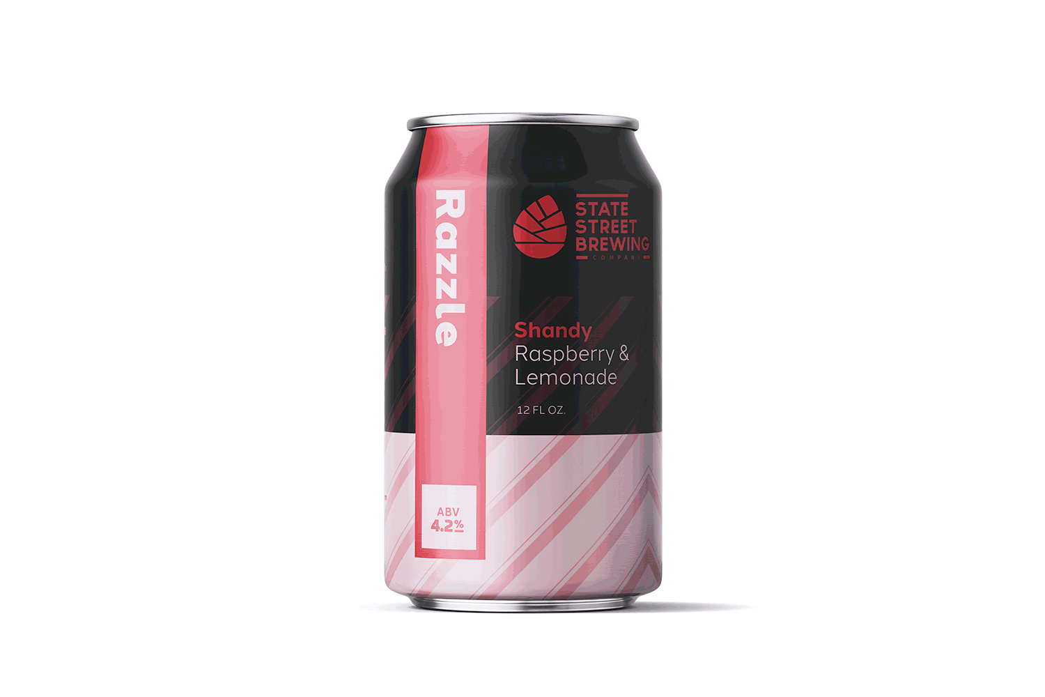
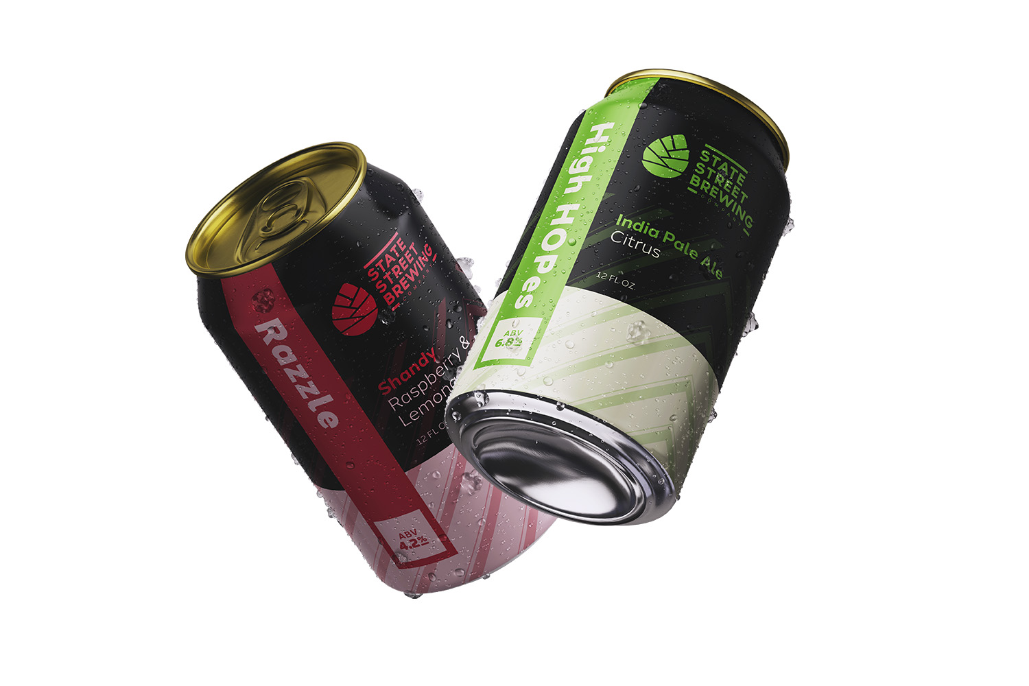
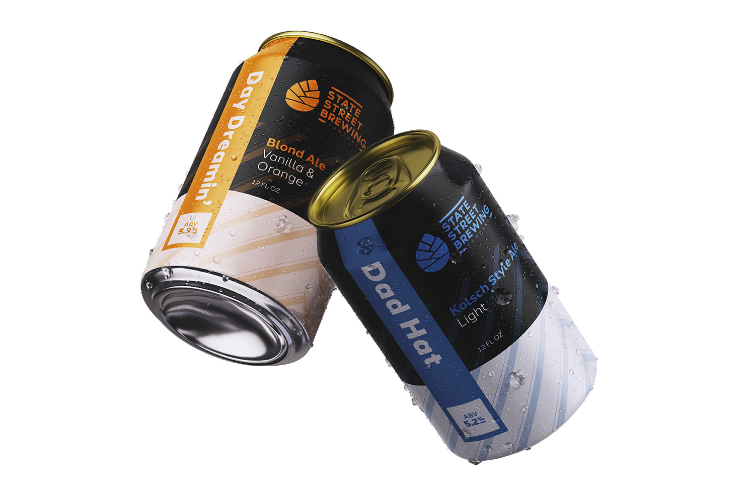
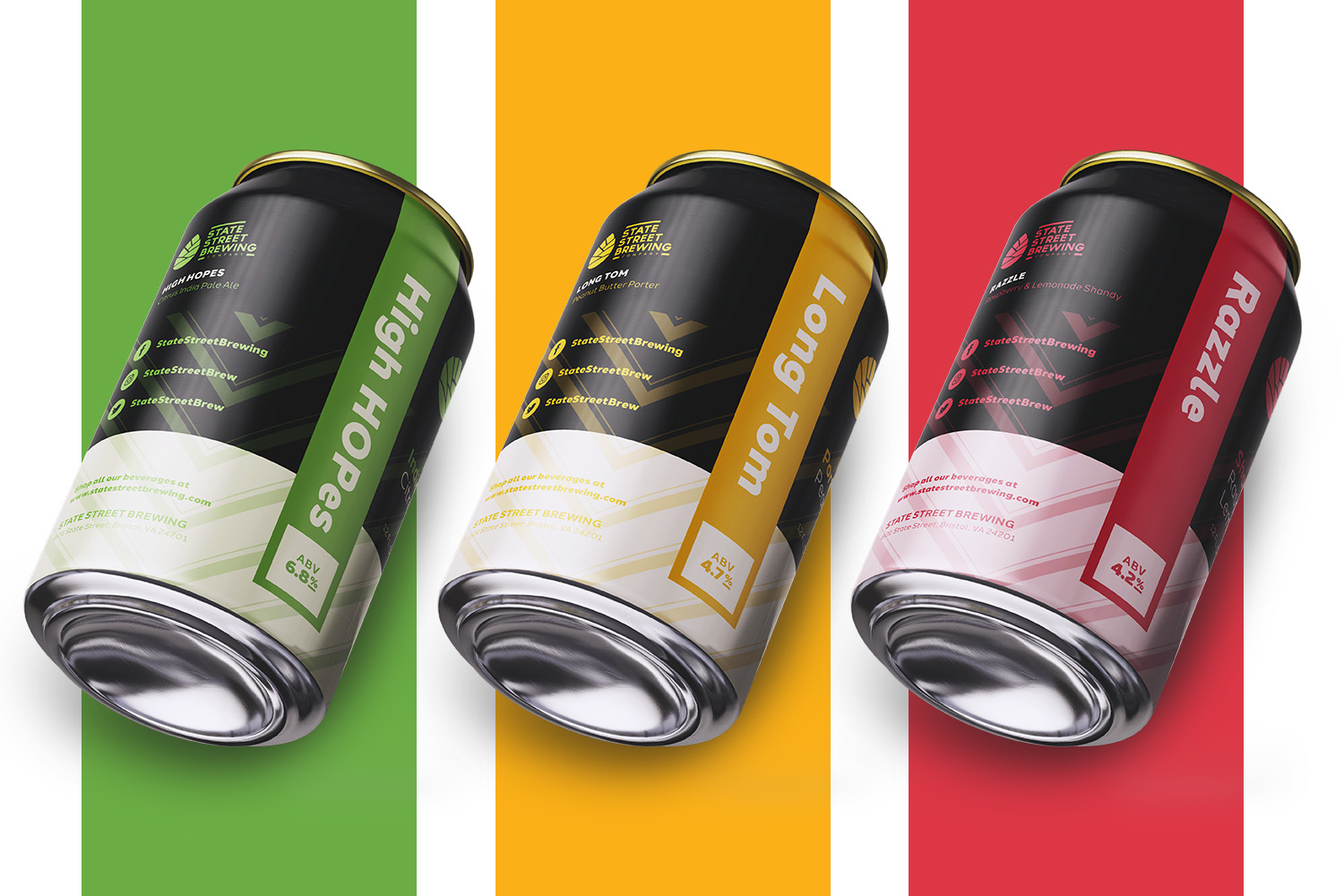
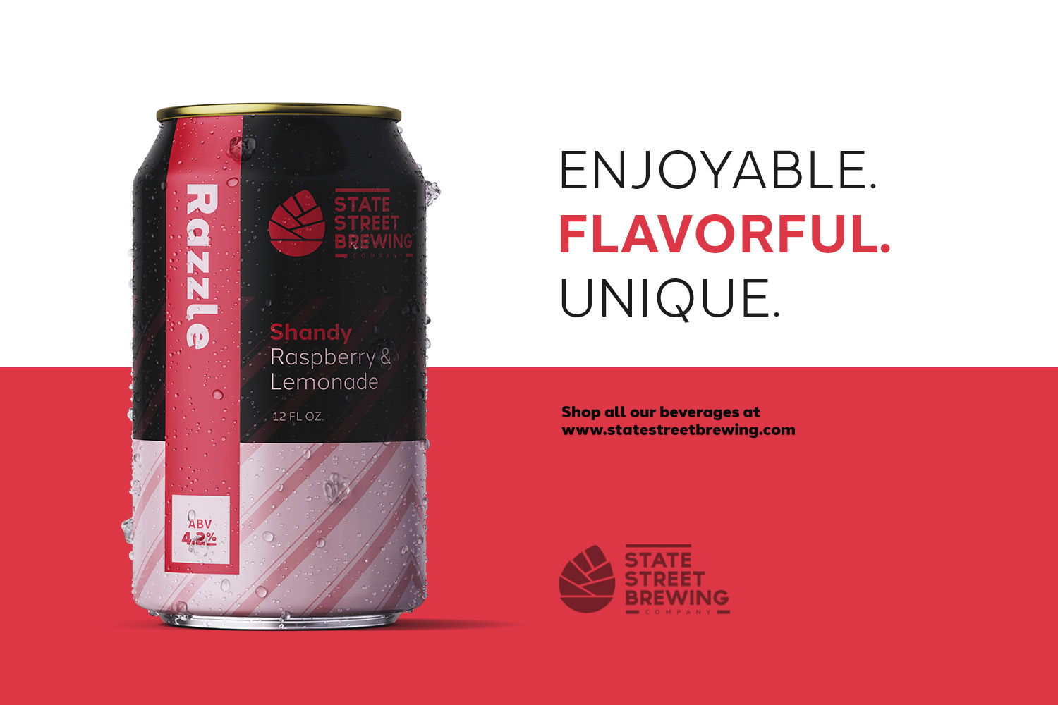
The approach that worked best for State Street Brewing was a minimalistic, high-contrast design that could easily be adapted for their variety of flavors. Bold bands of color down the side of the can allowed the name of each flavor to be prominent and quickly distinguishable from one another. The brewery’s logo was turned into a one-color option, allowing it to be big and bold. Candy-like strips gave the can personality without distracting from the important content. The type of beer needed to be in the spotlight, so it was placed front and center, with the minimal amount of text furthering the emphasis.