No two projects are alike, and this particular project is resounding proof. I was approached by Globallee, Inc., to design a package for a new healthy slim roast coffee blend. From the start, this project had a unique set of challenges.
Unlike most packaging, this isn’t a business-to-consumer product, it won’t be sitting on shelves in a grocery store. Globallee planned to sell this product through multi-level marketing. Like their other health-based products, it would be sold from consumer-to-consumer.
Designing for consumer-to-consumer
What does this mean for the packaging design? It was both freeing and limiting. Unlike B2C products, it didn’t have to compete with countless products on the shelves. But that meant that it was going to spend more time in the hands of consumers, because it would be standing on it’s own at product parties and trade shows.
Another challenge was it was not a separately branded product, meaning it had to fit under the umbrella of Globallee. The existing logo for Globallee had to be incorporated into the design, but was not the primary logo. And this product wasn’t a new product line that could be approached as a sub-brand of Globallee, rather it was a one-off product. Its description was its name: Slim Roast Coffee.
What problems arise from not having an established product name?
If this was a B2C product, distributed in stores, having Slim Roast Coffee as the “brand” name would not have worked. It would be too generic sitting among competitors, and consumers care about identifying the company that manufactures products. But since this product was C2C, there was more freedom in the specific “branding” of the product.
But from a design standpoint, the lack of a brand name created some issues. For most packaging, the logo of the company is a visual anchor within the design. This design instead had to be anchored by three descriptive words.
The color palette had already been established, because it would be utilizing the brand colors of Globallee to visually connect it to the company. But the individual sachets of coffee inside the box would be made out of craft paper, so the desired style of the packaging was earthy and organic.
Presenting the intial concepts
Based on the direction provided, I developed three different concepts that could accomplish the goals for this product.
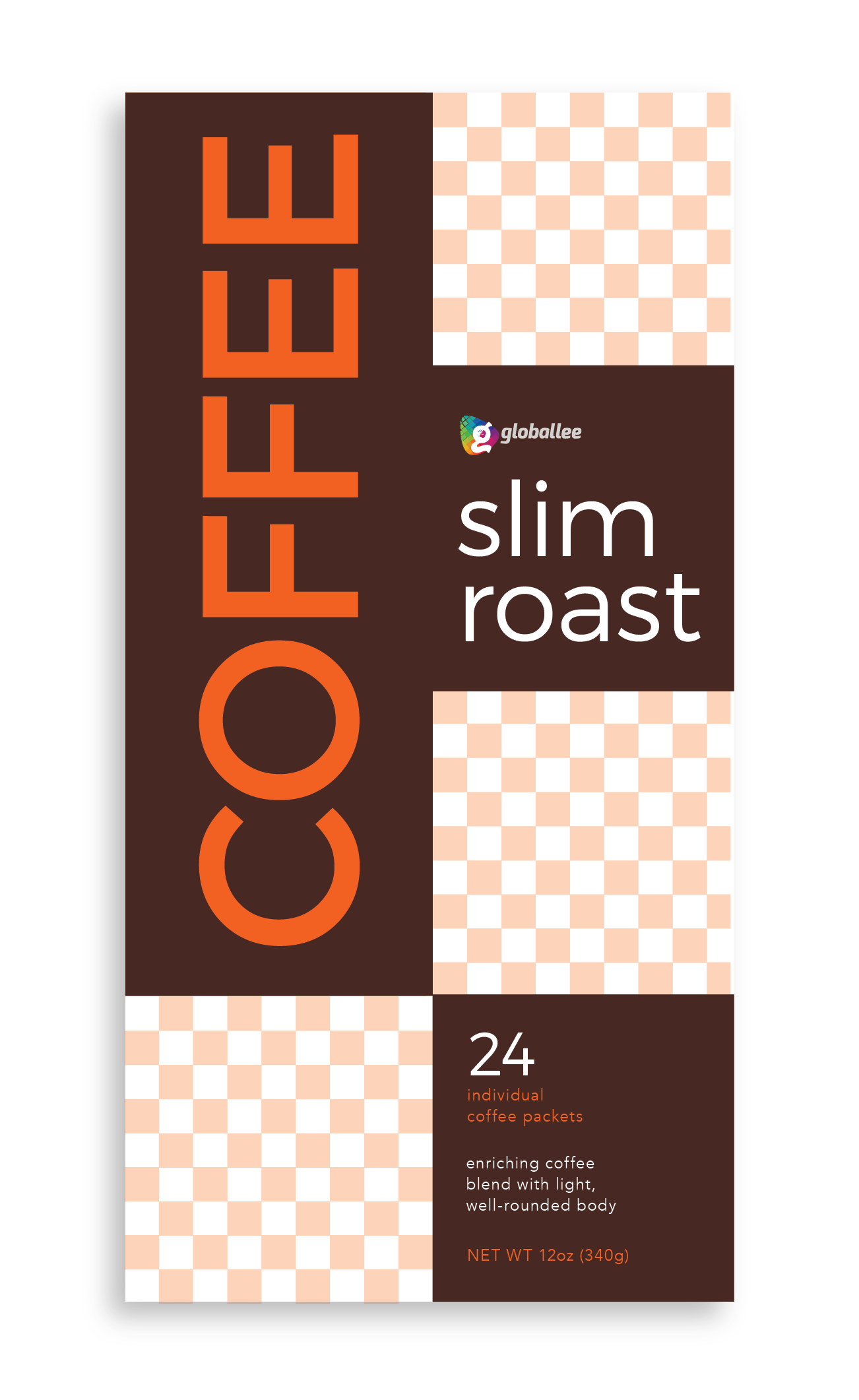
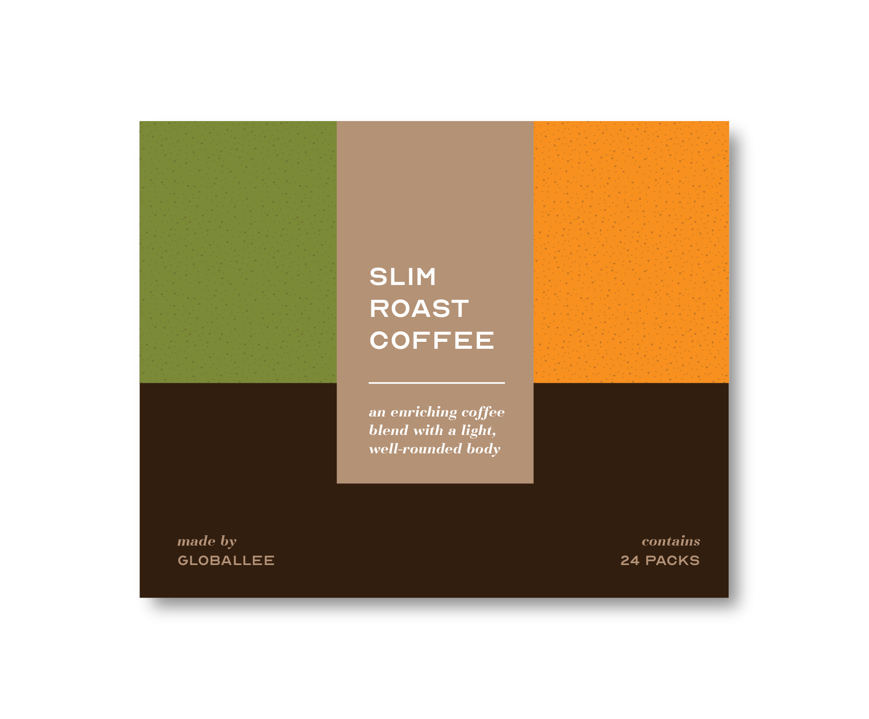
The first was a modern, geometric concept that utilized similar typography to other Globallee products. The dark brown color would quickly emerge as the solution to marrying Globallee’s overall brand style with the earthy, organic approach to coffee.
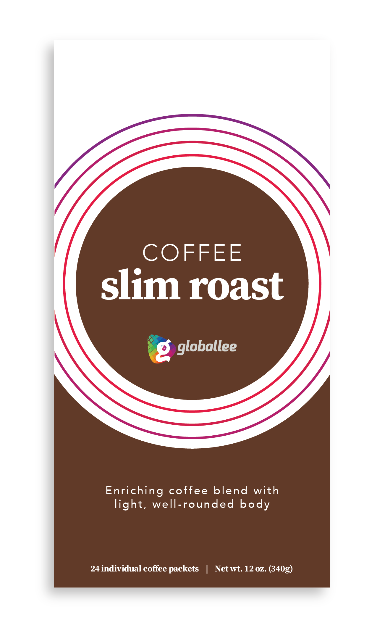
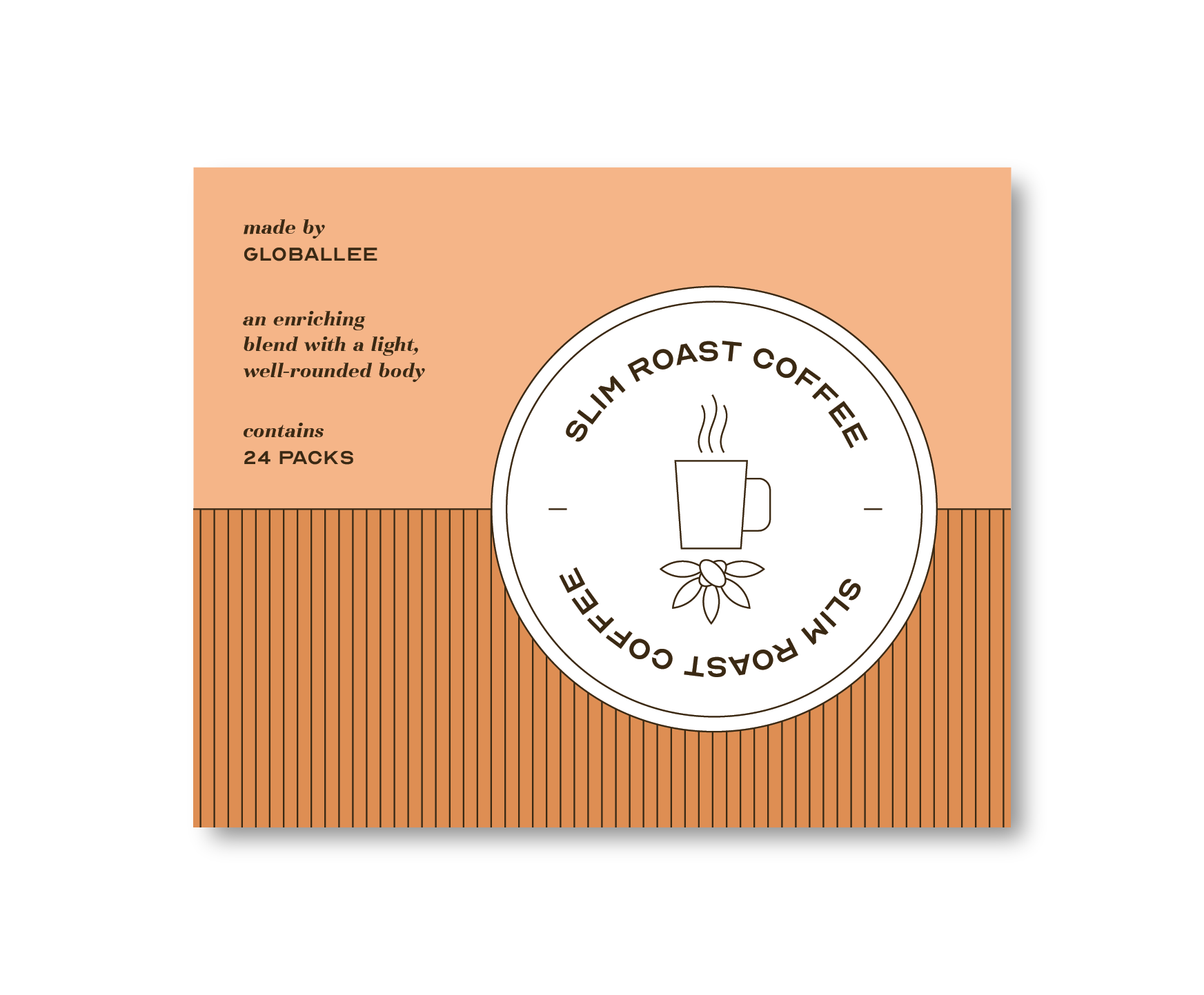
The second approach was a minimalistic style that placed the product name front and center. The subtle use of color tied it to Globallee, but wasn’t overboard and made it simple and elegant.
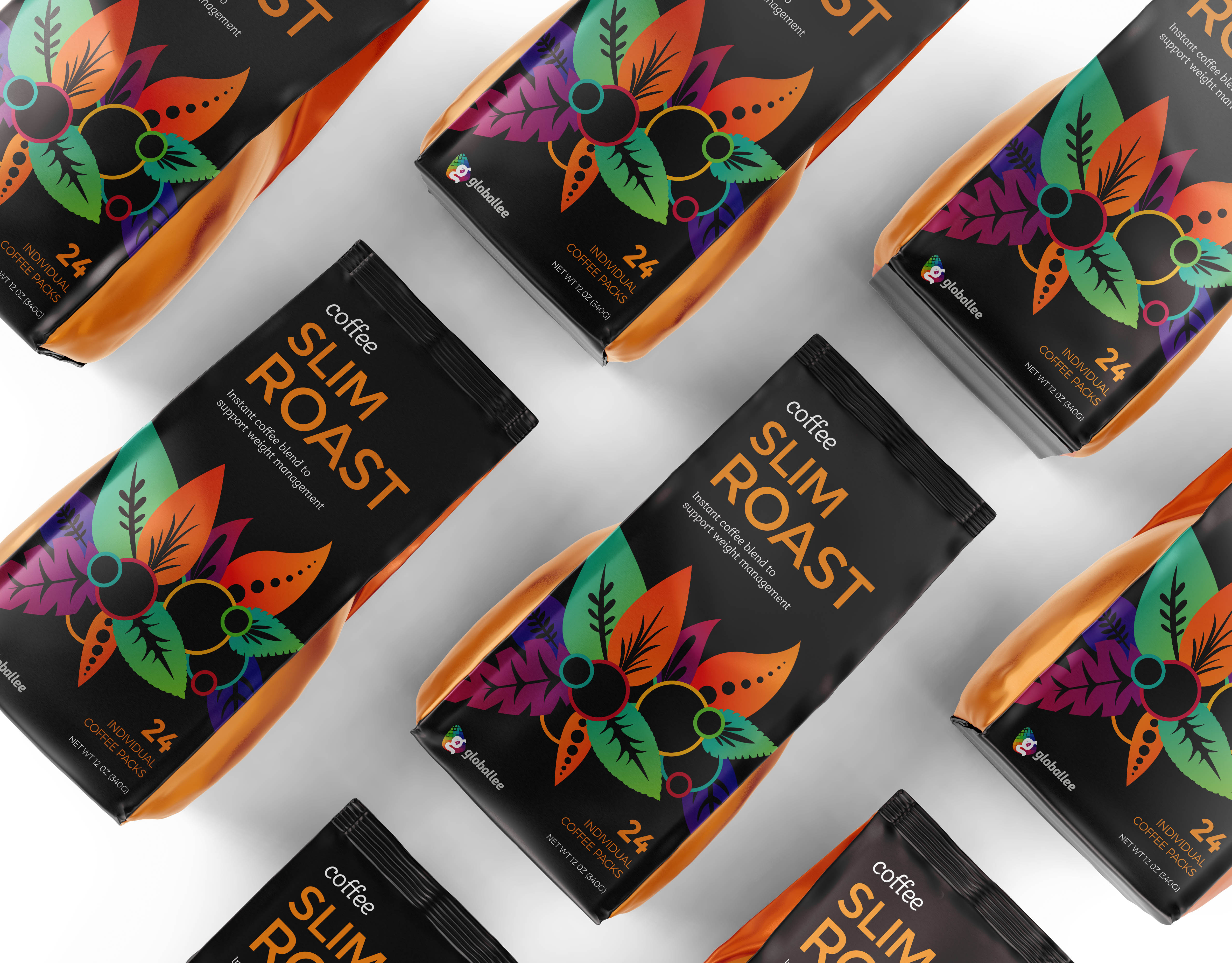
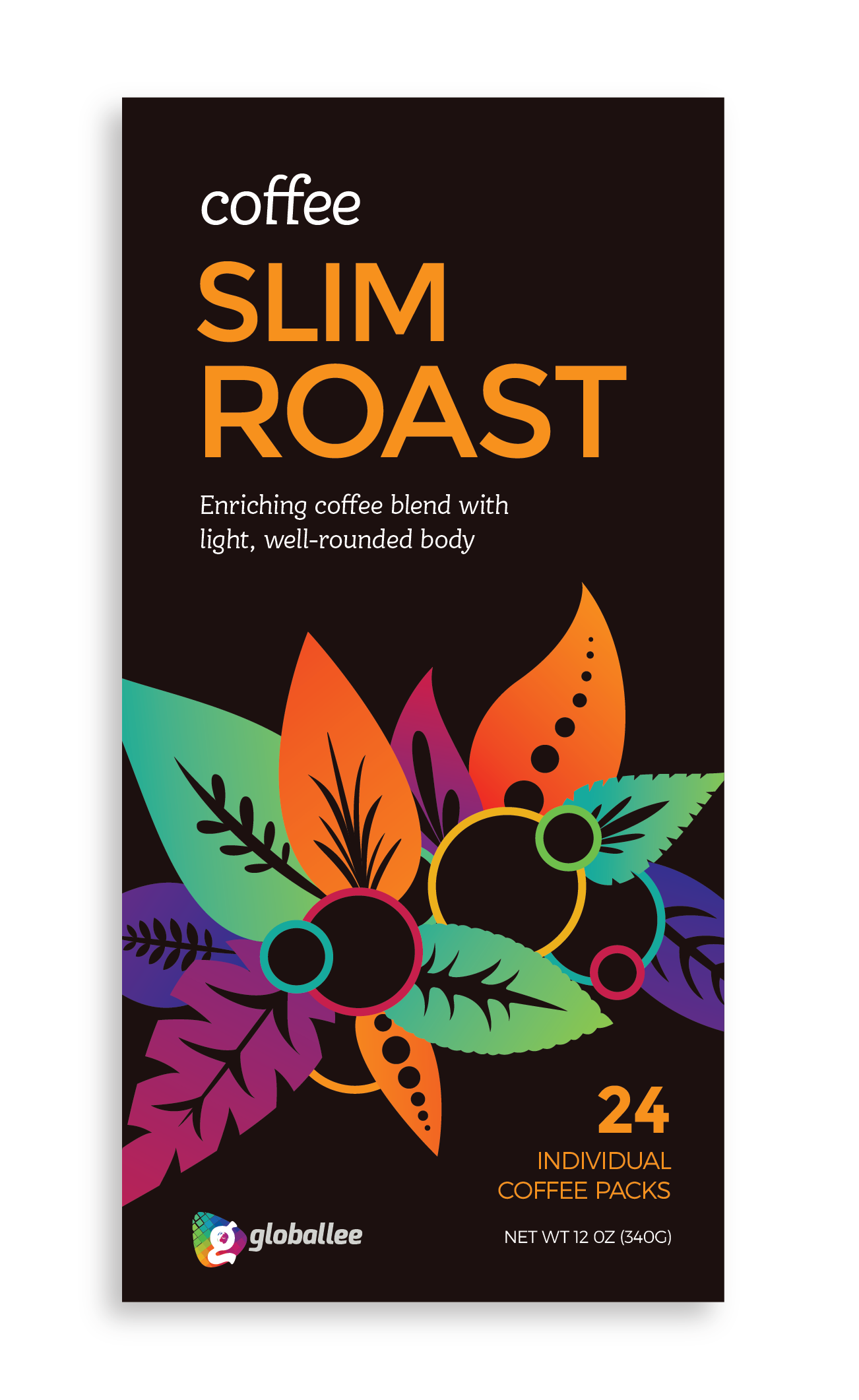
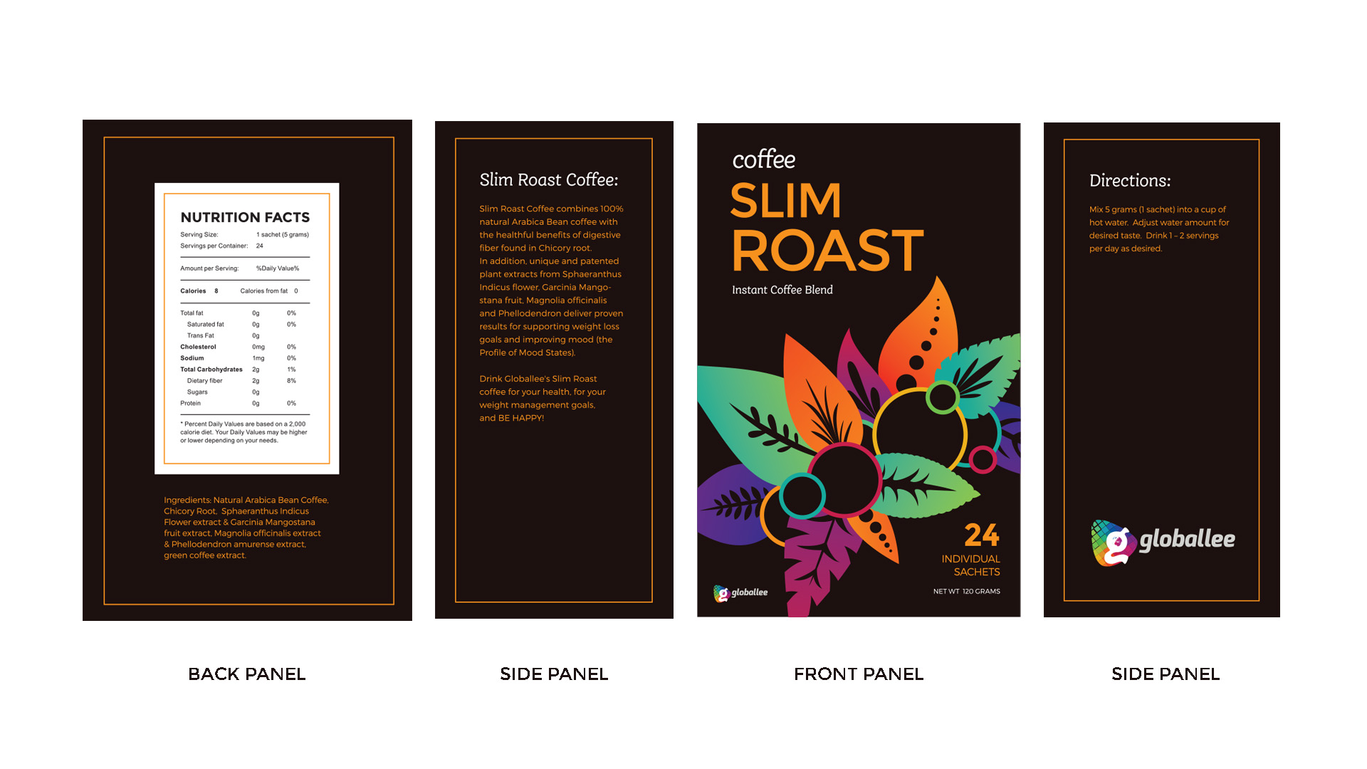
The third concept would ultimately be the visual direction we moved in. Using a majority of Globallee’s colors, I created an illustrative motif of exotic foliage that drew in the viewer’s eyes and directed them towards the product name. The rich, dark brown background made the colors and illustration pop. It was a unique visual style that felt at home amongst the rest of Globallee’s products, but was distinctly it’s own.
Presenting alternative concepts
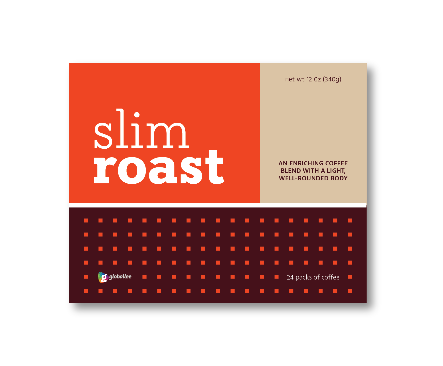
This is where the project hit a road bump, because initially, Globallee didn’t feel strongly about any one direction. They also wanted to change the box to be horizontally oriented, which heavily affected the presented concepts. After seeing the initial designs, they asked to explore a visual style that was further removed from Globallee’s brand. The next set of concepts were much more organic and trendy in style, and had little connection to Globallee’s visual identity.
This process was a great example of the difficulty of envisioning designs without something tangible. Once these alternative concepts were presented, Globallee realized that they didn’t want to stray far from their own identity and much preferred the designs that were originally explored.
This resulted in returning back to Concept #3, and back to the vertical orientation. A few alterations were made, and the side and back panels were fleshed out.
The final design met all the requirements and solved all the initial issues that we ran into. The bold, vibrant packaging would stand strong by itself in the hands of consumers, but still fit well underneath the umbrella of Globallee’s brand.