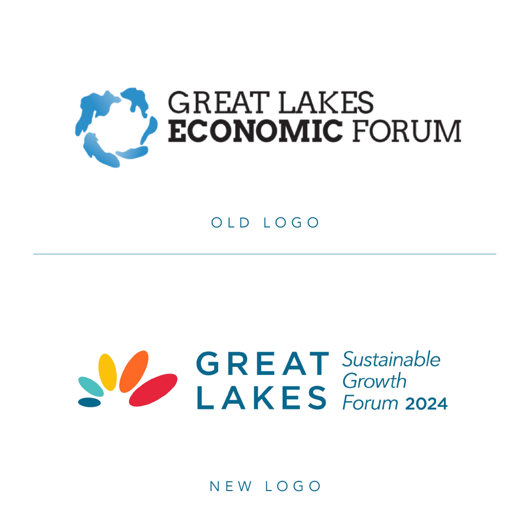
Giving a fresh look to an annual freshwater forum.
A keystone effort of The Council of the Great Lakes Region, the Great Lakes Sustainable Growth Forum is an annual event that sheds light on the impact of the Great Lakes. It showcase the region’s socioeconomic and environmental strengths and assets. It unifies leaders on the strategic importance of the Lakes.
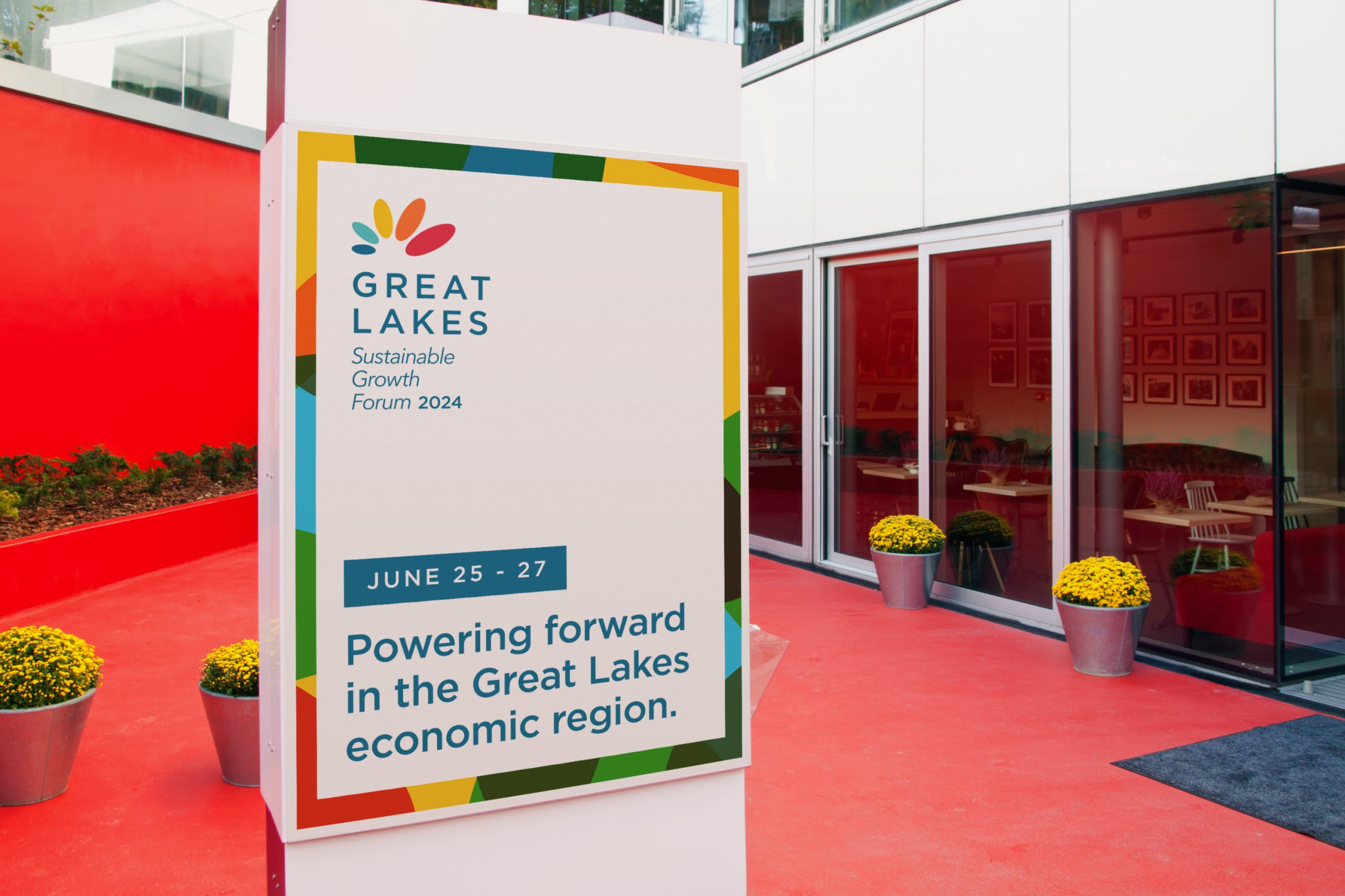
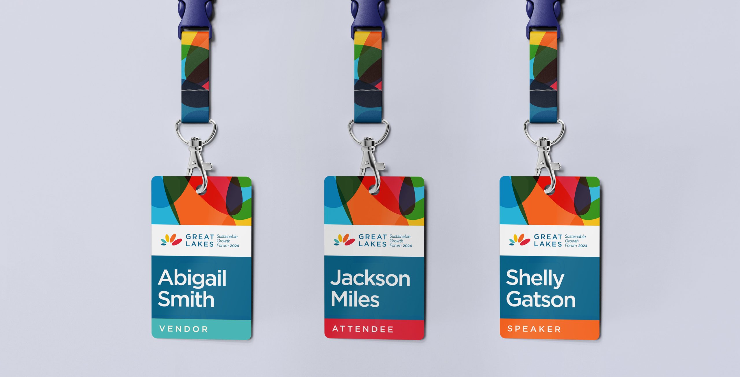
As the Council underwent a rebrand, it became important to upgrade the identity of the Forum. Creative Chameleon Studio worked with the Council to elevate the logo and brand elements of the Forum, giving it a new look that will establish it as an energetic, important annual event for years to come.
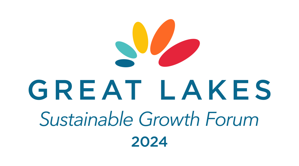
WHAT IT MEANS
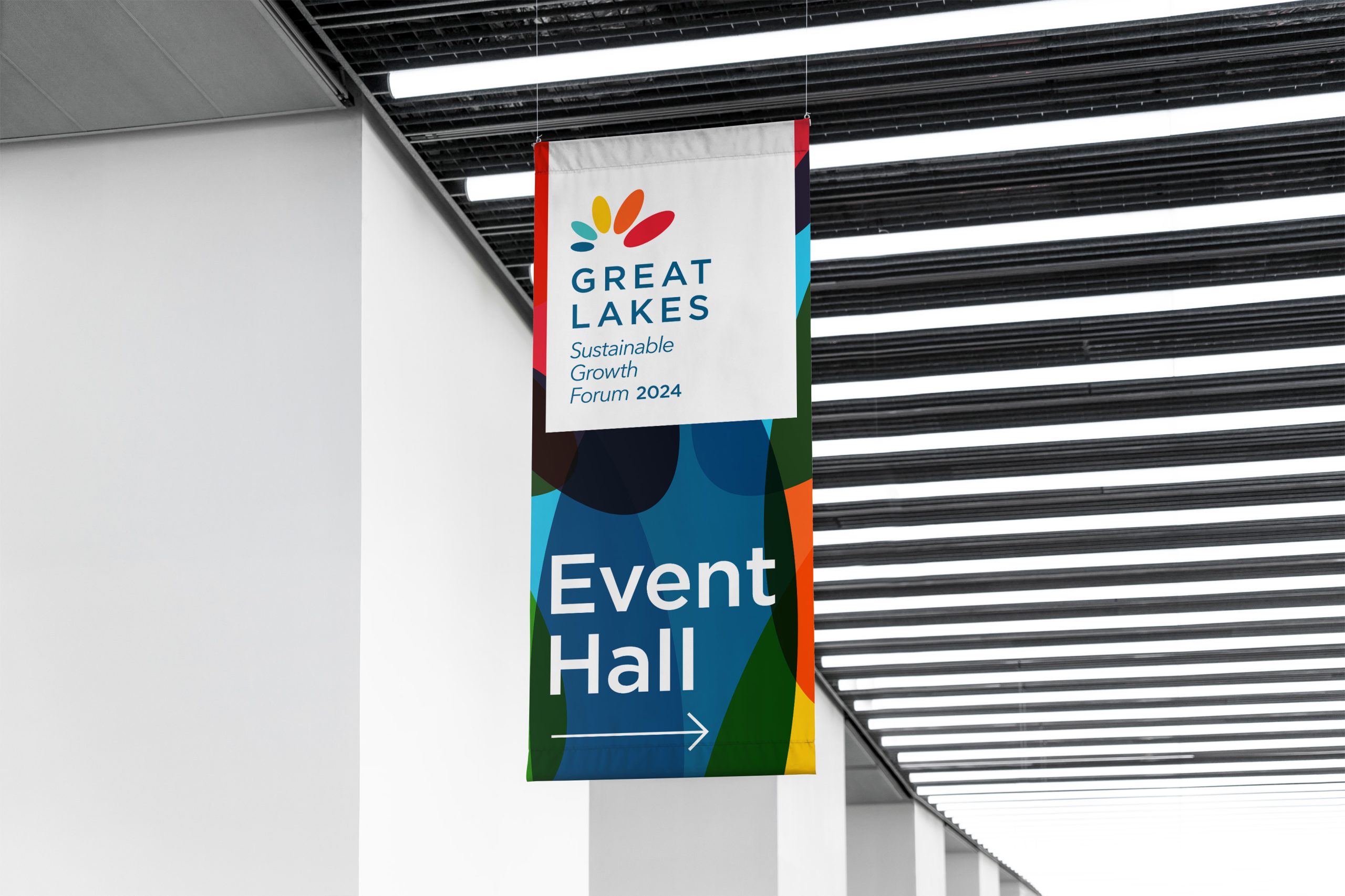
The five ovals represent our five Great Lakes. Each oval grows in size at it moves forward, capturing the goal of steady and sustainable growth in the Great Lakes regions. The shifting colors of the logo represent the breadth of impact by the Great Lakes, from the water to the people to the economies.