Giving a new business coach a golden identity system.
Business coach, Diedre Baker, needed an identity that reflected her goal of mending the broken structure of her clients' company and turn it into something beautiful, efficient, and sustainable.
LOGO DESIGN | IDENTITY SYSTEM | BRAND GUIDELINES
“Madison is a true professional with an amazing talent for clean, simple, impactful design … I cannot express how amazed I was with her talent, professionalism, and process. She went the extra mile to explain everything and her onboarding process is well thought out and eased my anxiety in this new space.”
– Deirdre Baker
Kintsugi: the Japanese art of repairing broken pottery with powdered gold, silver, or platinum.
The four arrows represent a compass and the way that BizKintsugi helps clients navigate the journey of entrepreneurship.
The lines come together to represents four individual pieces being joined to form a solid image, alluding to BizKintsugi helping clients build a better business, no matter their past failures or struggles.
The outer circle holds the pieces together, representing the longevity of the tools clients will receive as they form practices for a sustainable balance.
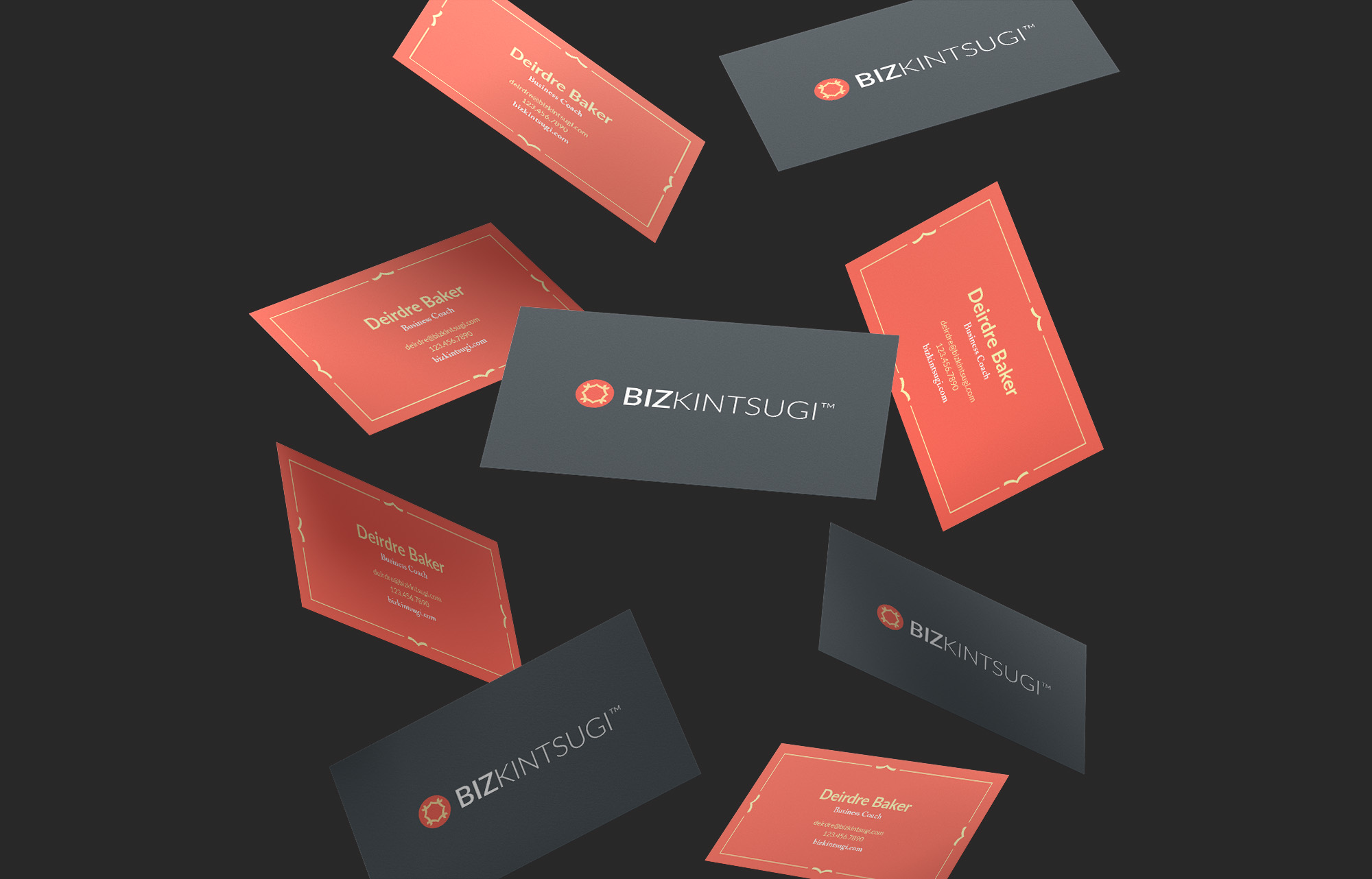
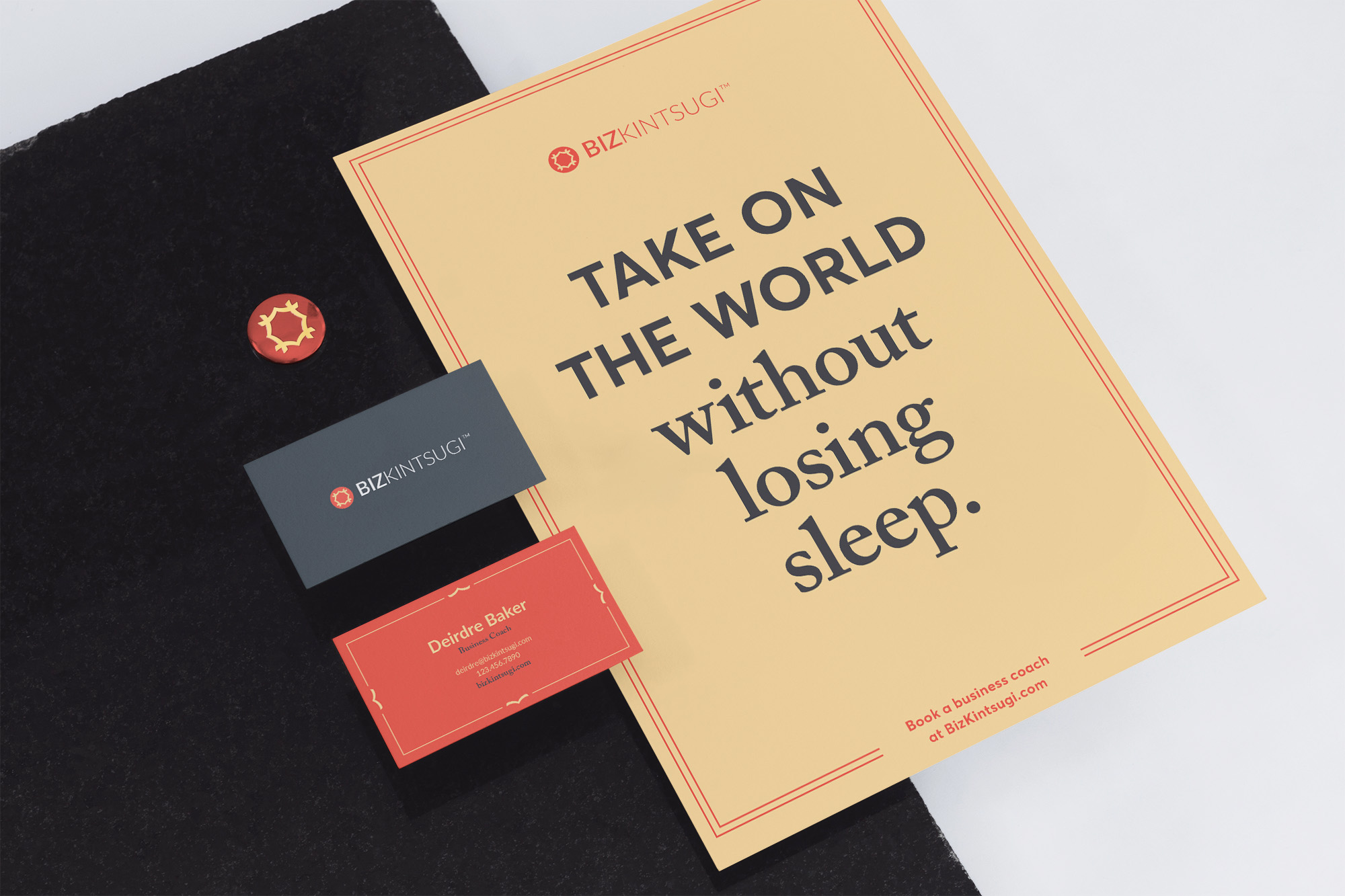
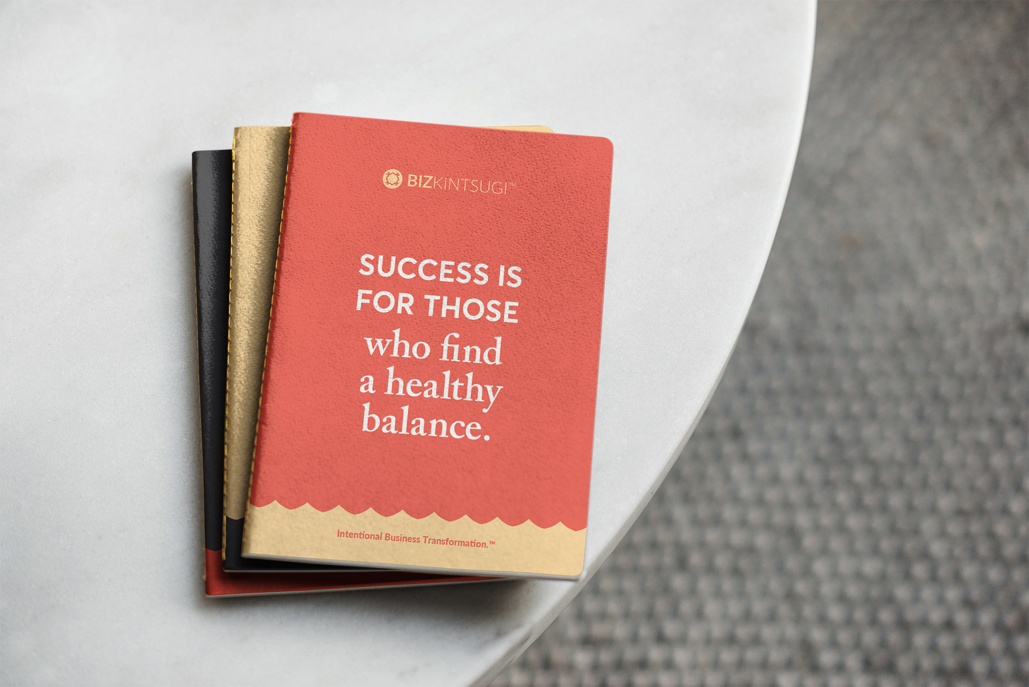
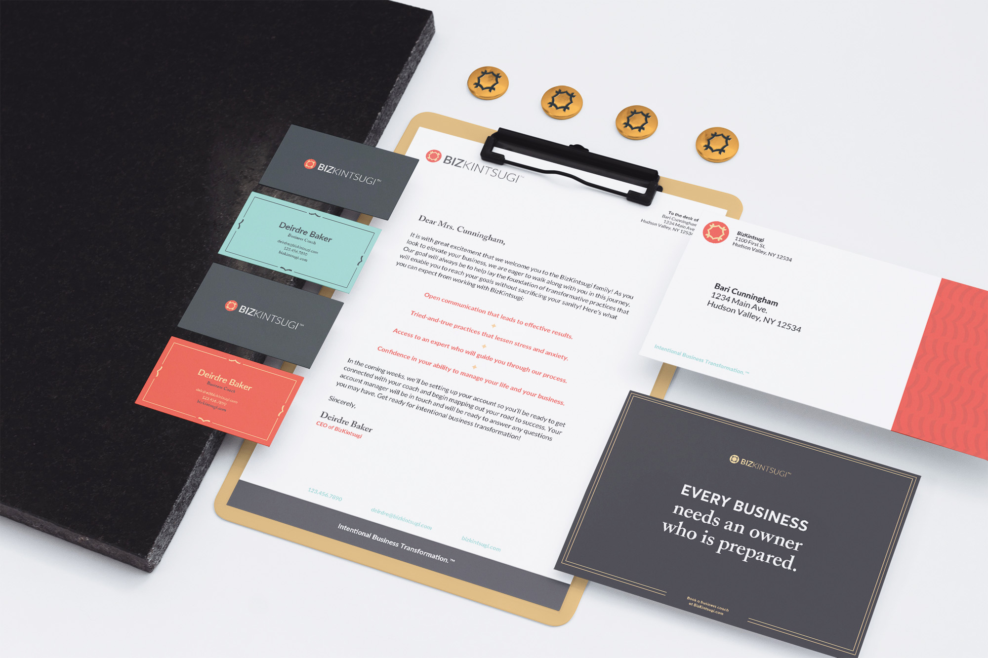
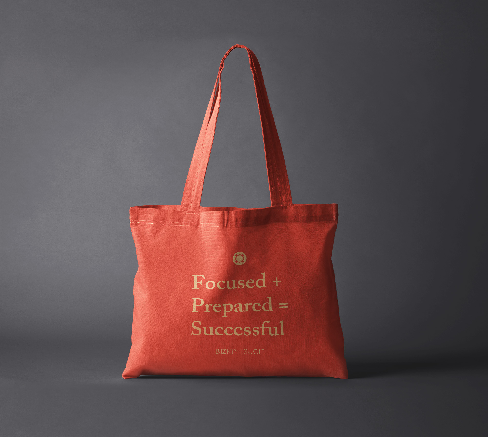
This logo was then developed into a larger identity system that was flexible enough to be utilized across various collateral, but strict enough to maintain visual consistency for brand recognition.
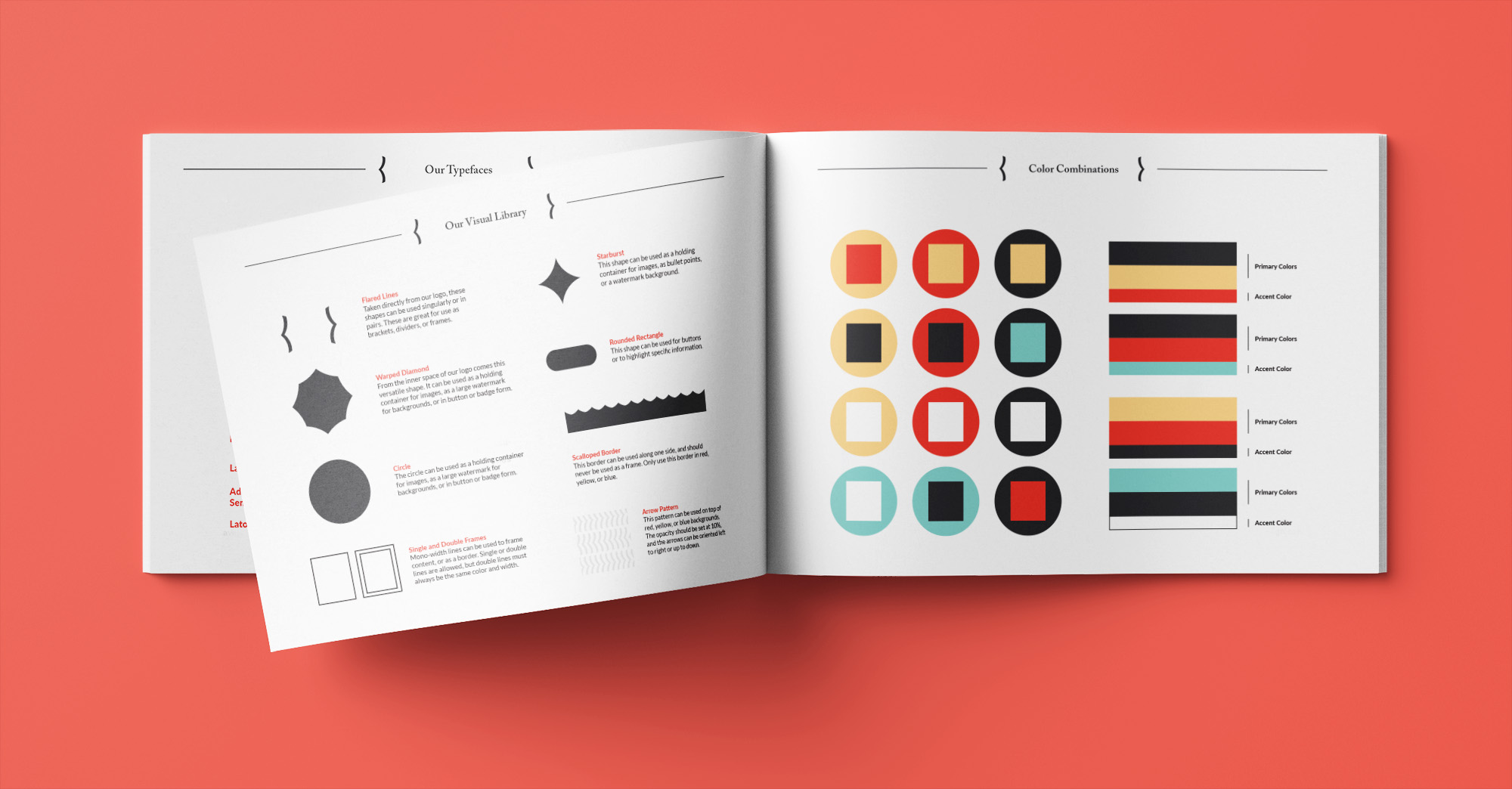
Accompanying every visual identity project is a brand guideline that condenses the brand information from the initial discovery session, the various rules for using the logo, type, and color, and examples of how the visual language should be applied to the company. These guidelines are important in ensuring that BizKintsugi’s new identity is consistent and will continue to strengthen and support the brand for years to come.