
Venturing out as a start-up is scary, intimidating, and nerve-wracking. And it often culminates in one moment – delivering the pitch. You poured hundreds of hours into your business plan, and you deeply believe in it. But now you have to persuade someone else to believe in it as well: investors.
Investors are the primary source of capital for many start-ups, so delivering an effective, professional pitch is vital to your success. And to make it more difficult, many startups have to convey complicated information and statistics in a way that any investor can grasp.
The Purpose of the Pitch Deck
Enter the pitch deck. This slideshow is a visual aid in your presentation, meant to guide and support you as you deliver a practiced speech. But in this moment, a pitch deck can be a two-edged sword. It can either help elevate your entire presentation, or stand in the way of success.
This is because while many startups work tirelessly on the content, they forget about the design. The content is the skeleton of your presentation, but the design is the muscles. It’s the ace in your back pocket. Ignoring what your deck looks like can be the biggest mistake of your presentation.
Most startups create their own decks, but that leaves them vulnerable these 5 common mistakes.
1. Overcrowding a slide.
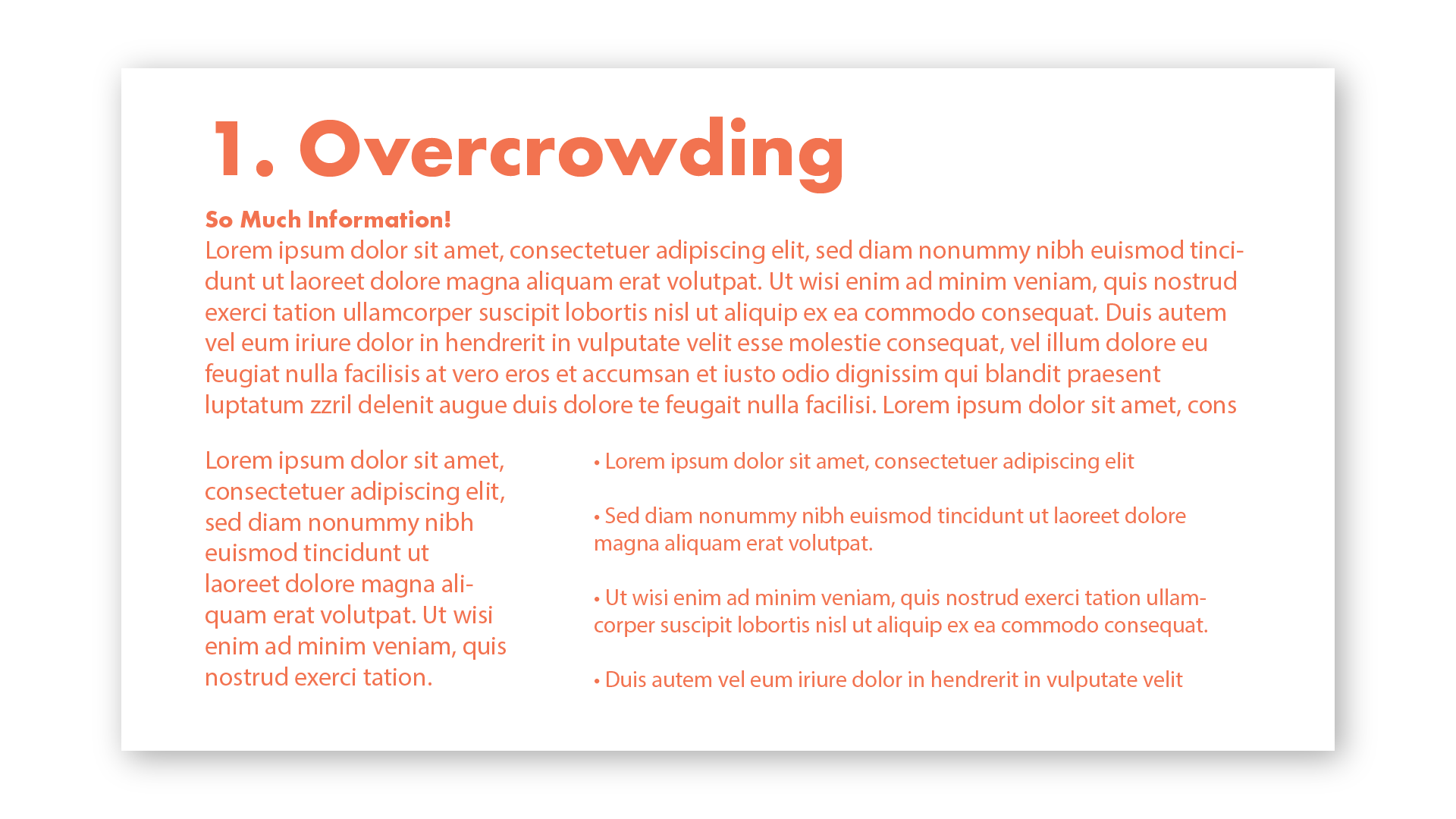
The rule of thumb is “less is more.” You don’t want to fill a slide like you would an essay paper. Cut down on the copy, summarize the main points, and let the slide serve as a support for when you talk. If your audience is reading the paragraphs you squeezed into a slide, that means they’re not listening to you! Use a slide to call out the most important points, then let your practiced speech fill in the blanks.
2. Not using negative space.
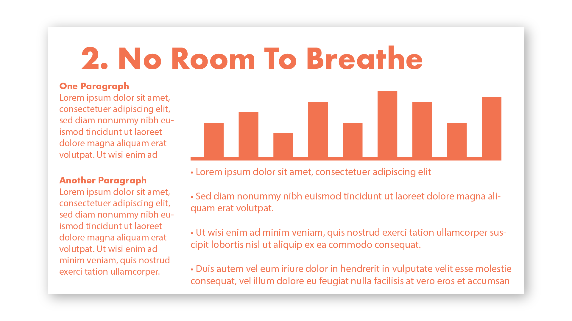
In addition to cramming too much information on a slide, many people forget to let things breathe! One of the most important lessons learned in design is that “negative space is your friend.” Don’t take your text right to the edge, and leave a little wiggle room between headings and body text. If you have a graphic on the slide, make sure it has some elbow room!
3. Making text too small.
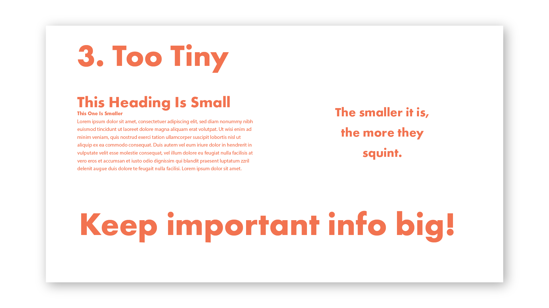
Your slides are up there for your audience to read, so make sure they can! Keep the most important information large and clear to see. Body text can be smaller, but it still needs to be legible from the back of the room. Test your slides on yourself, family and friends. Troubleshoot what text might be difficult to read and bump up the size and spacing to make it easier on the eyes.
4. Not choosing one style.
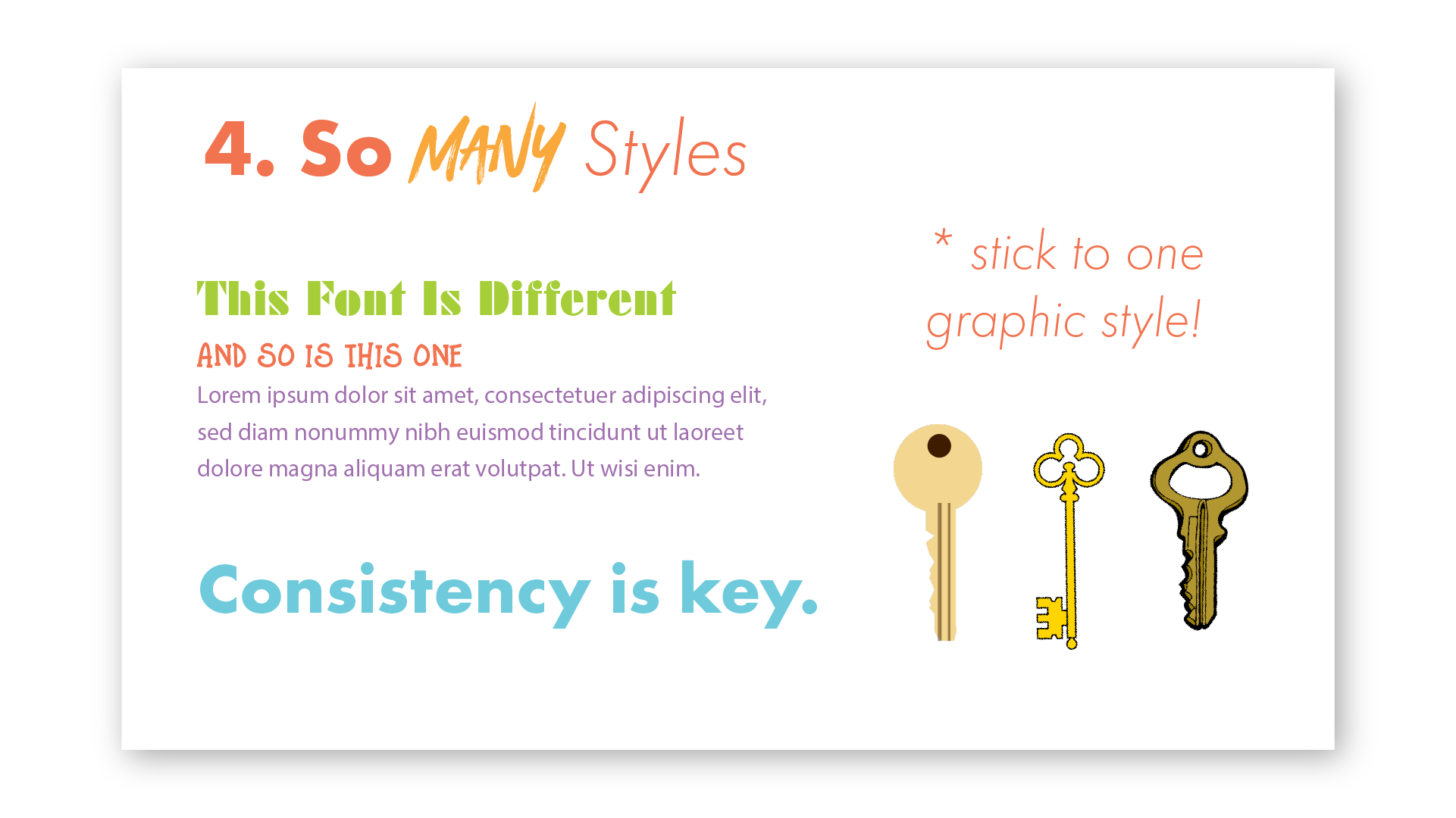
I’ve seen decks that cover six different styles at once! That doesn’t relay consistency and trust, two very valuable attributes you want investors to attach to your company. Select a color scheme that includes a primary color, a contrasting color, and a complimentary color. Choose one font for headings and one font for body text. Keep these both consistent throughout all your slides. And if you choose to incorporate graphics, select ones that are in the same style as well. Switching from a line drawing to a flat graphic to a Banksy-type image will leave your audience unsure of what you’re trying to convey!
5. Ignoring your brand.
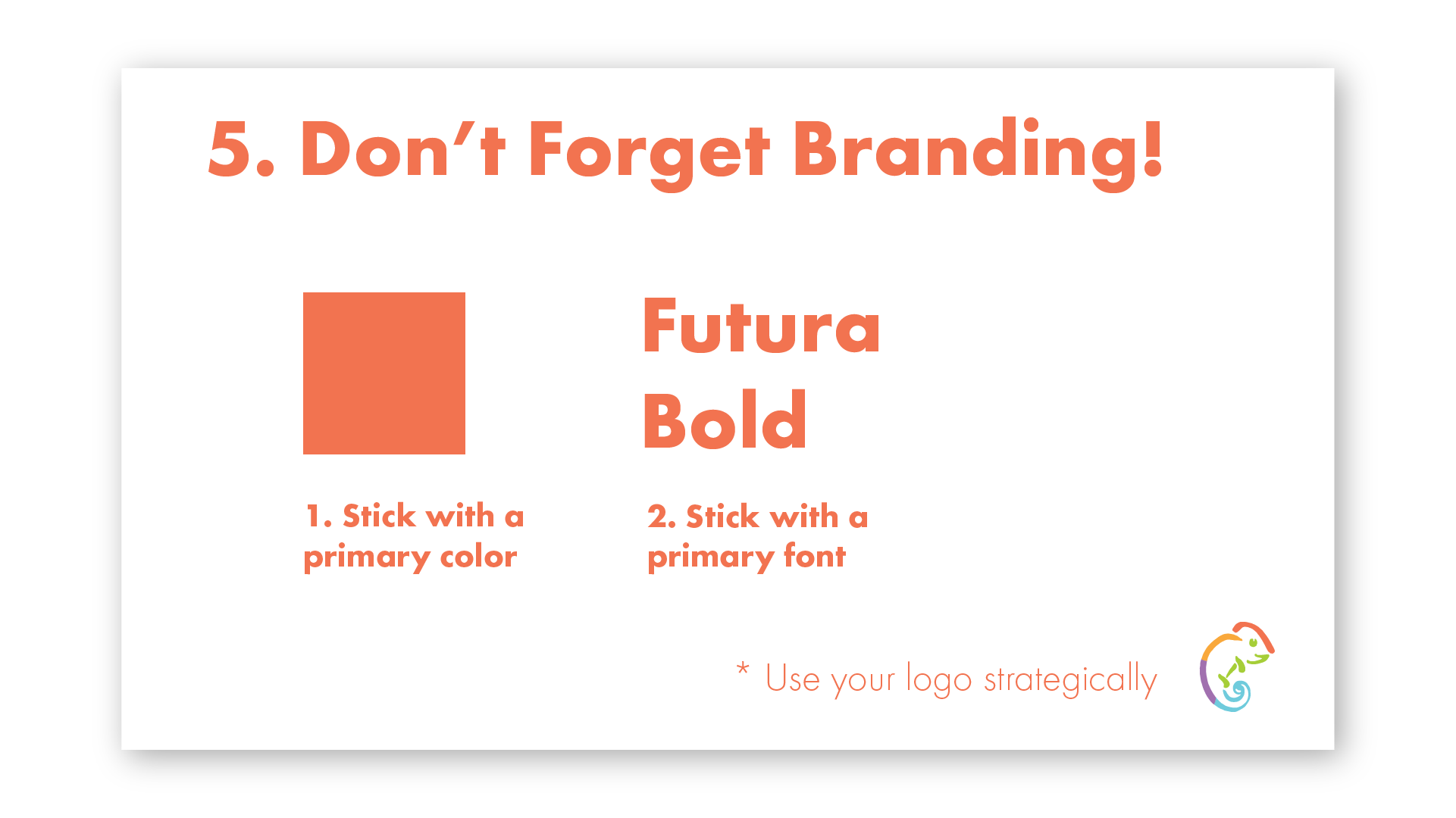
If you’ve invested in branding your company, it would be a waste of money to forget about it in your pitch deck! Poor branding would be slapping your logo across every slide to make sure no one forgets what it looks like. Placing your logo on the first and last slide can be enough. Effective branding would be using your color palette and brand fonts to evoke the feelings you want associated with your brand. If you’ve invested in a branding package that includes presentation templates, use those to keep your pitch deck on brand!
Having a well designed pitch deck can inject confidence in your presentation. Unfortunately, many startups neglect the visual aspect of their deck. Eliminating these 5 mistakes from your pitch deck can result in a better presentation and increase your chances of success! If you would like to hire a designer to improve your pitch deck, send a message through this contact form. To see examples of completed decks, visit this page.