We reimagined the look of this school's athletic department.
Crafting a new name & mascot.
After undergoing a school rebrand, it was time for St. Paul School of Ann Arbor to have a refreshed athletics brand. Previously the Crusaders, the school leadership wanted a new name and new mascot that better reflected the brand positioning of the school.
After assembling a decision-making team of leadership, faculty, and parent representatives, we began a thorough process for name selection. Engaging with the school community through surveys & suggestions, the team narrowed the options down to a shortlist and then agreed upon the new name: St. Paul Phoenix.
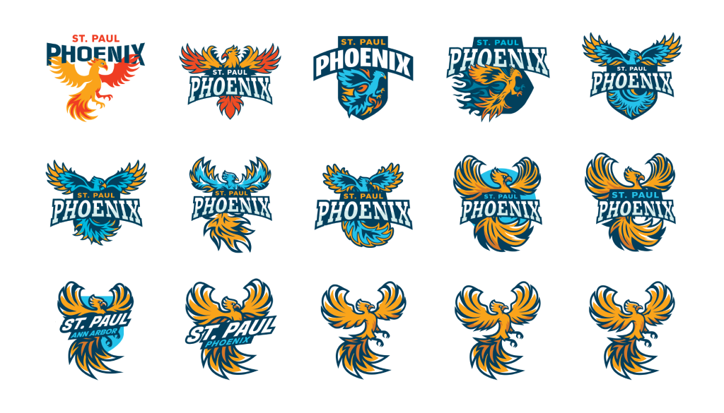
MASCOT DESIGN EVOLUTION
Once the name received approval, we then began the design phase. After initial exploration, there became three primary goals for the mascot design.
The mascot needed to use the school’s yellow, electric blue, and navy blue as it’s primary colors.
It had to be fierce and powerful, but still fit the middle school age of the students.
Large, swooping wings and tail were the notable features we wanted to highlight for the phoenix.
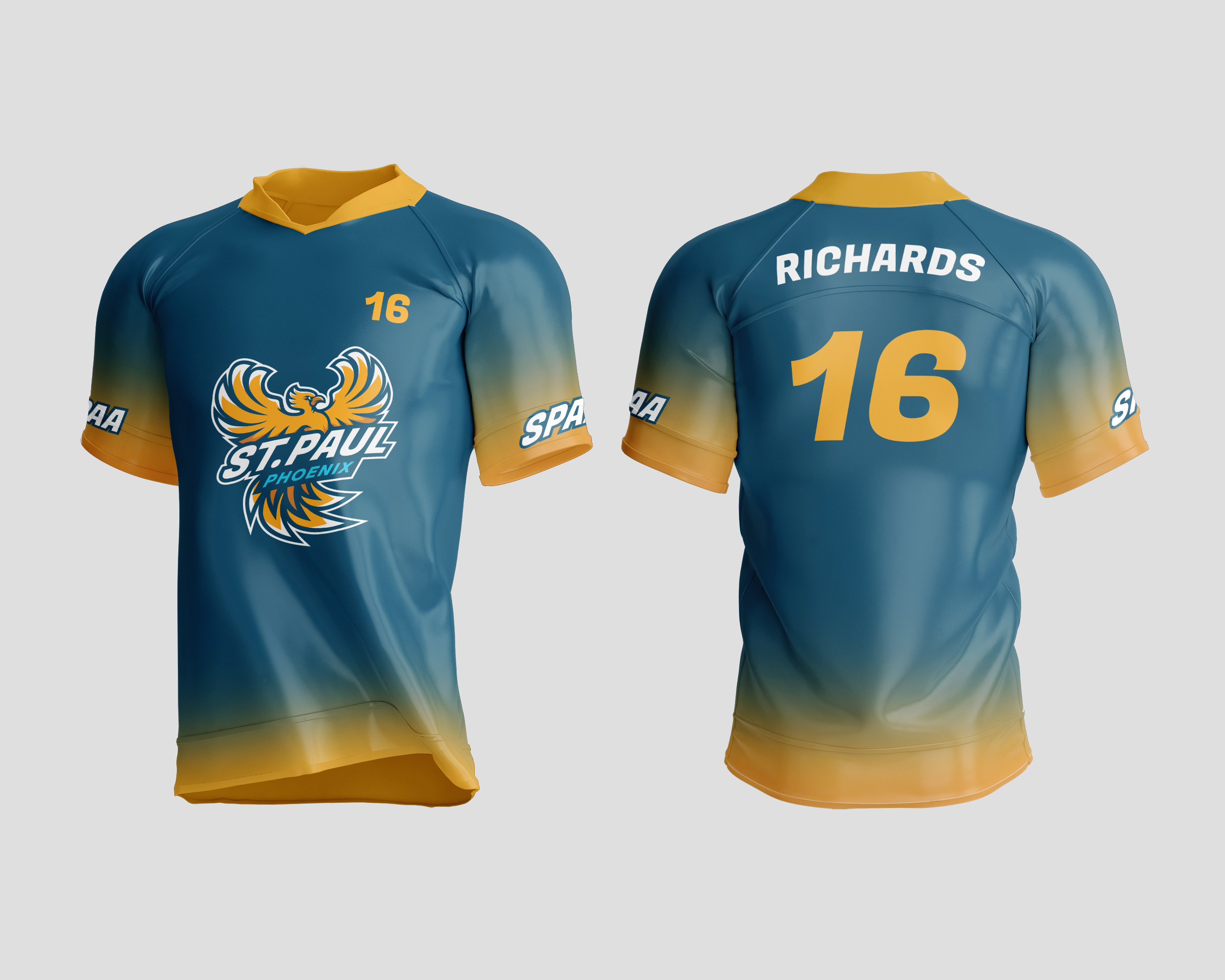
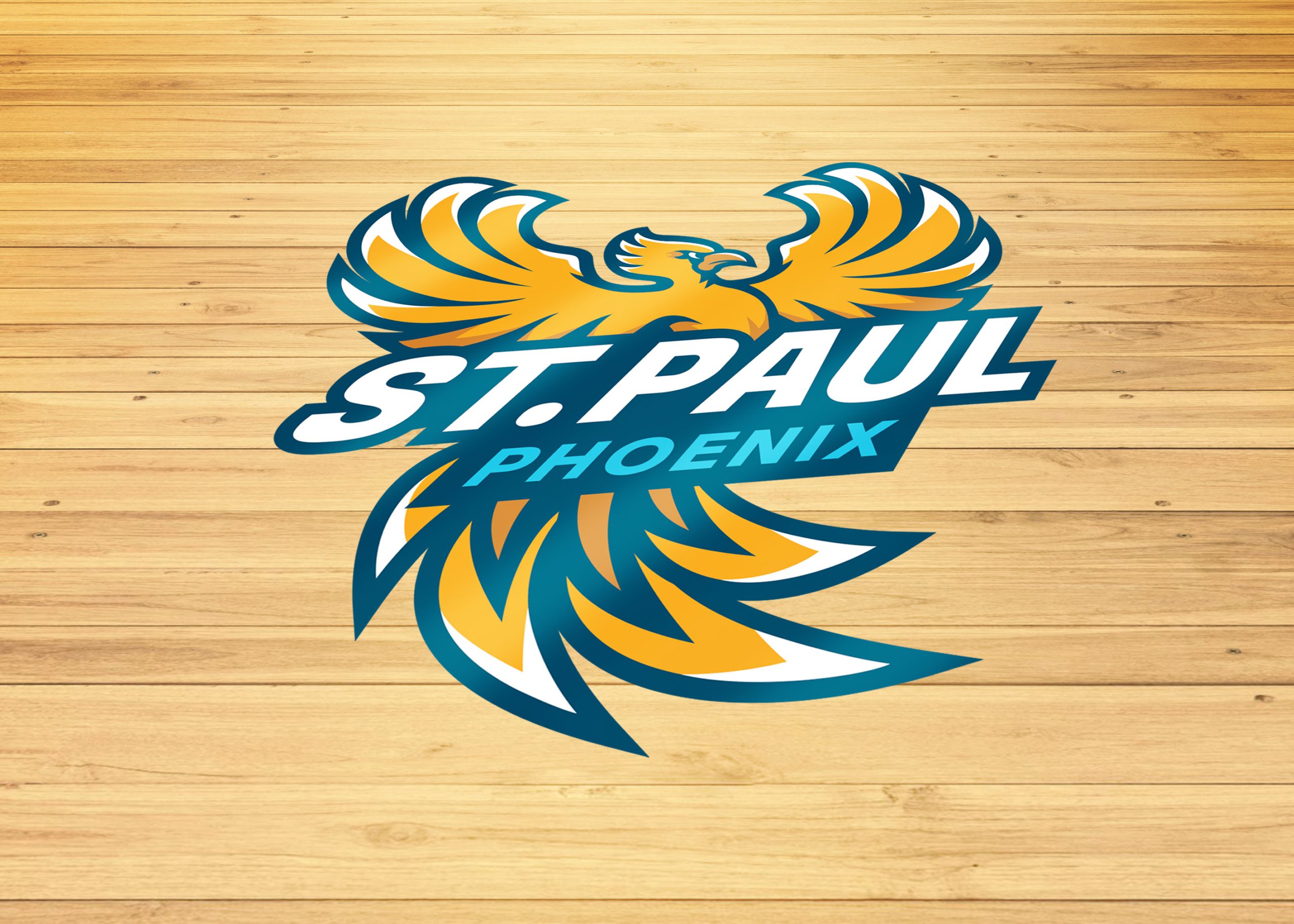
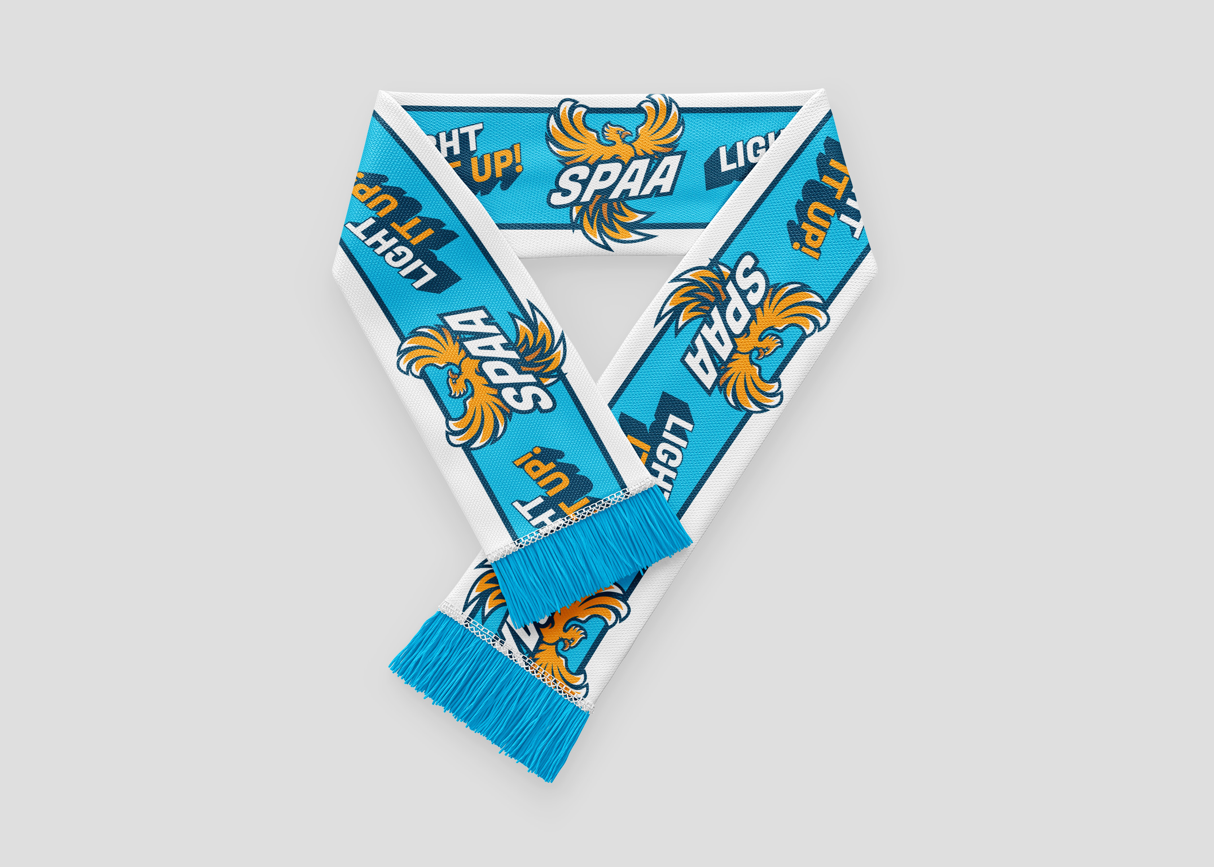
With a thorough design process, we landed on a bold, bright and powerful phoenix that captured the spirit of St. Paul’s athletic program. From there, we developed a full identity suite so the new look could touch every aspect of the programs design needs and begin to be implemented as the school’s new mascot.