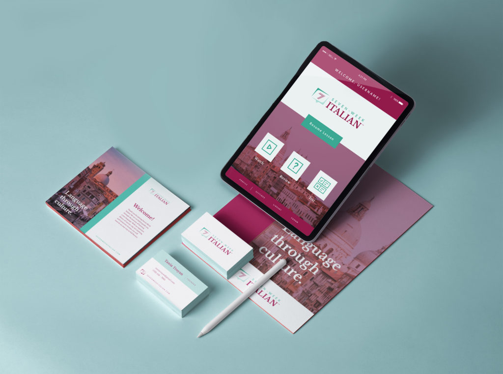
A common reason for a visual rehaul is a significant shift within a company, which occurred when language-learning platform Italist decided to pivot their strategy and change their name to Seven-Week Italian. To accompany the name change, owner Tania Troyan approached Creative Chameleon Studio to develop a logo and look that matched the brand.
It was important for the icon to highlight the seven-unit structure of the program. Since the courses teach how to speak, write, and read Italian, the chosen concept was a speech bubble, with seven lines to represent text stacked inside it to form the number 7. Pairing this icon with an elegant serif font and a clean, sharp sans-serif, the final logo captures the essence of the brand and is a unique mark that can distinguish the company for years to come.
PRIMARY LOGO
STACKED LOGO
Icon
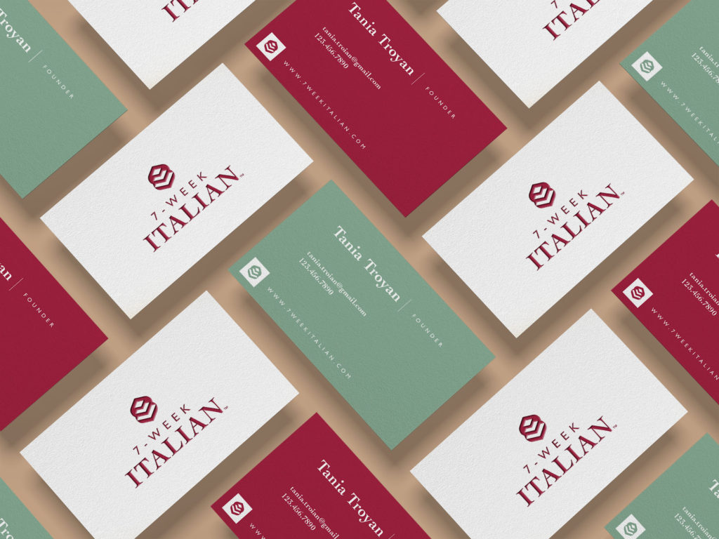
Alternative Concept
For each branding project, multiple concepts are presented to the client. Every concept provides a solution to their needs, but gives a range of visual direction the client can choose from. For Seven-Week Italian, the alternative concept was an elegant, abstract mark that represented the building blocks of learning a new language.