Despite being filled with texts, graphs, and pictures, an annual report doesn’t have to look bland. Non-profit organization, IMPACT 2030, wanted their report to have a vibrant feel to it, because they are proud and excited for the work they’ve accomplished this past year. The report was primarily comprised of case studies, which would be used individually and together in a comprehensive format. The design had to accomplish a few key points:
It first had to fit within their brand. Utilizing their brand colors was important and resulted in making the entire report truly feel like it belonged to IMPACT 2030.
Secondly, the report had to contain all the information without being confusing to the readers. This is tricky for any content-heavy layout, but the key was establishing a hierarchy of information so readers could easily navigate all the content. By having large, bold headings, and consistent visual elements for different areas of content, the final report is comfortable to read for any viewer.
The end result was visually captivating layouts, with each case study in the report using one of the brand colors to stand out. Consistency is key for an effective layout design, and by each case study working within a template, the important information is easy to find for the viewer.
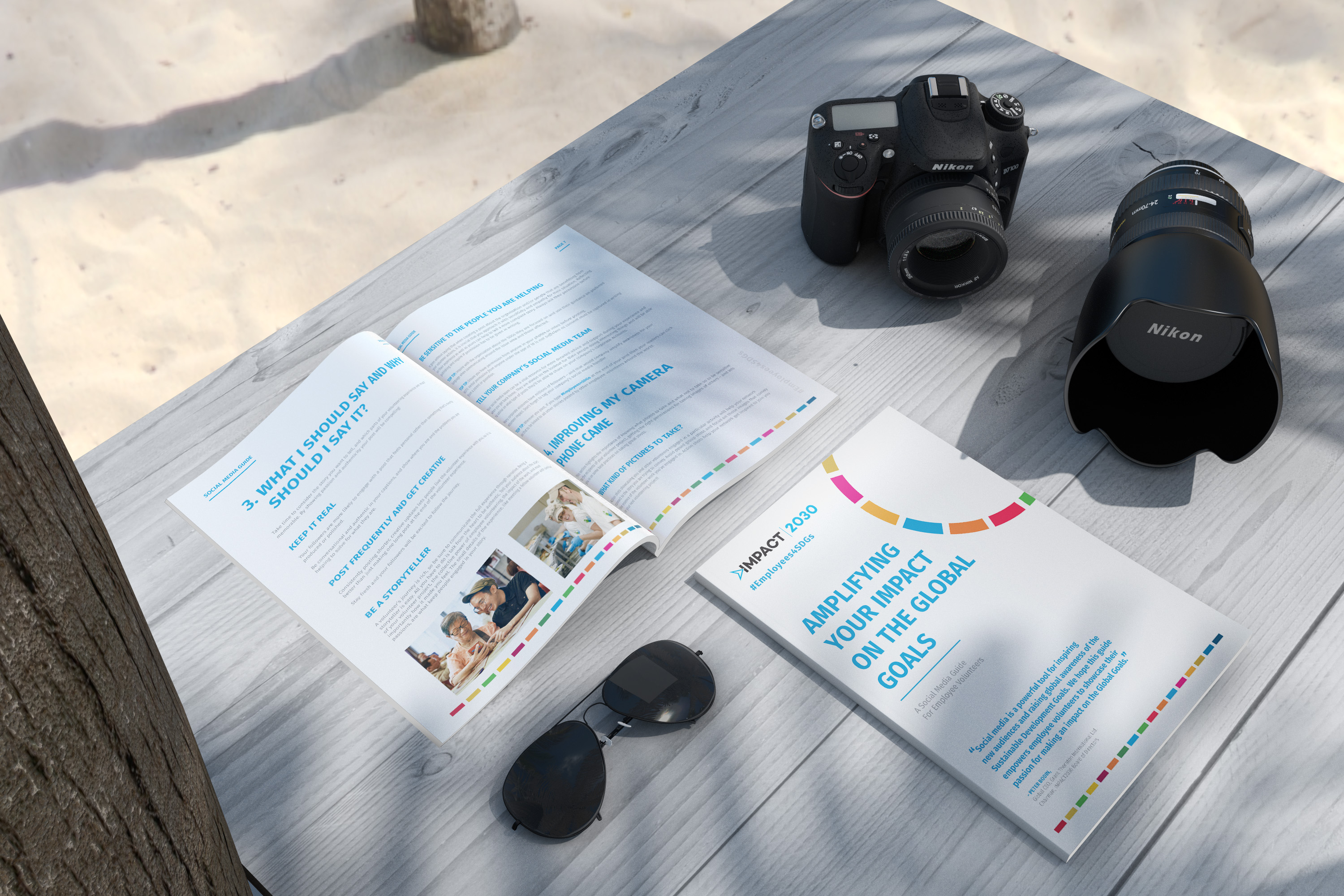
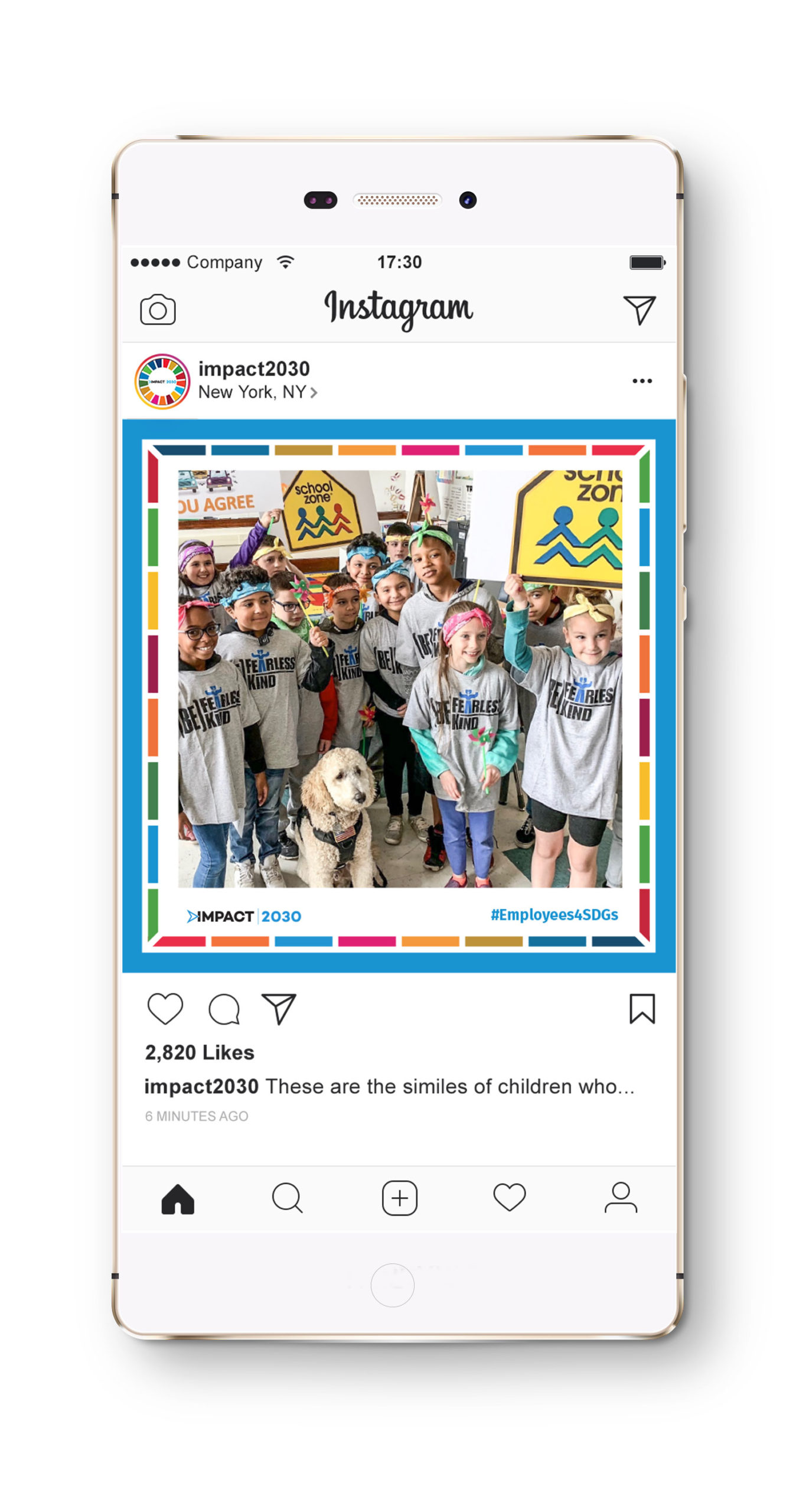
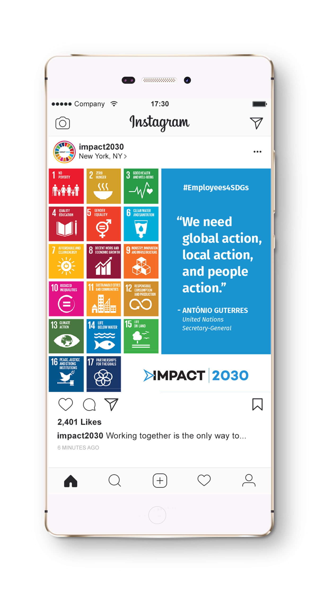
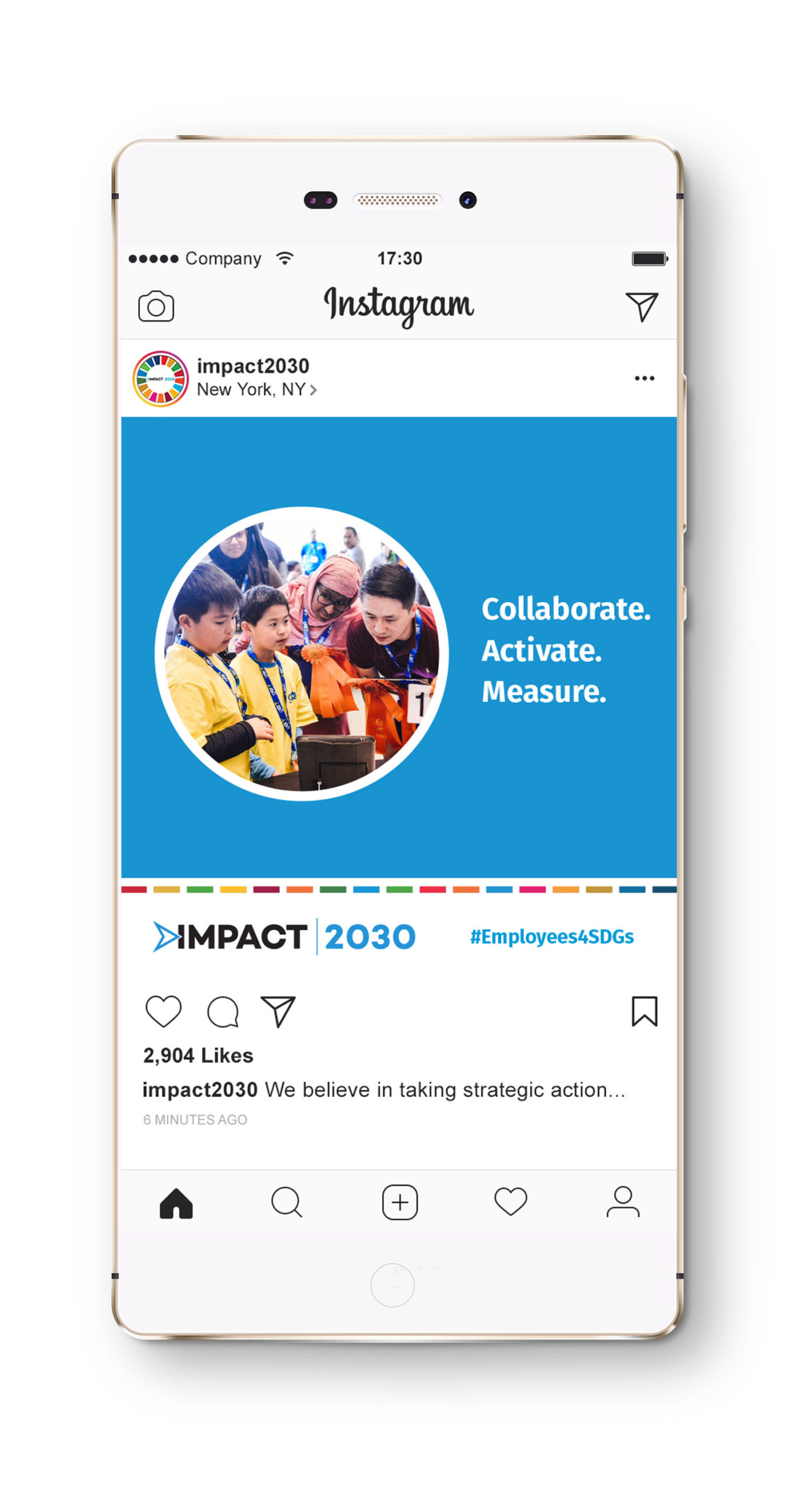
In addition to the case studies, a social media guide was provided for volunteers. This guide had to also work within IMPACT2030’s brand, so their primary blue was the accent color with their brand fonts used throughout the guide. The bar of brand colors helped tie the guide to IMPACT2030 and the case studies. Post templates were also created to provide consistency across social platforms.