Giving an Ohio-based non-profit a compelling & grounded identity.
THE PROJECT
New non-profit organization, Creating Central Ohio Futures, needed a logo that captured their local roots and their brand promise of a brighter future. They approached Creative Chameleon Studio to develop their new look, and the result was an energetic, grounded identity that can be built into a recognizable brand as they grow.
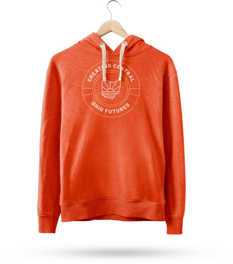
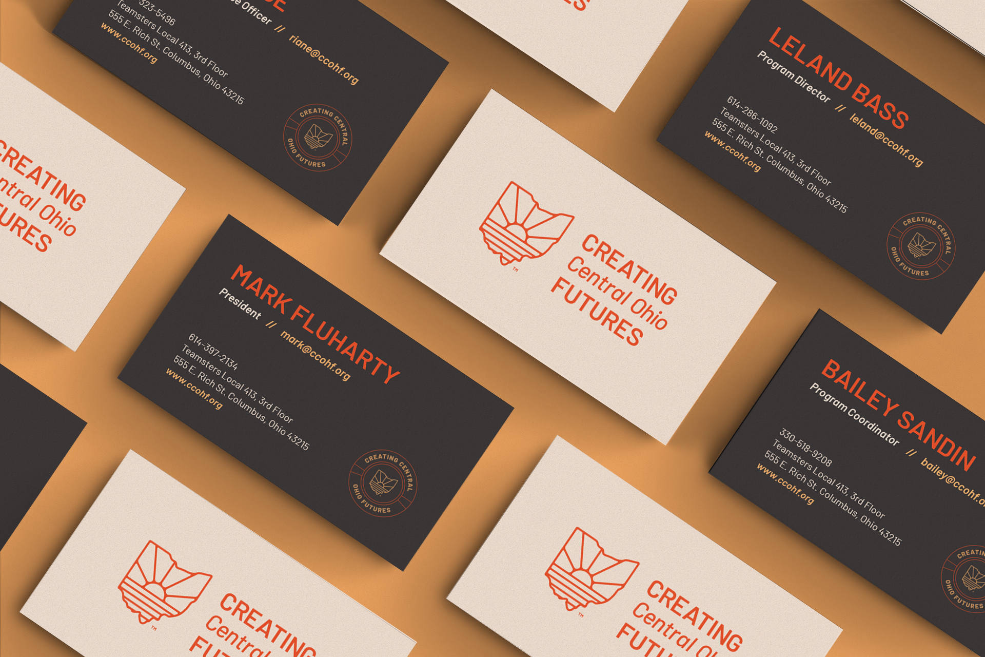
Since CCOHF works with placing people in local business to learn valuable skills, it was important to visually represent the areas they serve. And the image of a sun rising from a landscape resonated very well with their brand position. Using the shape of Ohio as a container allowed the sun to be placed over Franklin county, where CCOHF is located.
Pairing this icon with some angled, heavy fonts resulted in a logo design that felt Ohioan and felt grounded. The bright orange and rustic grey, yellow, and tan gave the identity some vibrancy and allowed flexibility within the identity. A full logo library was developed off the main logo, including an abbreviated logo, and a badge logo that could easily be used as a graphic element in marketing collateral. The final result was an identity that was unique to CCOHF and could become a staple of their community in the years to come.