Laundromats are an odd place, a strange business. They rest in a place of juxtaposition. The purpose they serve is to bring cleanliness, but often are attached to the stereotypes of dirty, shady, and unsafe. I was inspired to develop a brand concept that could turn a laundromat from a low-tier business to one that evokes safety and warmth.
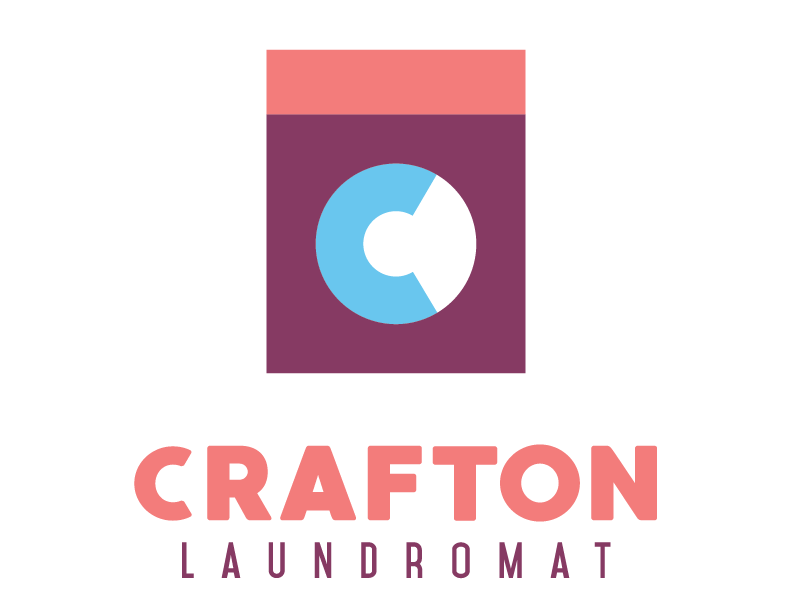
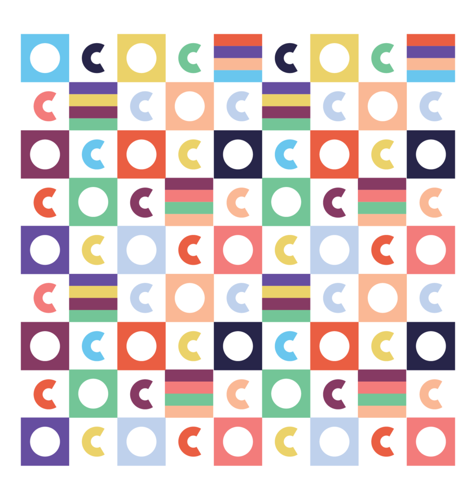
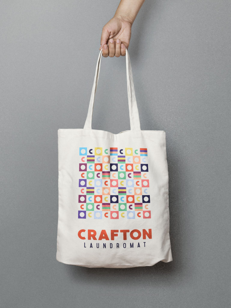
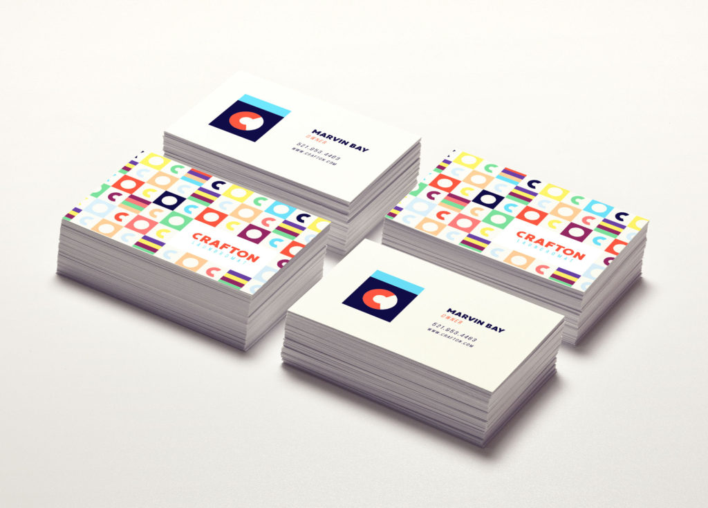
I wanted the logo to be minimal, but bold. Most laundromats have logos that are either crammed and ugly, or look worn and dated. This logo was derived by an abstracted interpretation of a load of laundry in a dryer. Simply comprised of three basic shapes, it both captures the name of the laundromat and it’s function.
The C in the logo can both represent a monogram for the company or a load of laundry being spun in a dryer.
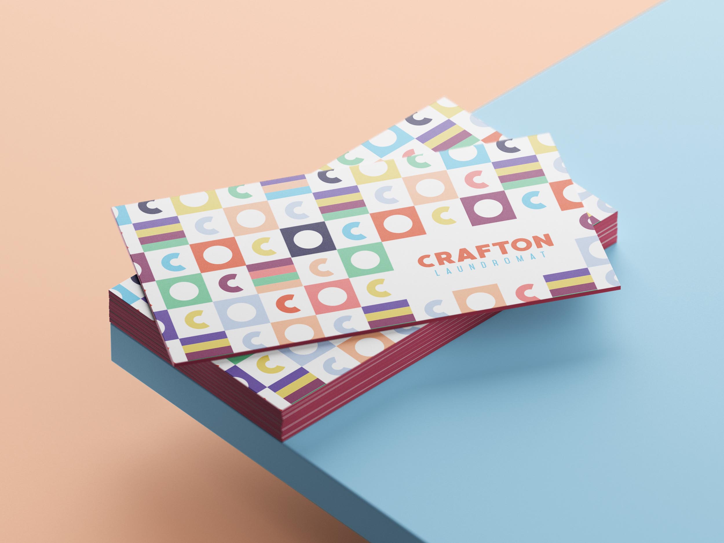
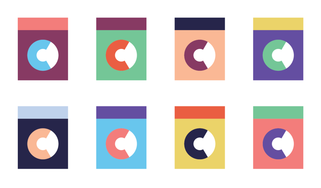
Equally important as the structure of the logo would be the colors. Instead of going with a realistic approach of sterile grays, whites, and blues, I wanted colors that would pop and enamore. When I thought of an inviting, warm atmosphere, my mind jumped to images of old Hollywood, sunsets on the West coast, and walking down an LA boulevard at dusk. There’s an almost nostaliga attached to the colors that those scenes provide.I selected ten colors that worked together to evoke feelings of safety and comfort. The range of colors also came toreflect the variety of people that utilize a laundromat.
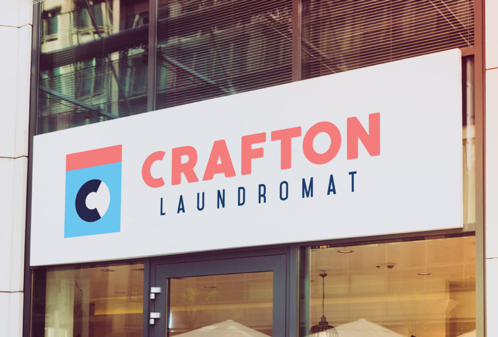
Because of the simplicity of the logo, it could be used in a variety of color schemes. This keeps the logo exciting and engaging, while the strong shapes it’s comprised of allows it to remain recognizable and encourages brand recognition.
The logo was able to be broken down into it’s parts to create a pattern for the visual identity. The bars of four colors was both a way to include more color in the pattern and it was an abstract interpretation of a pile of folded laundry.