Every company can benefit from having a distinct visual identity that aligns with their brand, and non-profits are no exception. The founders of The Concannon Family Foundation were in need of a logo and identity, so we started with a blank slate.
The first step was to dive into who they were serving and what made their foundation special. A big focus was the family aspect of their non-profit. It was started by Tim and Amy Concannon, and their vision was to help their three adult children be able to make long-lasting impacts in the areas they each felt passionate about. This meant that the foundation itself wasn’t honed in on one area, but would rather cover a spectrum of fields. All three children were pursuing different venues for charity work, ranging from environmental issues to social justice.
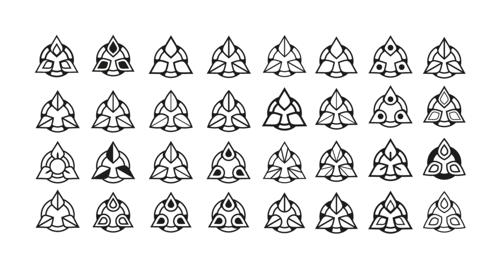
Given the nature of the foundation’s beginnings, the concept that stood out most was an abstract design that captured the idea of three entities branching out from one source. The process of getting to a final logo design requires rounds of concepts and revisions. At the early stages, an abstract star icon was refined into a semblance of what the final logo would be.
This design was visually strong, but in order to better align it with the foundation’s story, it had to be refined further. The next round of designs explored the family tree aspect by having leaf-shapes be more prominent, each one pointing in it’s own direction.
The best logo is rarely the first one designed. To ensure that the optimal solution was found, multiple versions of the icon were designed. The smallest of alterations can affect how well a logo functions, so it’s important to explore as many designs as possible.
The final design was selected for it’s bold simplicity, with the primary shapes easily being perceived as leaves without any extra elements needed. This design hit all the points for an effective logo. The simplicity allows it to be used in a variety of locations, making it easy to scale. It also can hold its own in the full color option or the single color option. It is unique, making it distinctive and easier to remember. This means it can support brand recognition and the foundation can start to build their brand in the minds of their audience. And while a logo doesn’t have to tell what the company does, it has to be relatable. And this design touches on the important aspects of the foundation.
PRIMARY LOGO
ICON DESIGN
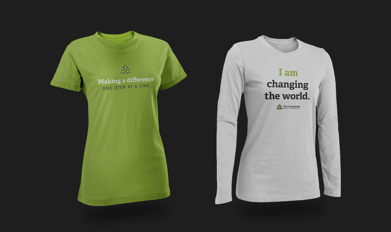
Apparel Designs For The Concannon Family Foundation
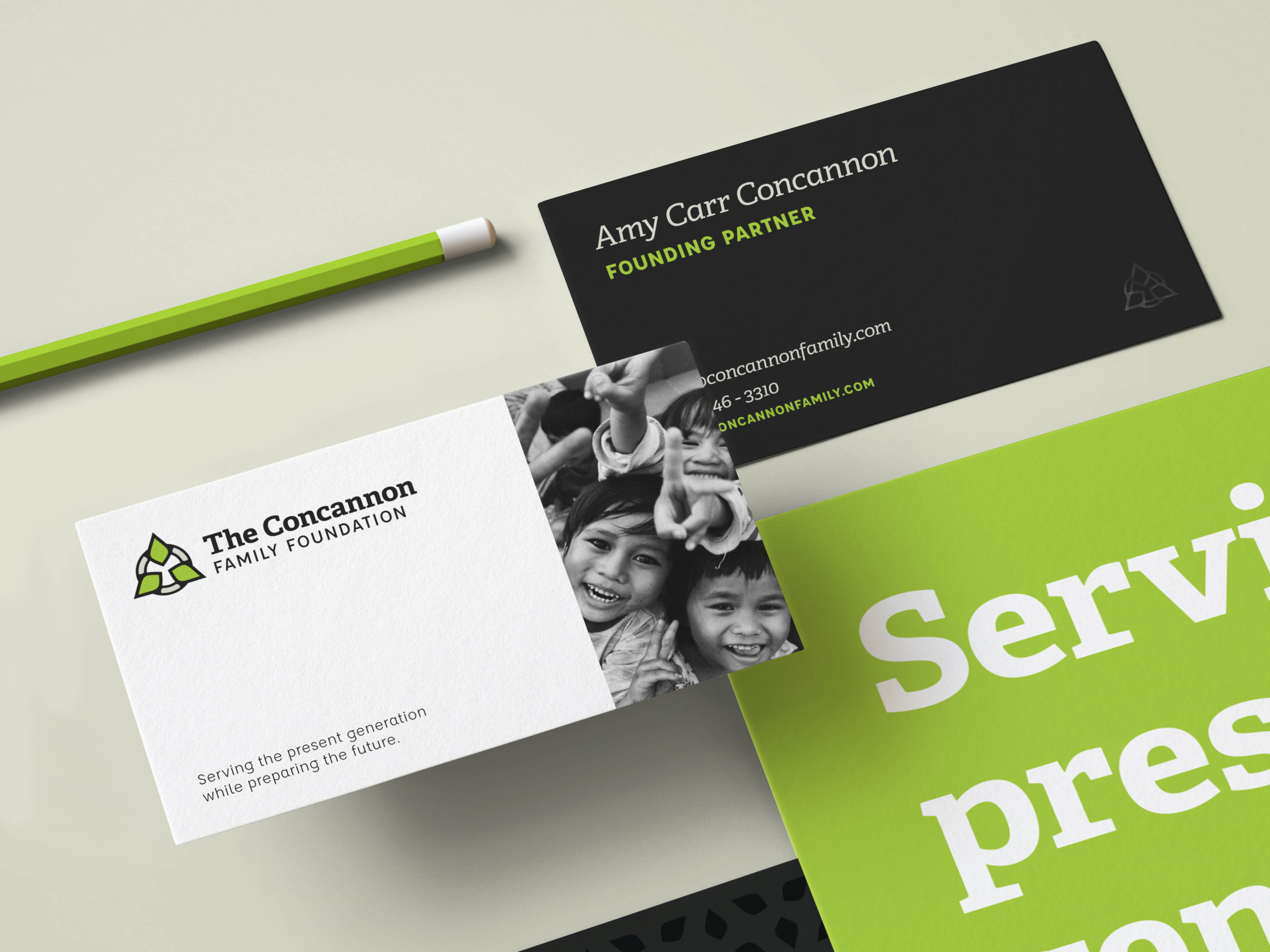
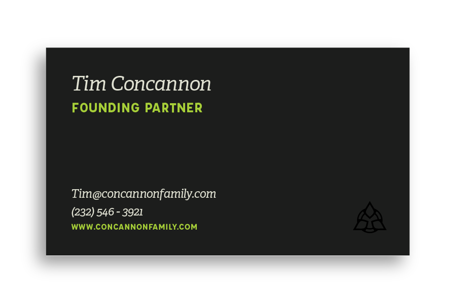
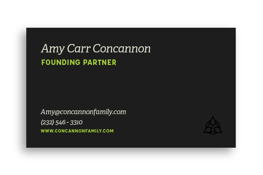
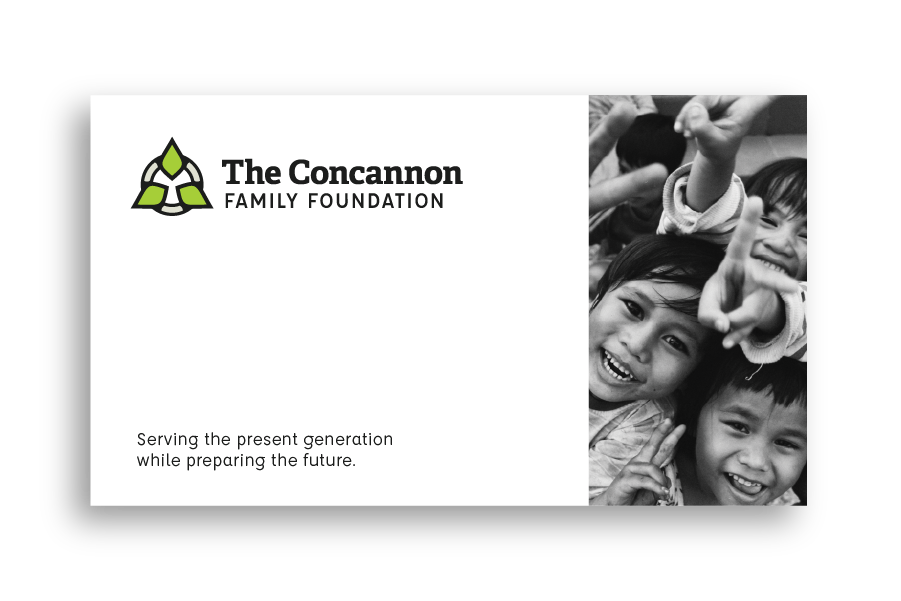
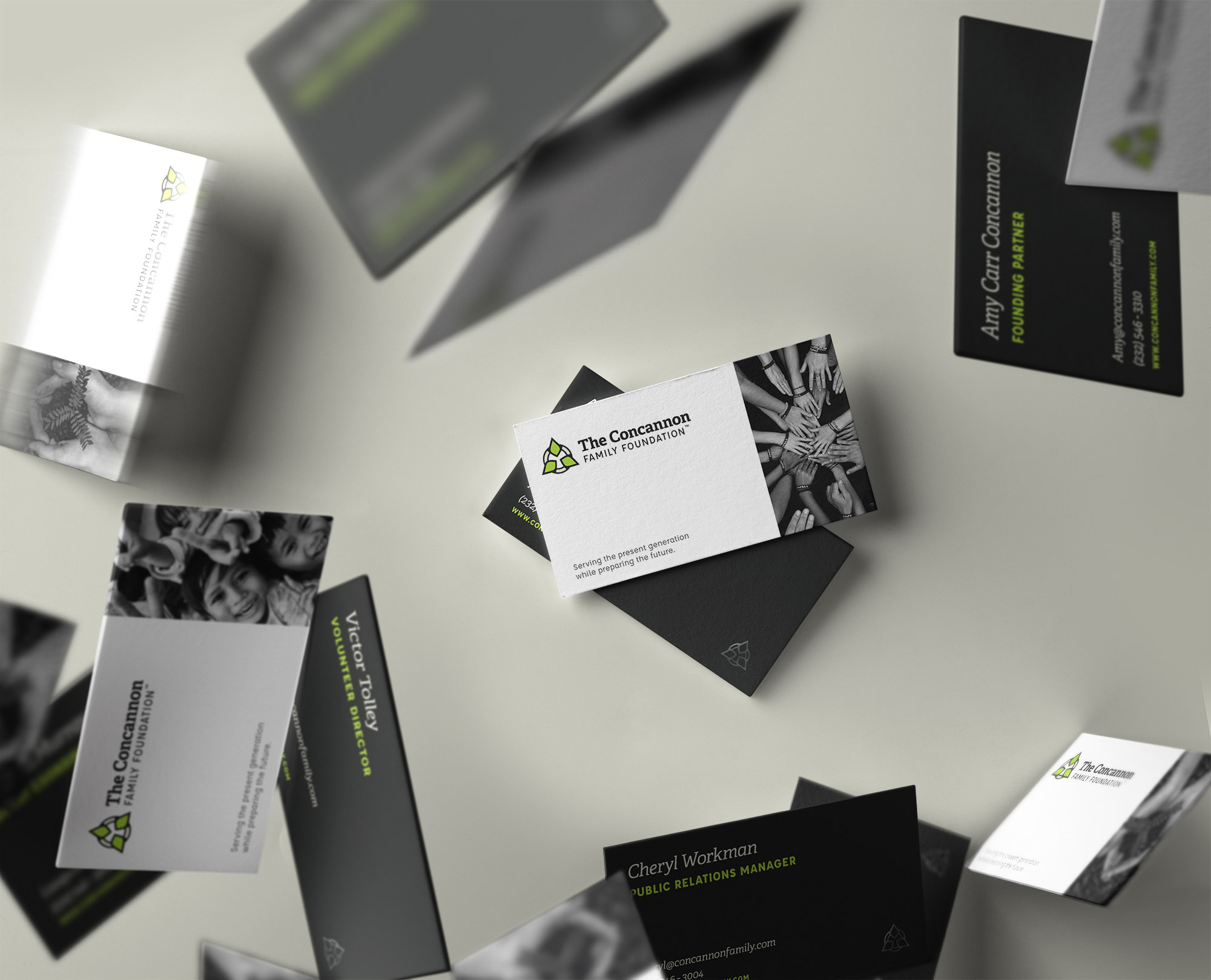
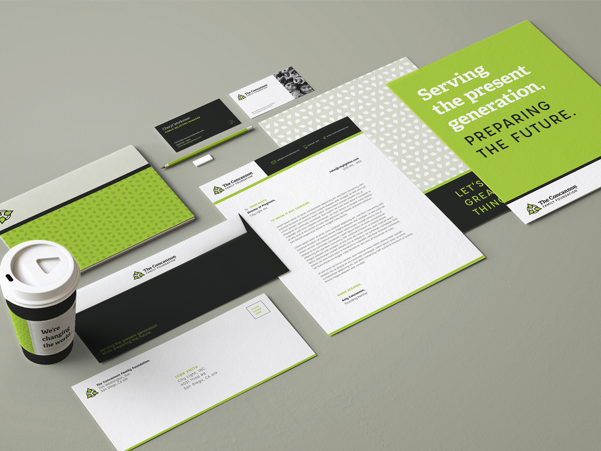
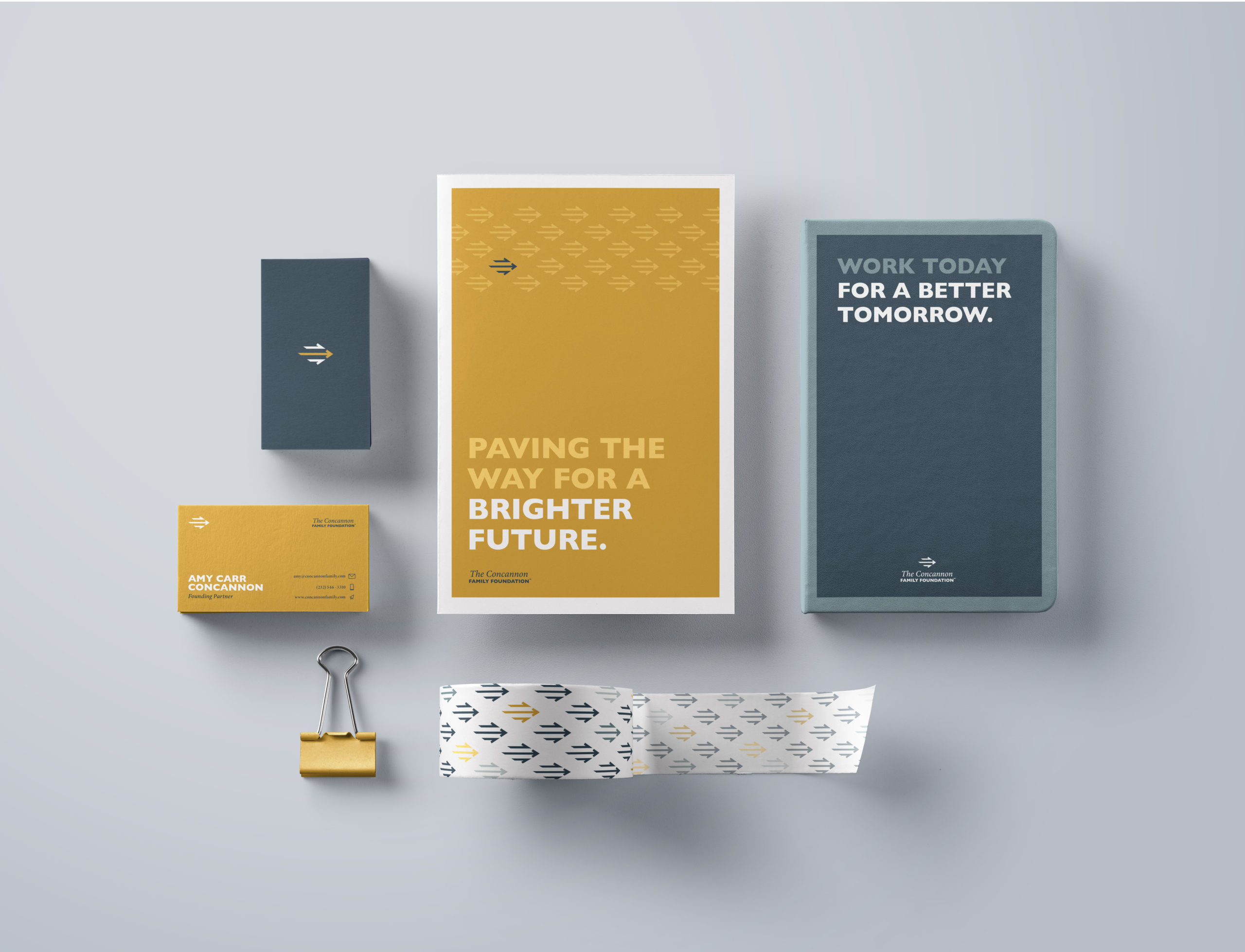
Just a logo is not enough for a company to build brand recognition. Having an identity system with specific colors, typography, and visual styles allows consistency across the entire business. So for the Concannon Family Foundation, the logo was expanded to have a full visual identity system. This can be seen in action with business cards, a letterhead, and other supporting collateral.
The bold colors of the Concannon brand allow for a minimal but striking business card design. Since the foundation supports a variety of causes, using different images for the front of the business cards allows each team member to showcase the area they focus in. Having all the images in black and white results in a clean, timeless visual style.
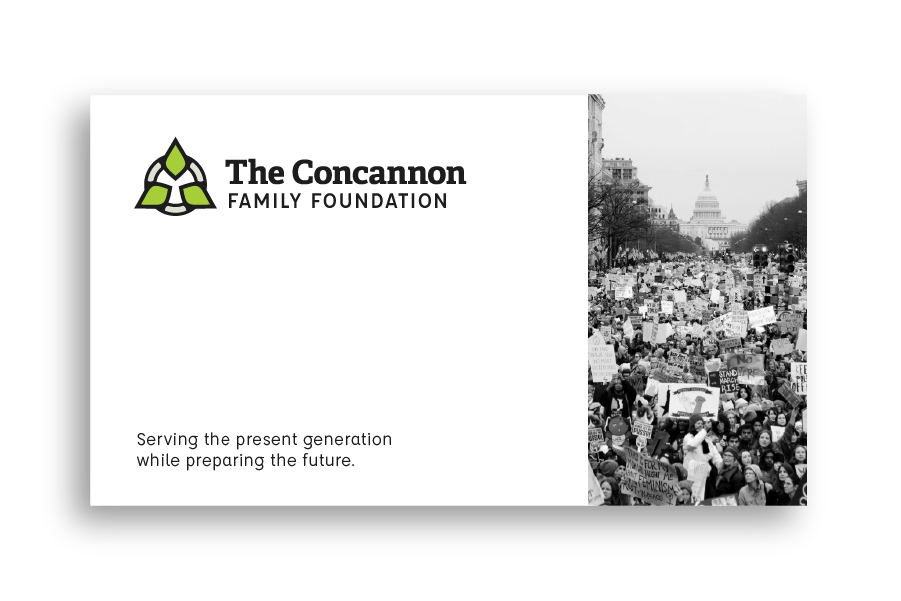
Stationary Designs For The Concannon Family Foundation
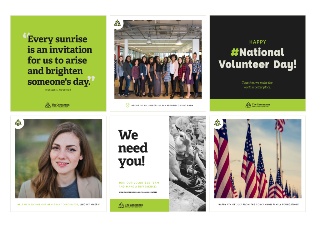
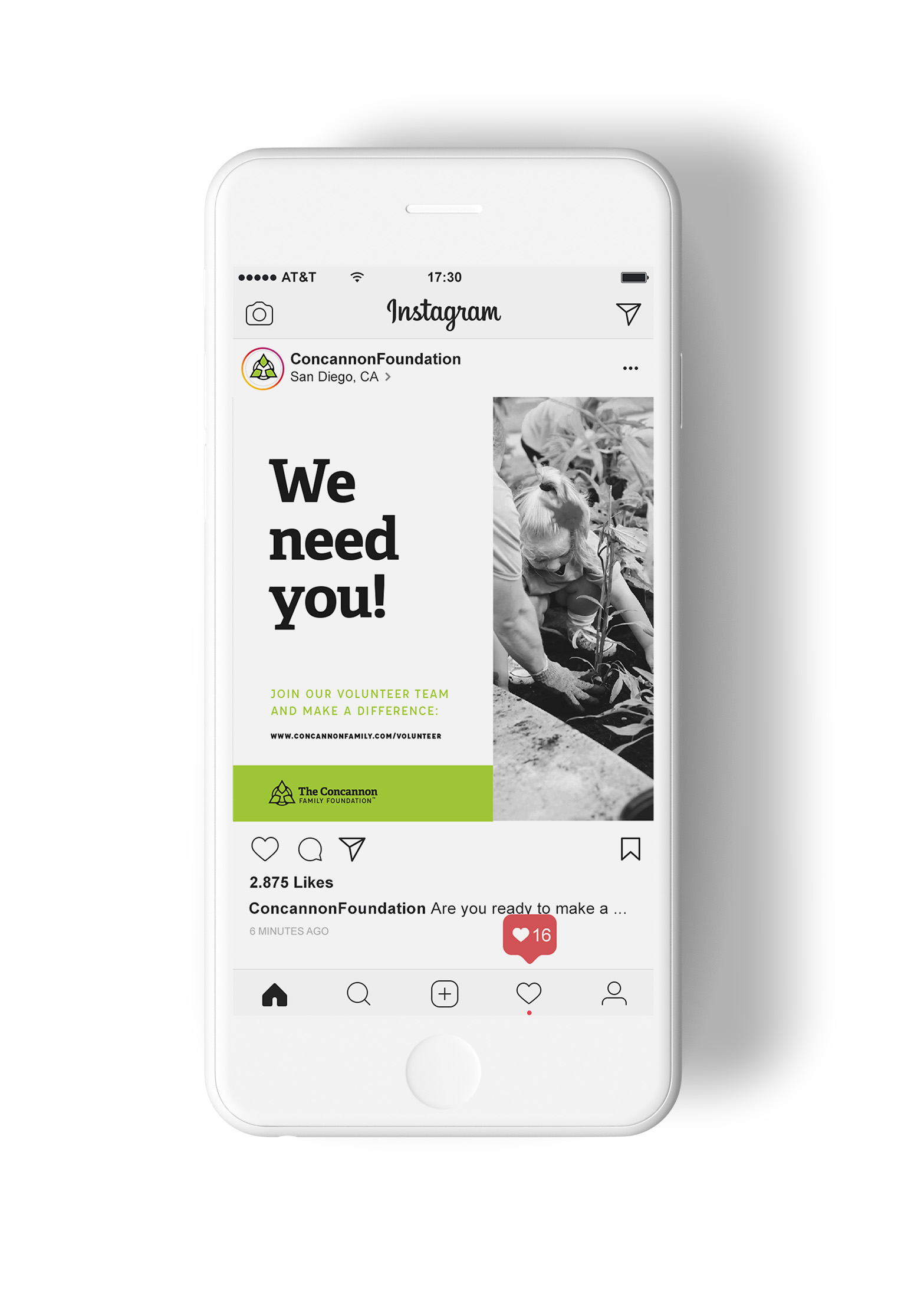
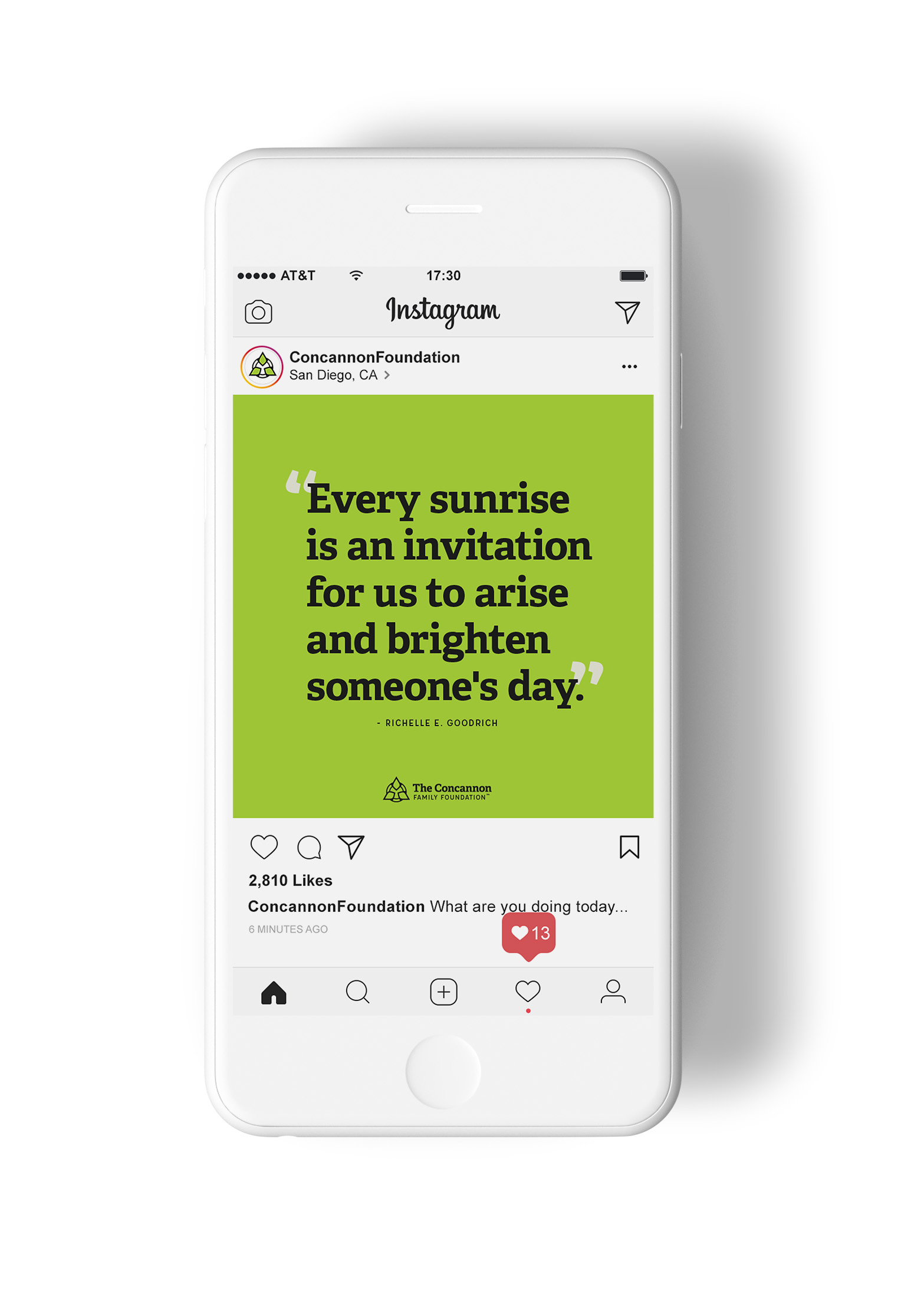
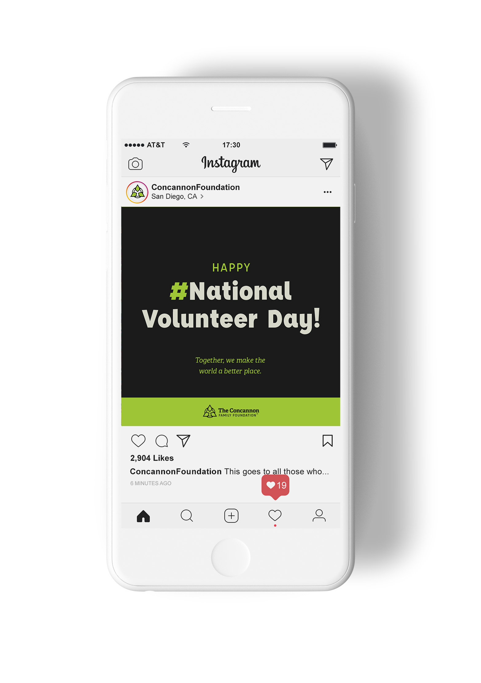
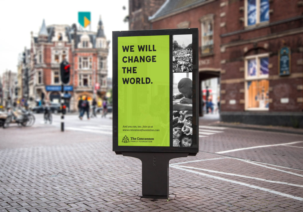
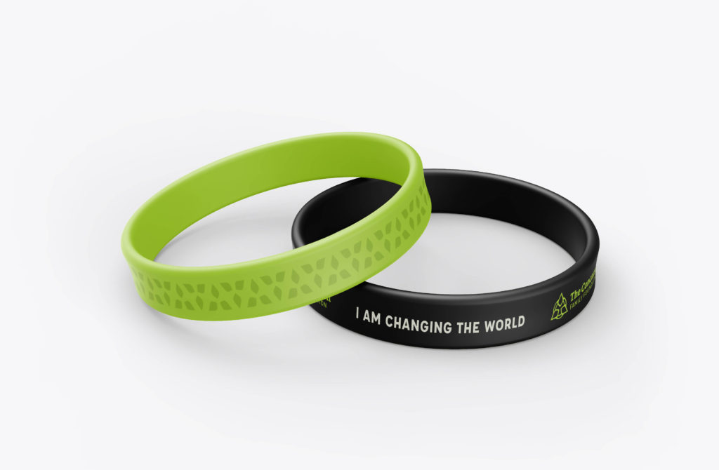
The brand colors, typography, and photography style needs to be applicable to social media and other collateral as well. These sample posts and advertisements showcase how the identity system can adapt to different types of usage, allowing the brand consistency to be translated to any aspect that the foundation may need.
Alternative Logo Concept
For each branding project, multiple concepts are presented to the client. Every concept provides a solution to their needs, but gives a range of visual direction the client can choose from. For The Concannon Family Foundation, the alternative concepts included a minimalistic icon that represented how the foundation is moving forward and preparing a better future.