UPGRADING AN OLD LOGO FOR AN ELECTRIFYING REFRESH.
The American Academy of Cannabinoid Medicine aims to be the gold standard for the education and dissemination of medical cannabinoid information. But the logo they had did not reflect the their high-bar of quality that they provide this modern industry. It also had some functionality issues, leading them to pursue a refresh.
Deliverables:
LOGO DESIGN
IDENTITY SYSTEM
BRAND GUIDELINES
Links:
FACEBOOK
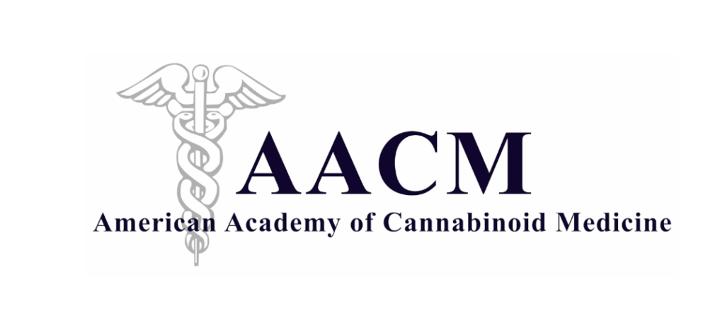
Example of old logo:
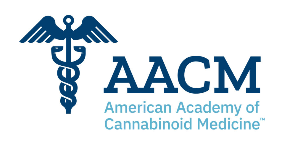
The two goals of the refresh was to address the usage issues of their logo and to provide a stylistic upgrade. Having a flatter, bolder visual style modernized the entire design, and provided a more functional icon that could be used at any scale. By moving the typography off of the icon and upgrading the typefaces to a chunky slab serif and a legible sans serif, the logo became much cleaner and easier to use. This also allowed it to by dynamic, able to be rearranged for different usages.
Updated logo design:
A key part of the upgrade was improving the color palette to give more energy to the entire identity. Pairing a deep navy blue with a steely light blue allowed for a more contemporary look. Establishing a clean, high-contrast design system gave AACM the flexibility to grow their brand into a recognizable entity in the medical cannabis industry.
Website Example
Social Post Examples
To discuss how Creative Chameleon Studio can rejuvenate your brand, get in touch today.