
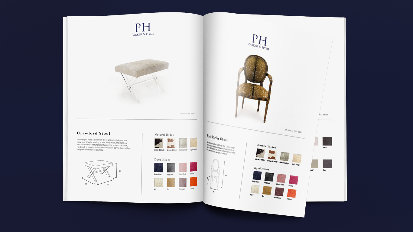
The Making of Marketing Materials
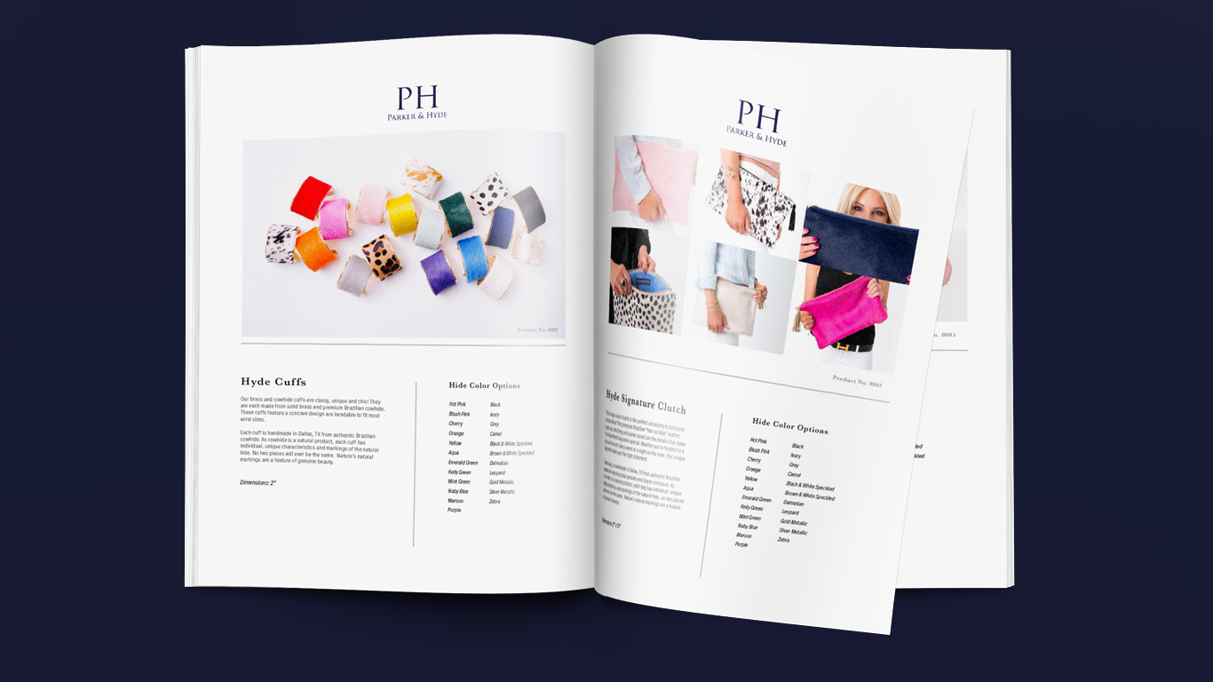
Creative Chameleon Studio was approached by Parker & Hyde to develop two collection books and pricing guides for their customers. Because their products are high-end, they wanted their marketing collateral to reflect that in style. The chosen layout was simple, clean, and emphasized the furniture while easily providing the necessary information. Using a condensed color palette of blue, grey, and black creates a sense of sophistication and emphasizes the brand of Parker & Hyde.
For this project, I created line illustrations for each product. They were used to show measurements and were also incorporated into the pricing guide. The style of illustration highlights the structure of the furniture and fashion collections, and compliments the overall aesthetic of the layout.
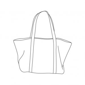
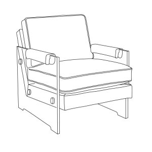
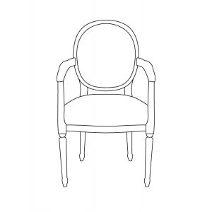
The pricing sheets needed to contain a large amount of information in an orderly way. By using the illustrations to identify the products, they can be organized and easy to see at a glance. They also help in creating a coherent style throughout the marketing material. The varying styles of fonts used helped draw attention to the most important information and establish a hierarchy.
“I was referred to Madison by a colleague to design marketing materials and a pitch book for my furniture business. I didn’t really have much thought or input on how I wanted the book to look but that’s when Madison showed her true strengths. With minimal direction, she used her creativity and artistic abilities and provided me with 3 different amazing layouts – in less than 2 hours! In addition to her speed and creativity, Madison also showed me a great deal of patience – especially when I wanted to make minor revisions or tweaks. If you’re looking for an honest, fast and creative graphic designer, then Madison is your girl.” – Zack McLarnon, Owner
To see more of this project, visit Behance.
Error: Contact form not found.