
What Goes Into Designing A Brochure?
The tri-fold brochure is a staple of printed marketing materials, and can be a very effective one at that. There’s plenty of real estate for all the important information you need to include. It’s easy for potential customers to pick up and flip through. They’re relatively inexpensive to produce. Many small business owners invest in the production of brochures, but are tempted to design it themselves. While I strongly encourage any business owner to familiarize themselves with design programs and the process of creating materials, a brochure is no easy task to design.
RELATED POST: What Should Small Business Owners Design Themselves?
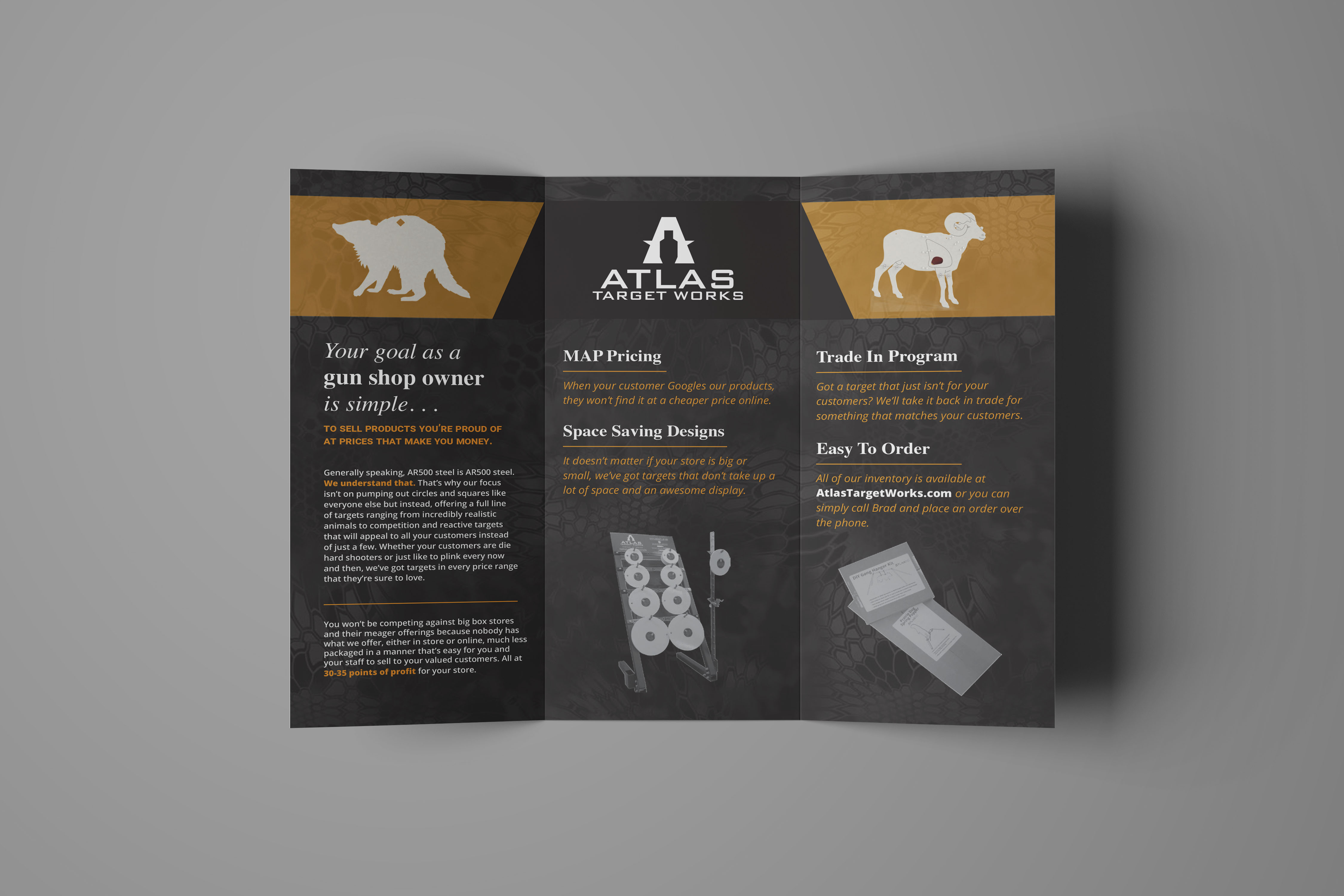
I had the wonderful opportunity of working with Brad Norton, owner of Atlas Target Works, on a brochure for his business. He had created a layout for the brochure, but he wanted a professional’s eye to look it over before sending it off to the press. His designs were very commendable for someone’s first time in InDesign, and with about an hour of work, I was able to go through with the design and make some adjustments to really elevate what he had.
We then talked through the alterations I made and I explained what I did and why, so he would have the tools to help the rest of the designs he wishes to tackle. I’ll be sharing with you what I shared with Brad, and give you some easy ways to improve the DIY materials you create for your business. The before and after designs are also a visual expression of what a professional designer brings to the table.
Original Designs
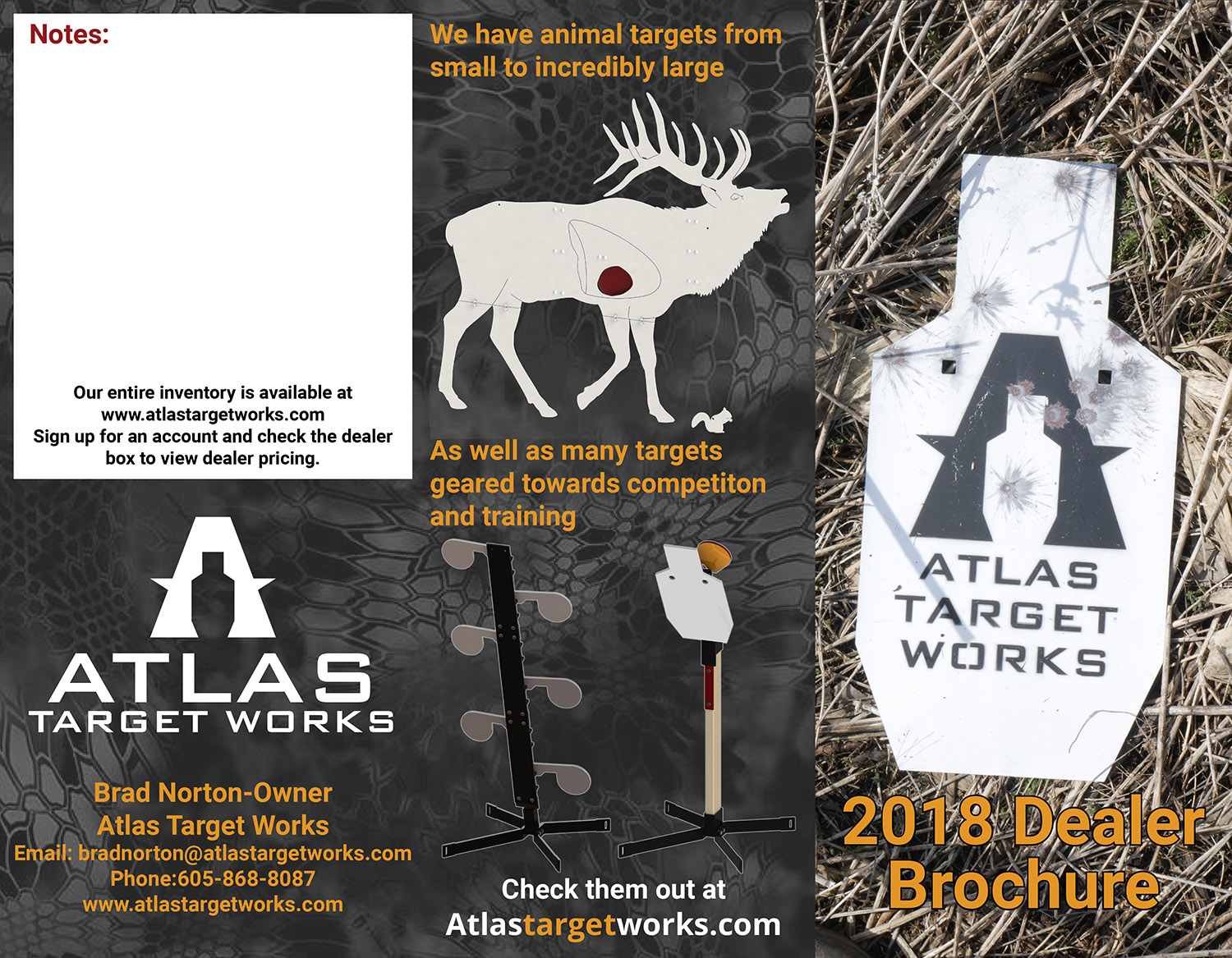
Exterior Panels
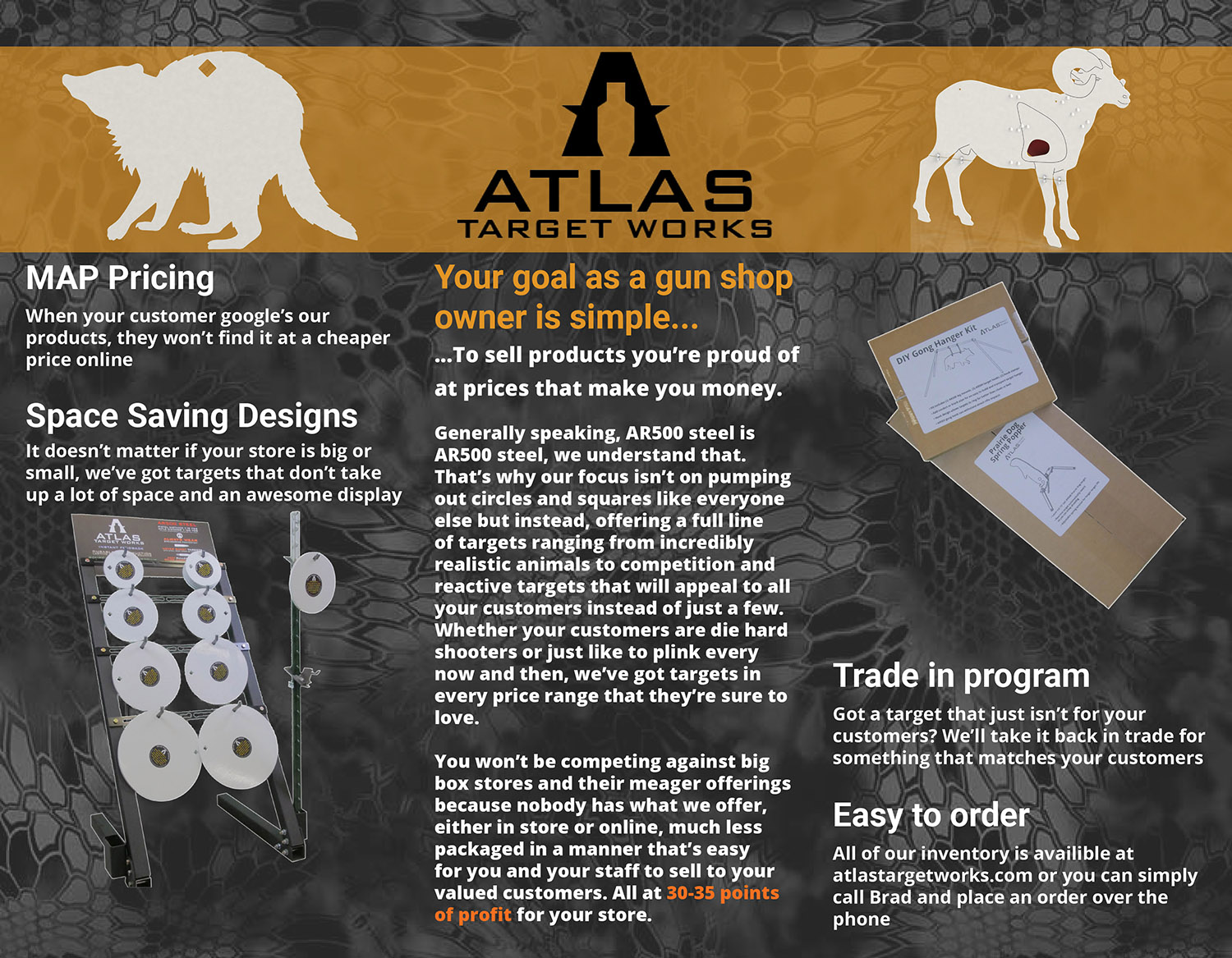
Interior Panels
Reworked Designs
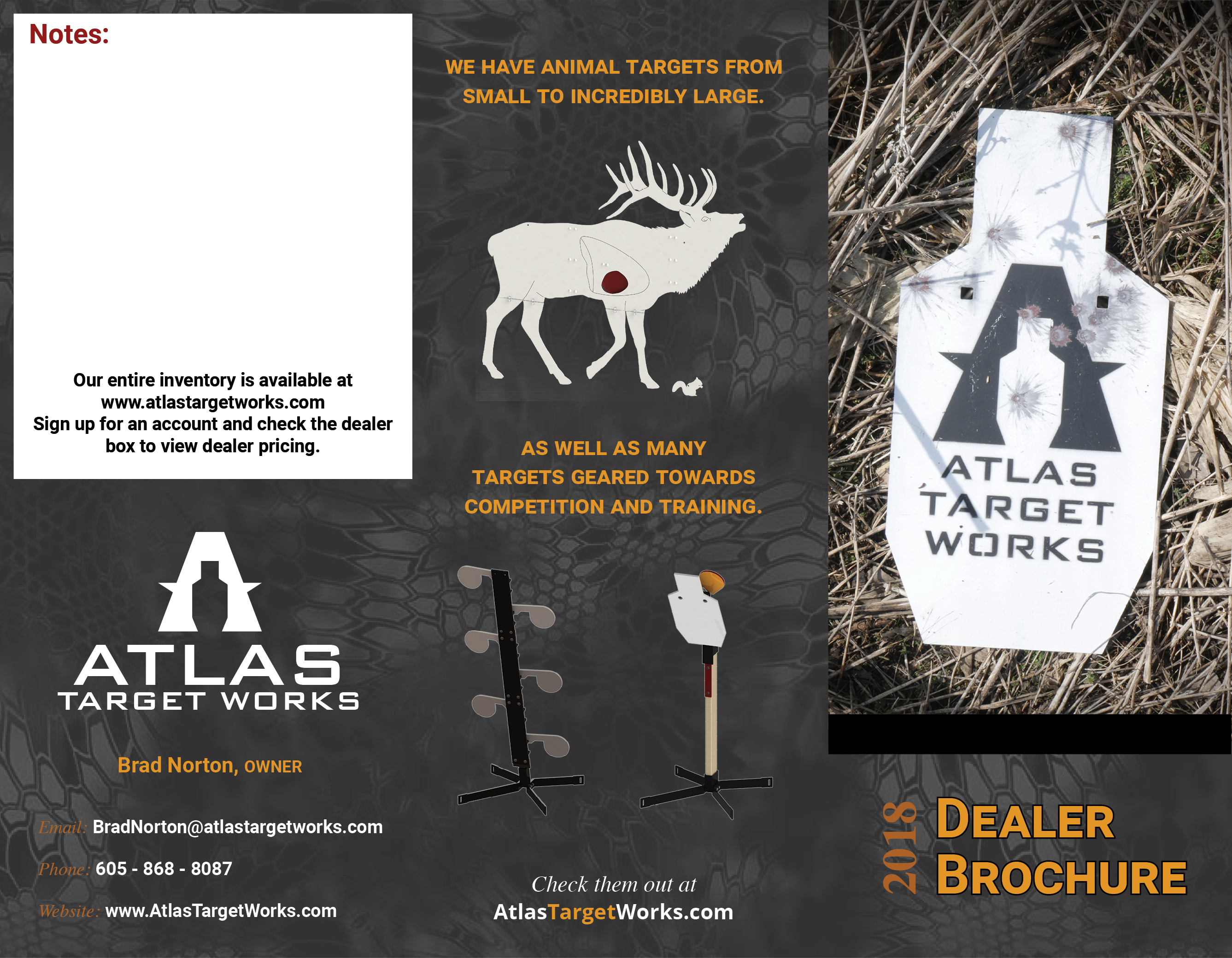
Exterior Panels
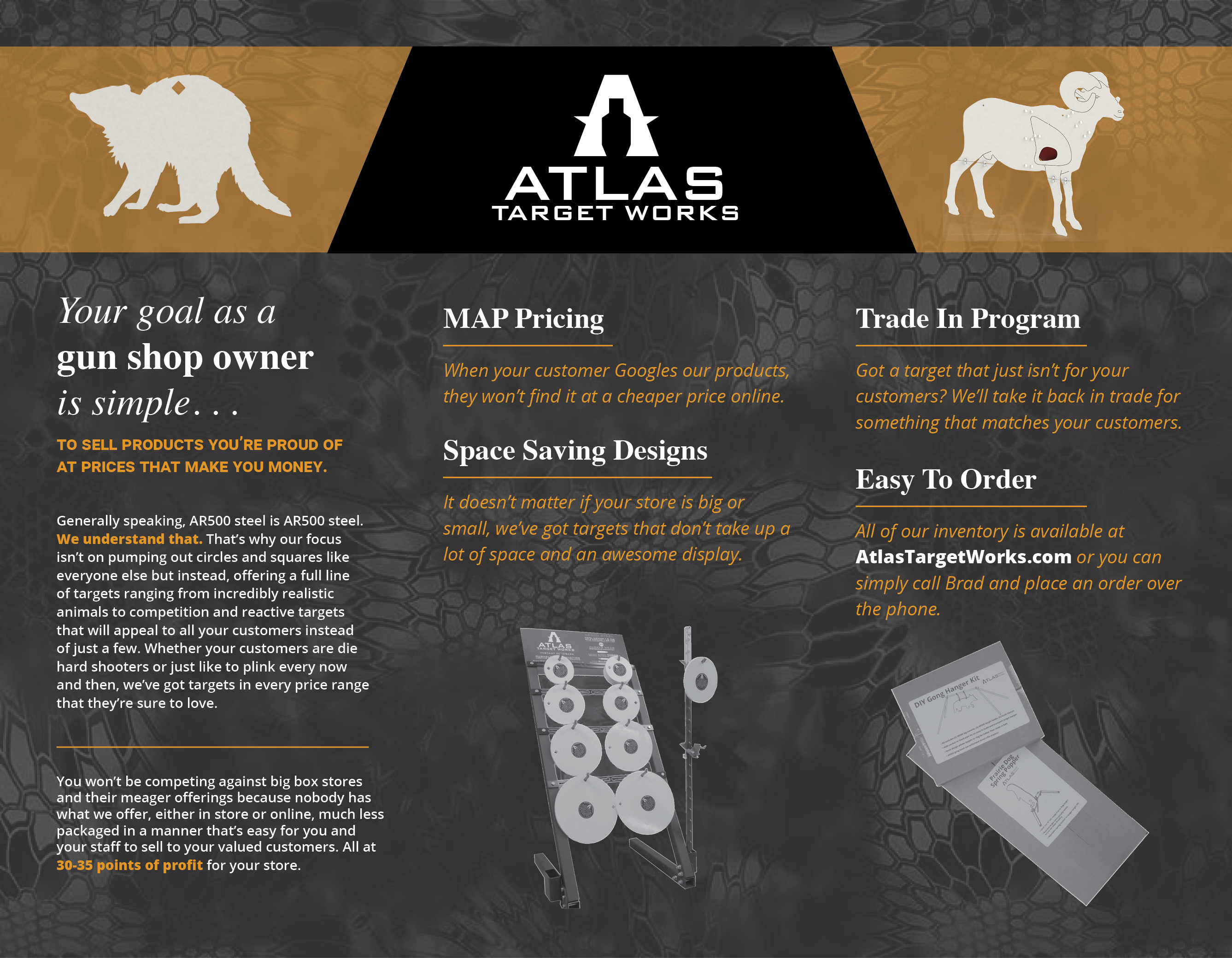
Interior Panels
1. Contrast
The first thing that jumped out to me as I was reviewing the initial designs was the color and pattern choices. While the style certainly reflects the nature of the products Brad is selling, it poses some readability issues. The main purpose of design is to communicate with the viewer, so having easy-to-read text is vital to a successful design. Having high contrast between your text and it’s background is a sure-fire way to increase readability.
My initial alteration on the front panel was getting “2018 Dealer Brochure” off the straw background of the image. If you were to unfocus your eyes and look at the front panel, it will appear as one tone. That’s not ideal for text, especially the first text your reader encounters.
The yellow-on-black was a nice color combination, so I stuck with that and simply raised the image so I could put the header on a dark background. The snakeskin pattern that Brad had used on the interior and back panels was brought to the front, although I darkened it and lessened the contrast so it wouldn’t compete against the text.
2. Hierarchy
The most important thing to keep in mind for any design is the hierarchy. Simply put, you need to decide what element is most important and what element is least important. You then make choices to direct the viewer’s eye down the list. Most of the alterations I made were done to establish this hierarchy. I wanted the most important things to jump off the page, instead of having to compete against lesser elements for the viewer’s attention.
A basic example of this can be found on the front panel. Even though the only text consists of three words, hierarchy can still be determined. I asked myself what is more important to the reader, the fact that it’s 2018 or that they picked up a dealer brochure?
It’s definitely more important for them to immediately know what they have in their hands, because that will determine whether or not they open it up to continue reading. By changing “2018” to a darker color and reorienting it on the side of “Dealer Brochure,” it no longer fights for the attention of the viewer. It still serves its purpose of identifying when it was produced, but it plays second fiddle to the more vital information.
This series of choices can be found throughout the entire redesign. The white headline text on the interior page allows the reader to quickly see the services offered without having to sift through extra text. Having the phrase “gun shop owner” in bold as opposed to the surround italics reinforces the target audience for this brochure. Making the website address white pulls it away from the yellow body text, telling the reader that the website is important.
3. Font Choice
There are many articles written that expound on the differences between types of fonts and when to use them. From my experience, there are two important things to consider when picking out fonts.
First is the legibility in regard to the usage of the font. If you have body text, (a large number of words in succession,) using a font that has extra swirls and curves and textures won’t make it easy to read. But if you are going to have three words in 150 pt. size, then having an eye-catching font can quickly establish hierarchy.
Second, does the style of the font reflect the overarching emotions your design is supposed to entice? Brad’s target demographic is gun shop owners. Using a script font with flourishes isn’t going to give me the style that his readers will relate with. It also does nothing but fight against the information of the products that the brochure provides.
Roboto had been used within the original design, so I stuck with that as a primary font. For the front panel, I changed the text into small caps, so it became more eye-catching and easier to read. The clean lines that using caps provides are a great way to make text feel less intrusive. You never want your text to look out of place or uncomfortable for the reader, so caps can be a great option when used sparingly.
I also added a serif font, Times. (Not Times New Romans, but rather an alternative, slightly lighter typeface.) This font was used primarily in the headings. Open Sans was used in italic and semibold form for the body text.
* Using a classic serif font with a bold, clean sans serif font is a great combination that exudes professionalism and quality. I’m not sure if this is because of the aesthetic pairing or the usage of the combination in other designs that leads to the association, but it’s my go-to choice. If you have a few words in large, bold sans serif, using a smaller serif font above or below as a subheading or lead-in can look clean and professional.
4. Margins
Having breathable margins is one of the initial steps you can take to instantly elevate your designs. There’s a common saying in the design field, “White space is your friend.” It is the absolute truth.
It might feel like you need to increase the font size as much as possible to make your text stand out and easy to read. That’s surprisingly not the case. The body text in the original design was bold and 14 – 16 pt. I changed that to a semi-light 9 pt. font. You might be thinking that it’s counter-intuitive to shrink a font to make it more legible. But when working with print materials, 9 pt. is a standard size for body text. If you look at most magazine, newspapers, and flyers, you can quickly find small body text that is easy to read.
You’ll also find that it’s almost always a light font. That’s because when a small font is bold, there is less negative space between the letters and within the letters themselves. This makes is more difficult to read. A 9 pt. light font is easier to read than a 14 pt. bold font because the contrast is increased. Legibility is all about contrast.
Having text surrounded by negative space is very important in design. The human brain and eyes are uncomfortable by elements being close to edges and harsh lines. Throughout the entire design, I scaled the images down so they were surrounded by more negative space. Doing so didn’t lessen the importance of the elements, but actually increased their importance because they were more comfortable to look at. This prompts the viewer’s eyes to linger longer on them.
5. Brand Standards
One change I made was done for the sole purpose of strengthening the branding of the brochure. In the original design, the black Atlas logo is sitting on a yellow band that goes across all three interior panel. On either side is a silhouette of an animal. The logo was very close to the edges of the yellow band, so scaling it down to increase the negative space was a certain choice. But in addition to that, I changed the logo to white and put a black shape behind it.
The shape was angled on both sides to reflect the A shape of the logo. This subtle element wasn’t random, but rather entirely intentional. Replicating the angle of the logo was a quiet way of reinforcing identity of the company.
RELATED POST: Branding, Identity, Logo
Now Atlas Target Works isn’t a globally recognized brand, like Coca-Cola or Walmart. But establishing visual elements as “branded” makes the piece more coherent and increases the effectiveness of the design.
This can simply be done by mimicking a portion of your logo within your layout. If your logo has a distinct circle shape in it, utilizing curves throughout the design will make the whole piece feel purposeful and intentional. If your company’s visual style is very flowing and organic, but your design is riddled with harsh lines and ragged angles, there will be a feeling of disconnect within your viewer. They might not be able to identify it immediately, but the message of your material will be competing against it.
Strengthening your brand in a design can be done through graphic elements such as shapes and colors, the typefaces you choose, the aesthetics of the images you select, and the overall eye-path you create for your viewer.
Conclusion
Keeping these five things in mind can help you create a better design, no matter what type of design you’re creating. I hope that you’ll walk away with a few tools to use if you DIY some of your design work. I also hope that this walkthrough gives you a better understanding of the benefits of hiring a professional designer. There are many more things that go into a quality design, and a good designer is trained to use them to provide effective designs.
If you have a project you’d like to hire me for, you can send me an email at madisoncarrdesigns@gmail.com. If you’d like a professional review or rework of a design you did yourself, I would love to work with you on it!
Please leave a comment if you liked this type of article and if you received a helpful tip or two. If you have any questions regarding some of the changes I made within the brochure for Atlas Target Works, I’d love to answer them!
Error: Contact form not found.