We modernized and polished this growing school’s identity.
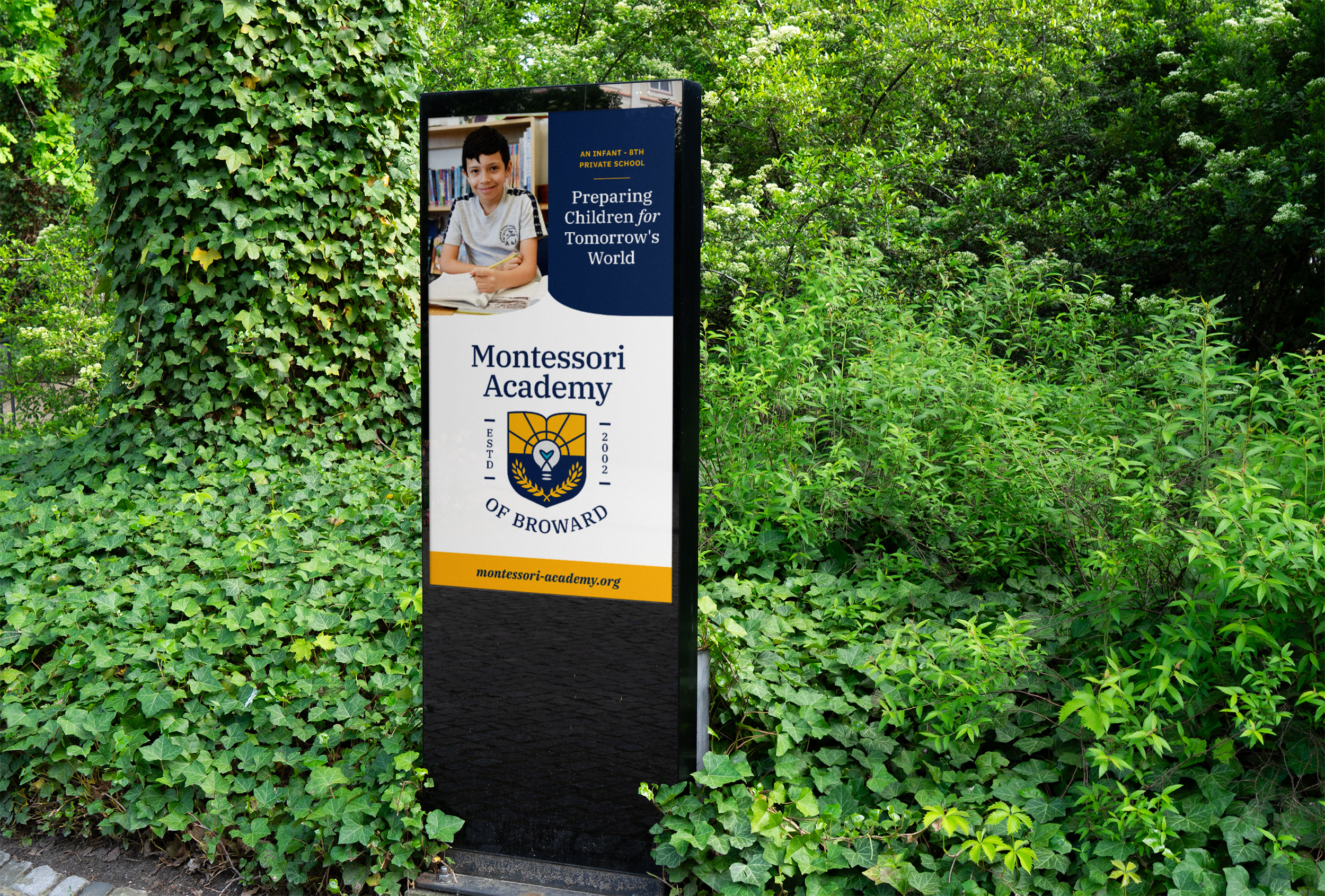
Rooted in Pembroke Pines, Florida, Montessori Academy of Broward serves children 8 weeks through 8th grade. Founded in 2002, MAB has a strong track record of academic excellence, but its brand felt left behind.
We partnered together to refresh the school’s crest and build out a stronger brand identity system to help MAB grow its reach in the coming decade.
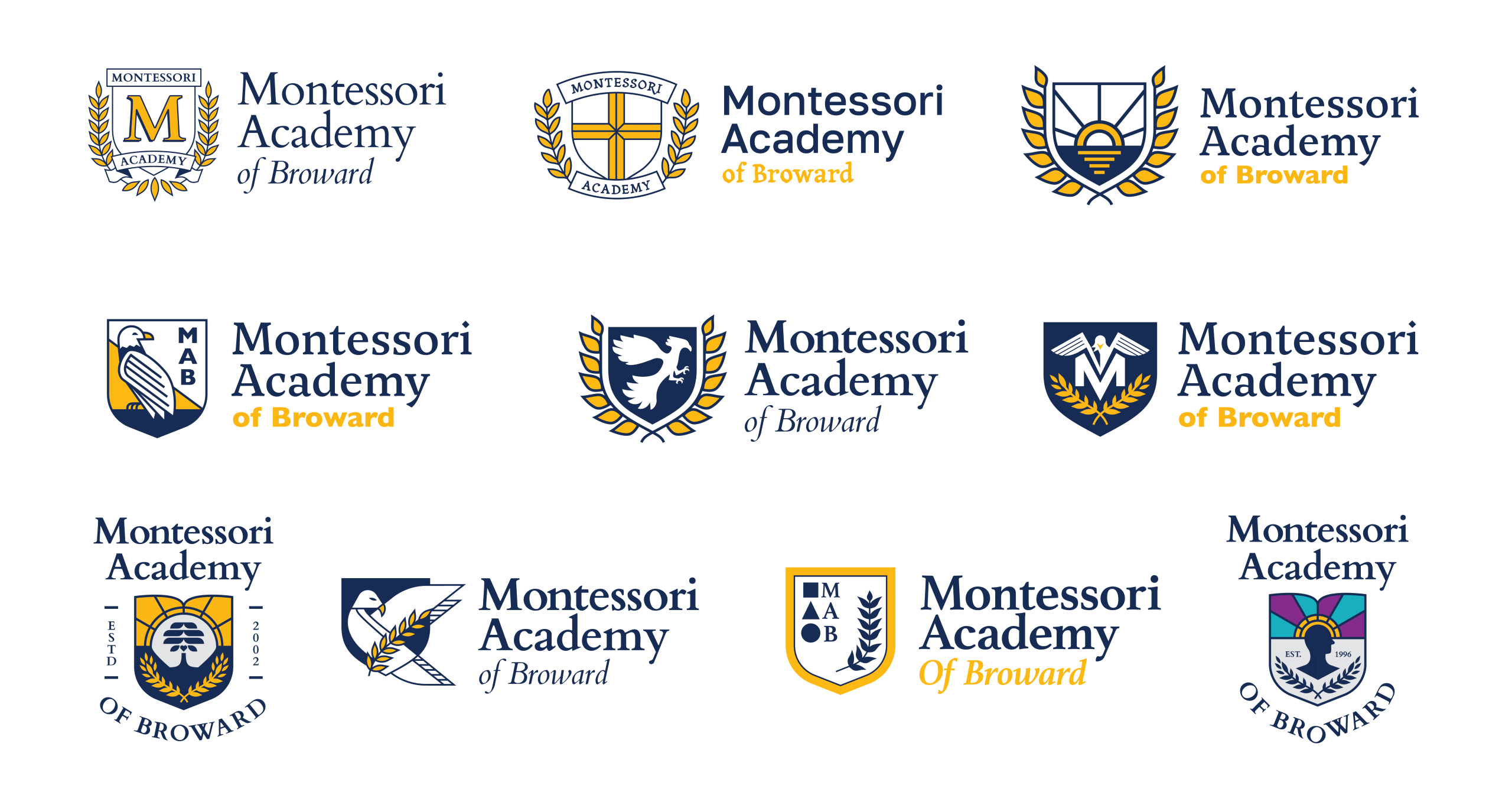
REDESIGNING A LOGO
We began by identifying what elements should remain within the logo. The shield was a shape that anchored the crest, and having laurels around it could help the crest remain recognizable in the community.
We also explored some different focal points, such as a prominent ‘M’, and eagle, and a sunrise to reflect the tropical location of the school.
REFINING A LOGO
A sunrise concept emerged as a favorite direction, so we reworked the logo to incorporate a lightbulb and a heart. These two extra symbols provided a stronger connect to the school’s ethos and approach.
Keeping the laurels as an element, they were simplified and tucked into the bottom curves of the shield so the entire crest was better balanced and easier to use.
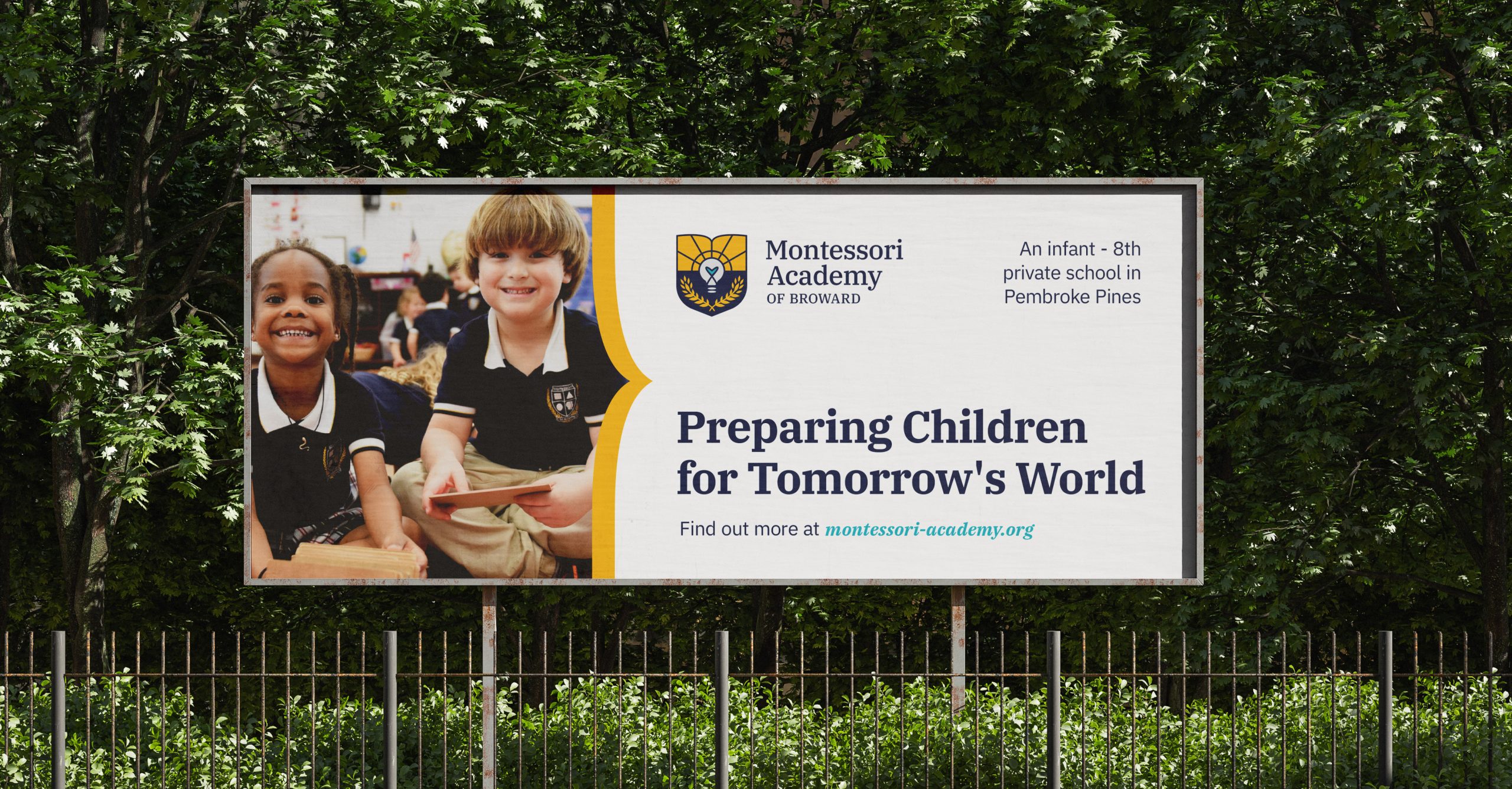
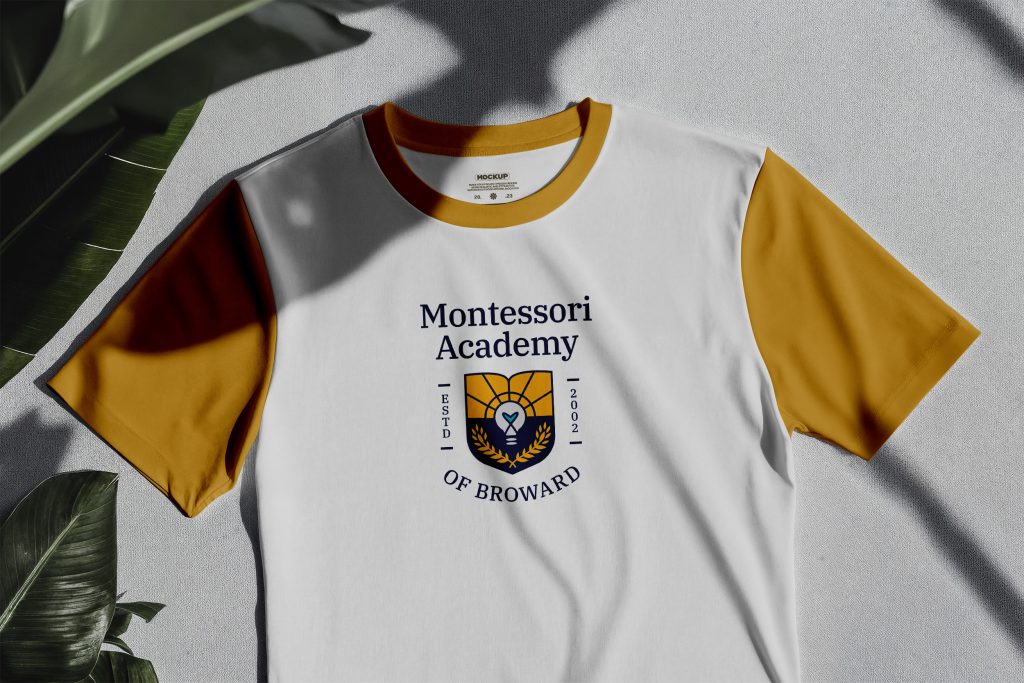
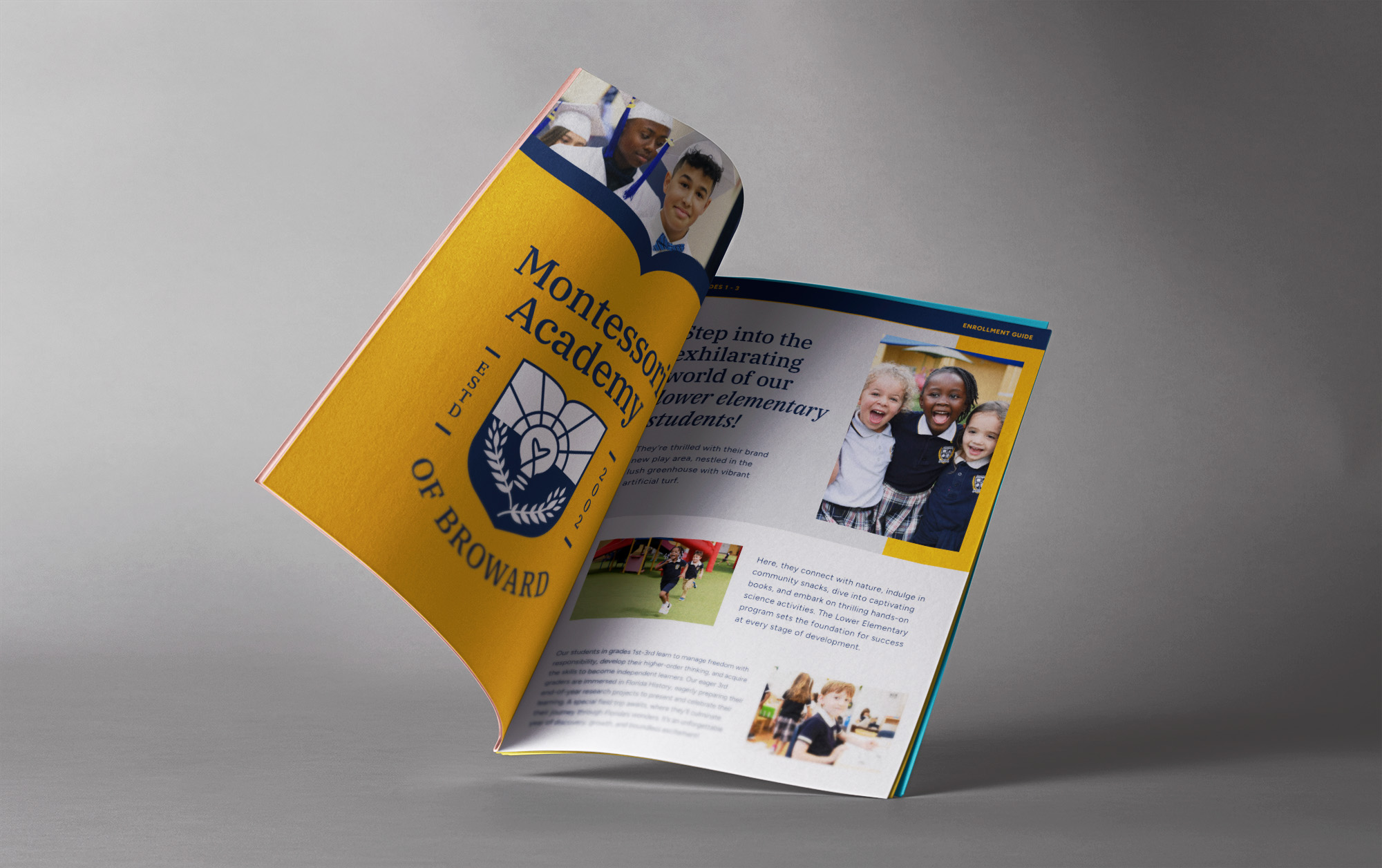
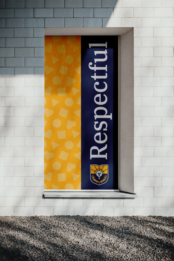
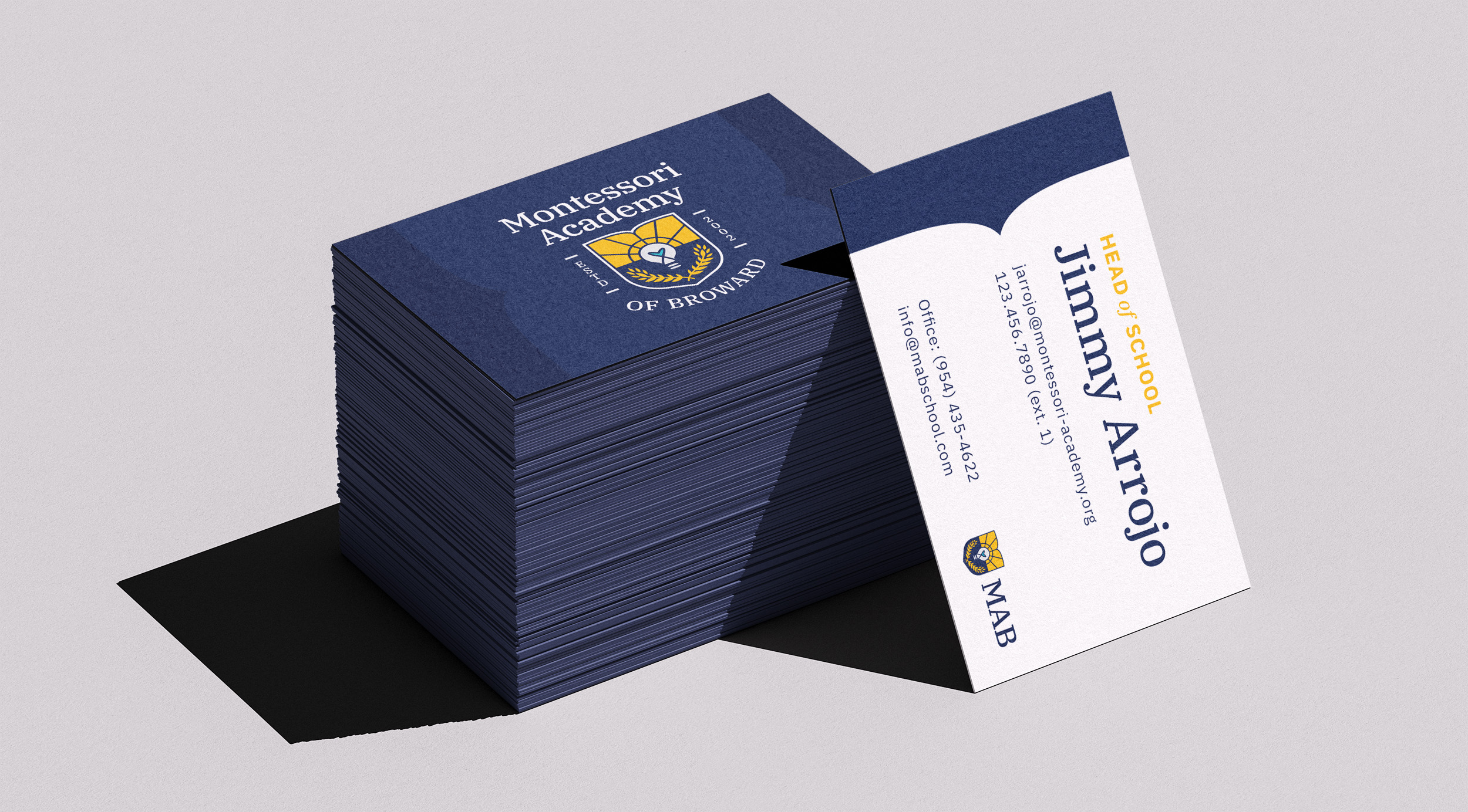
When the logo was approved, we built out a brand system with a full logo suite, color palette, typography, and repeat pattern.