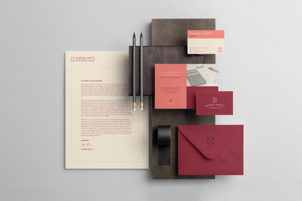
HELPING A NEW ACCOUNTANT BUILD A TRUST-WORTHY BRAND.
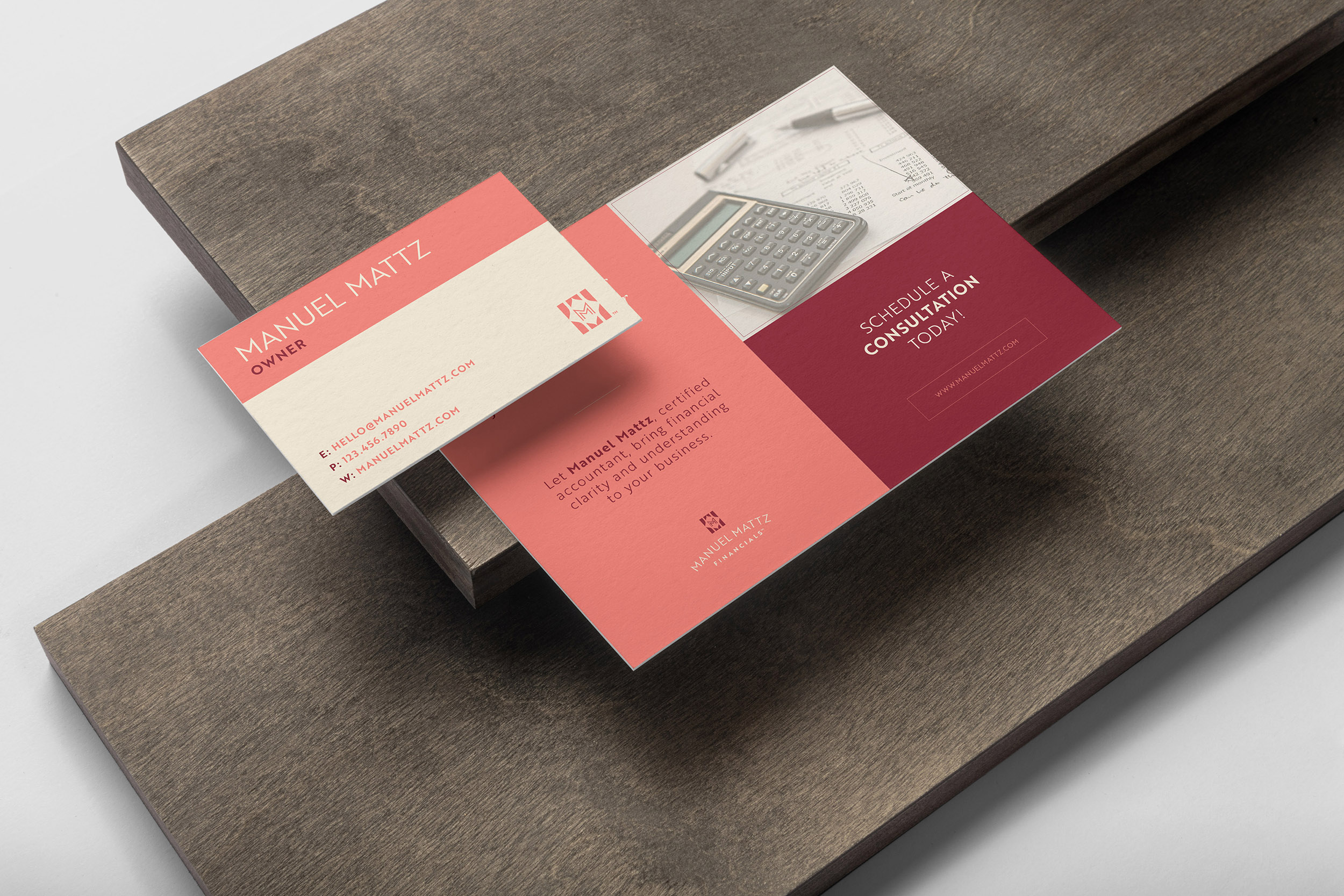
Trust and credibility is vital to a bookkeeper’s brand, so Manuel Mattz approached Creative Chameleon Studio to develop a logo design that looked timeless and professional. The icon design was inspired by a row of books with an elegant double M monogram prominently in the center. A sans serif font gave the logo a clean, legible style that could easily be utilized on any type of collateral.