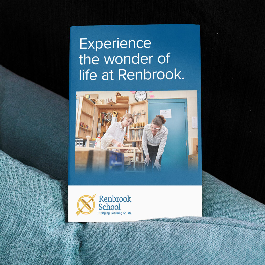
Renbrook School has been a long-lasting presence in their community. Their campus is packed with history and gravitas, nestled in the mountains of Connecticut. As they reflected on their decades of educational excellence, they knew it was time to bring their brand up to date. So we embarked on a full rebrand, elevating their entire identity across the whole school.
PROJECT OVERVIEW
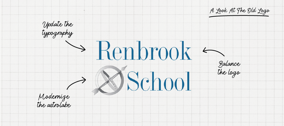
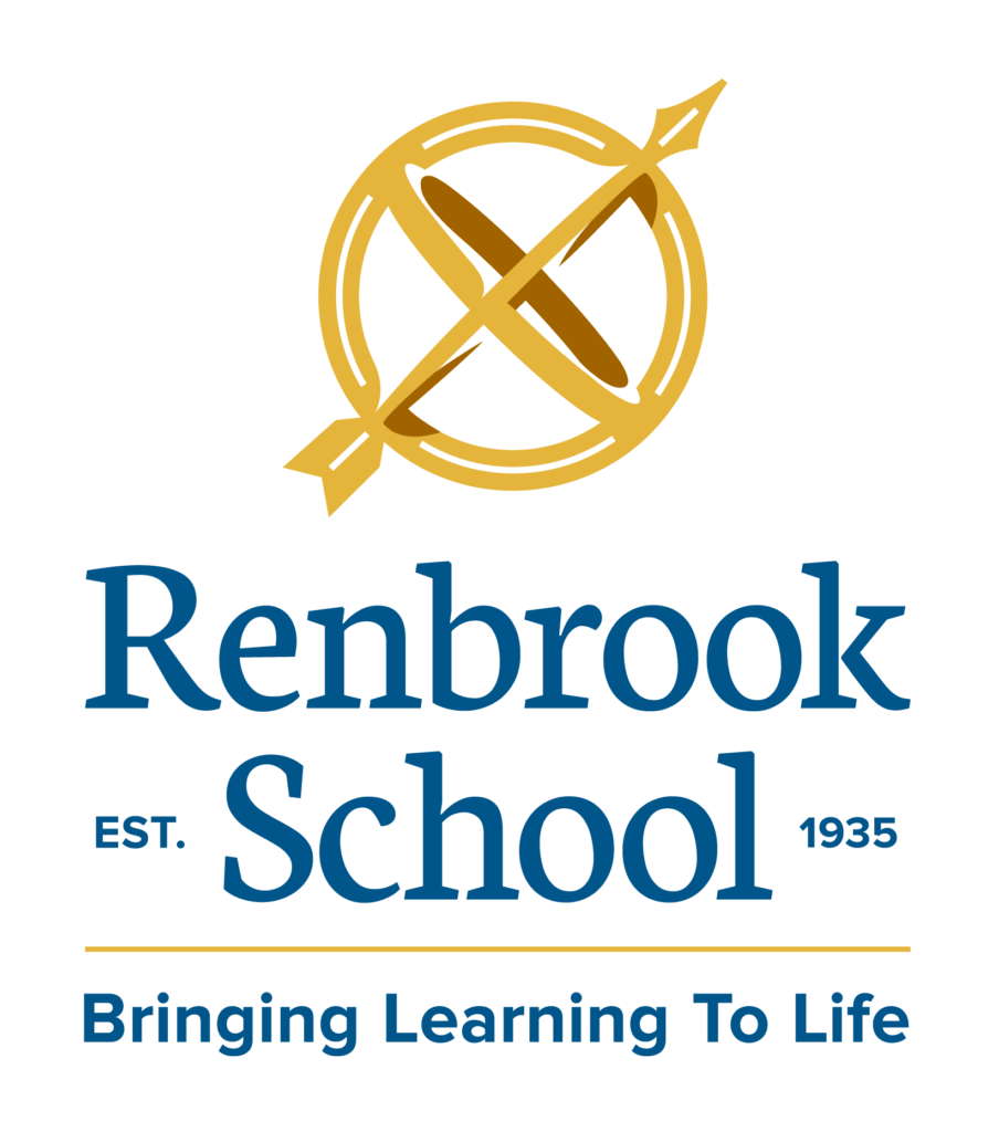
The first step was redesigning the school’s primary logo. The astrolabe is integral to who they are, a large astrolabe sculpture sits at the heart of their campus. But the old design was clunky, unbalanced, and hard to use. Through multiple rounds of exploration, we arrived at a sleek, strong astrolabe that balanced elegance and impact.
Along with the icon, we refined the color palette and typography, bringing a dashing gold into forefront and more durable and usable font families.
PROJECT OVERVIEW
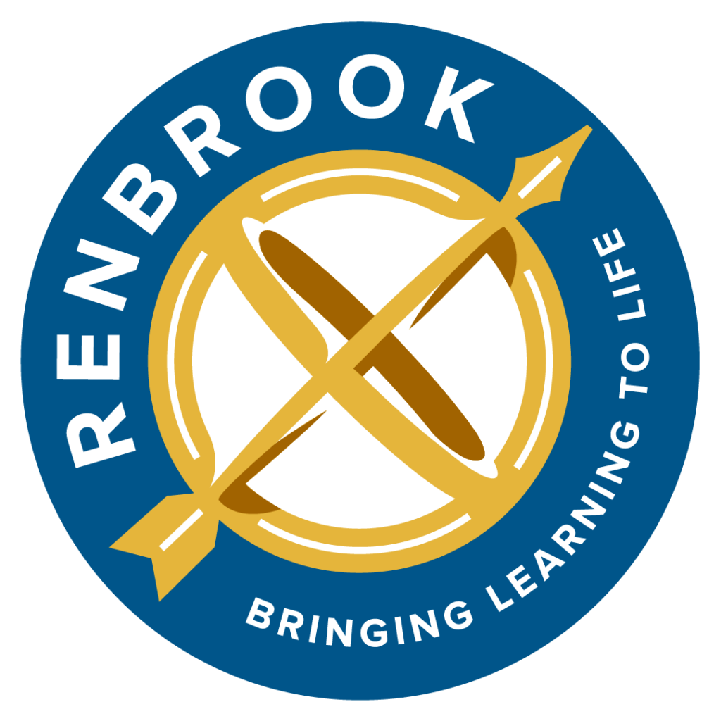
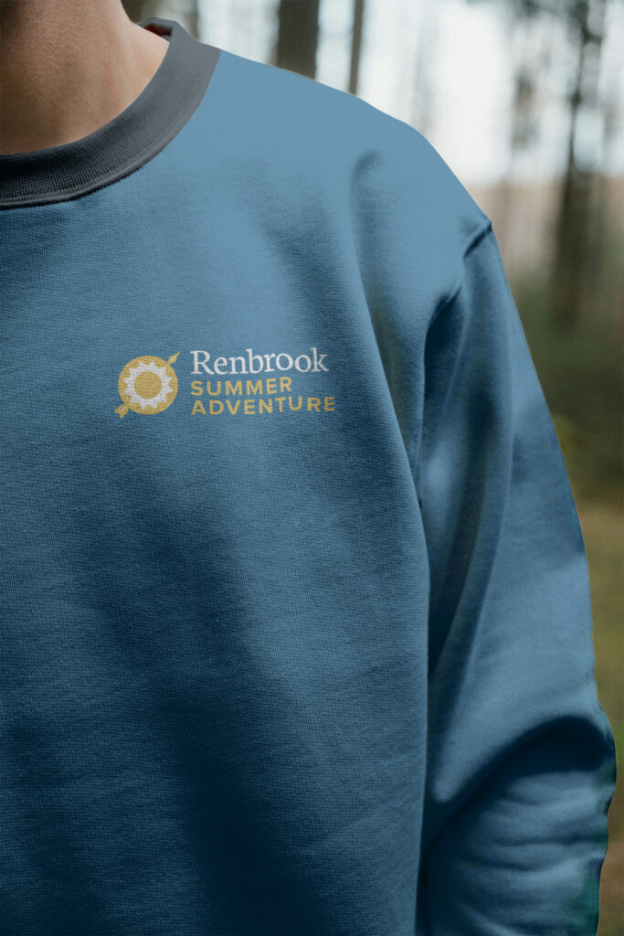
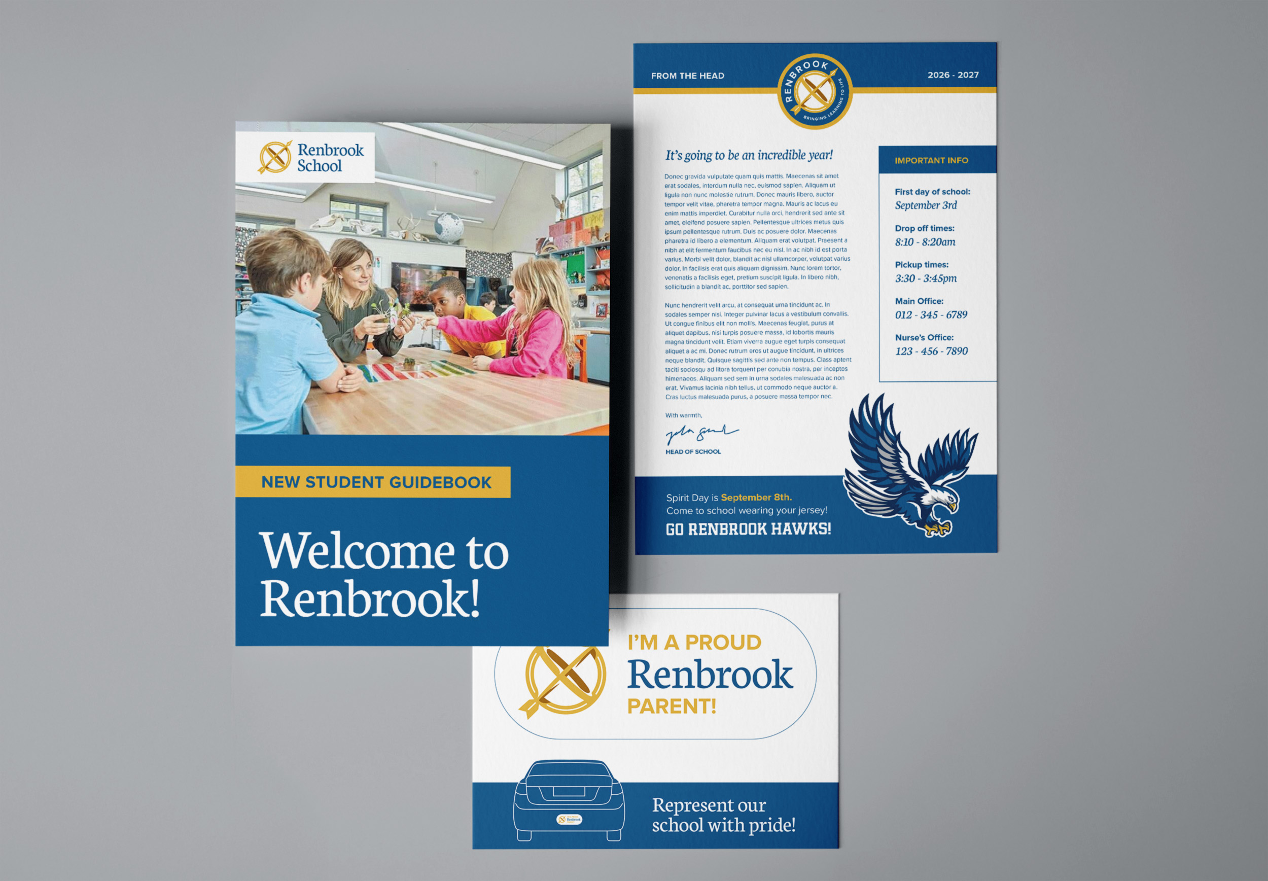
Before this rebrand, Renbrook School only had a few scattered logo files. After arriving at the new logo, we built a full library of logo variations to cover every usage case a school could have.
PROJECT OVERVIEW
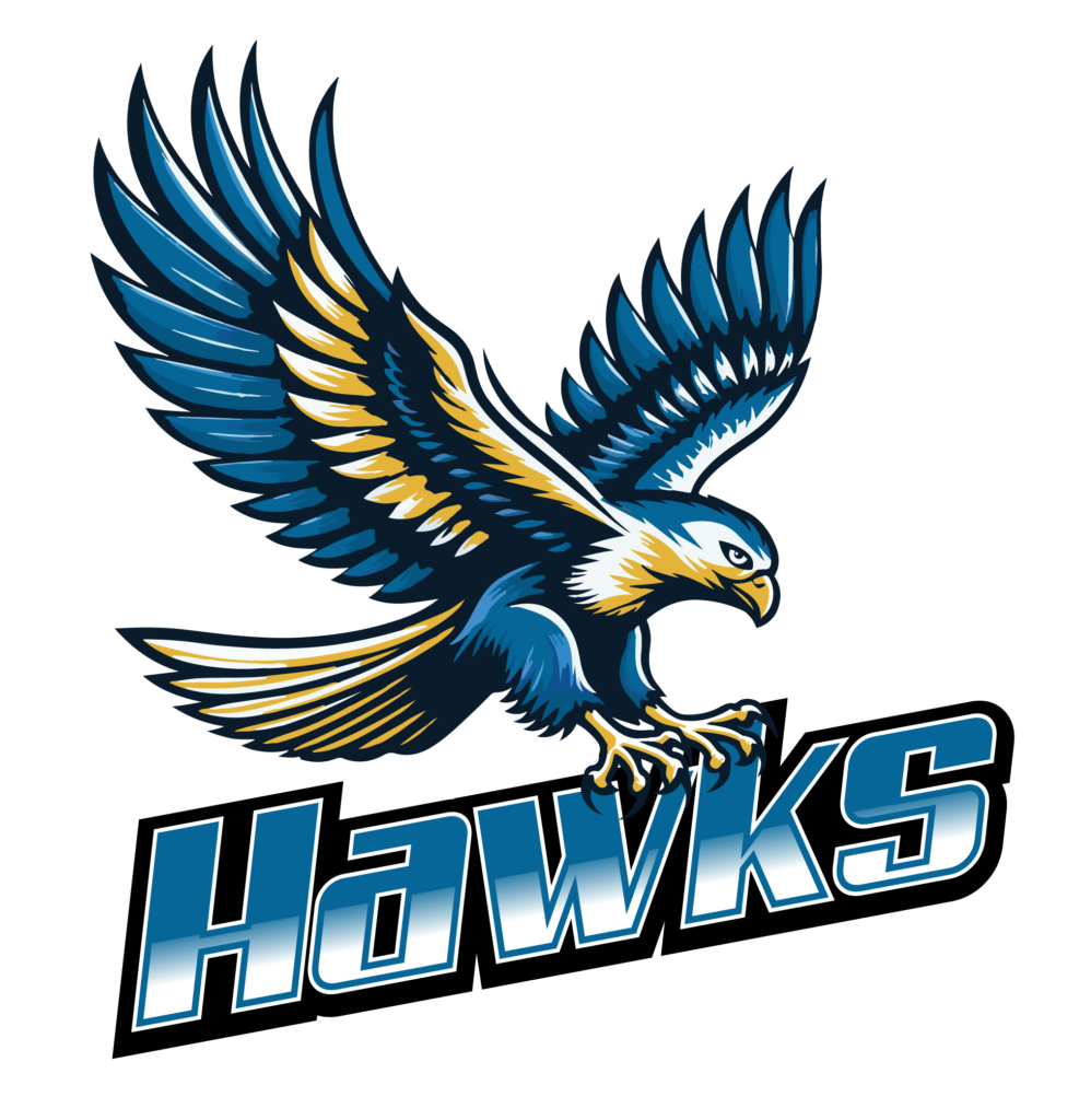
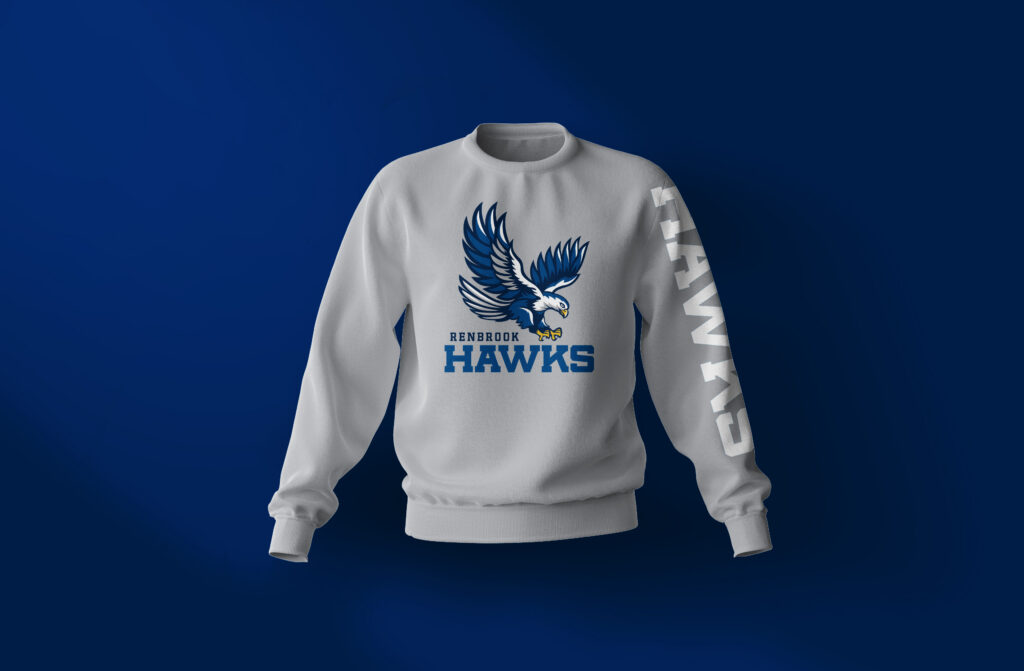
Renbrook’s mascot was in a similar state to their old logo: a clunky file, dated design, and a lot of headaches when it came to using him.
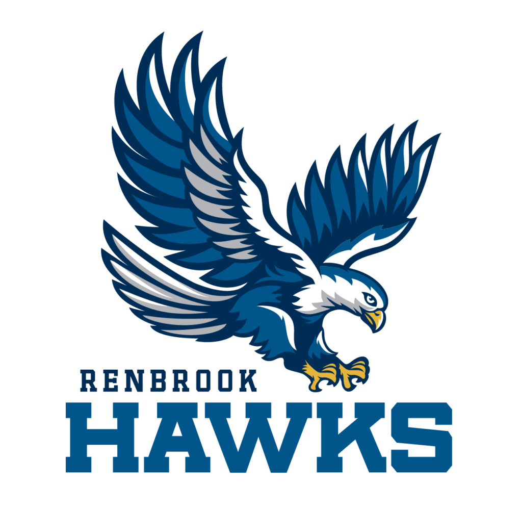
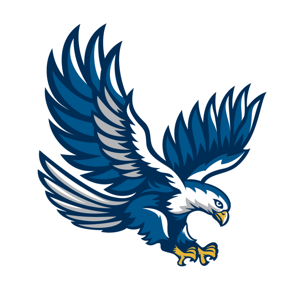
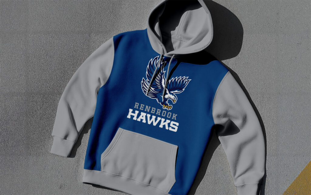
We gave the hawk a refresh, simplifying him while keeping the iconic pose. The typography for the athletics department also received an update, which allowed for a library to be developed that gave the department a mascot that was fully functional.
OLD MASCOT
NEW MASCOT
PROJECT OVERVIEW
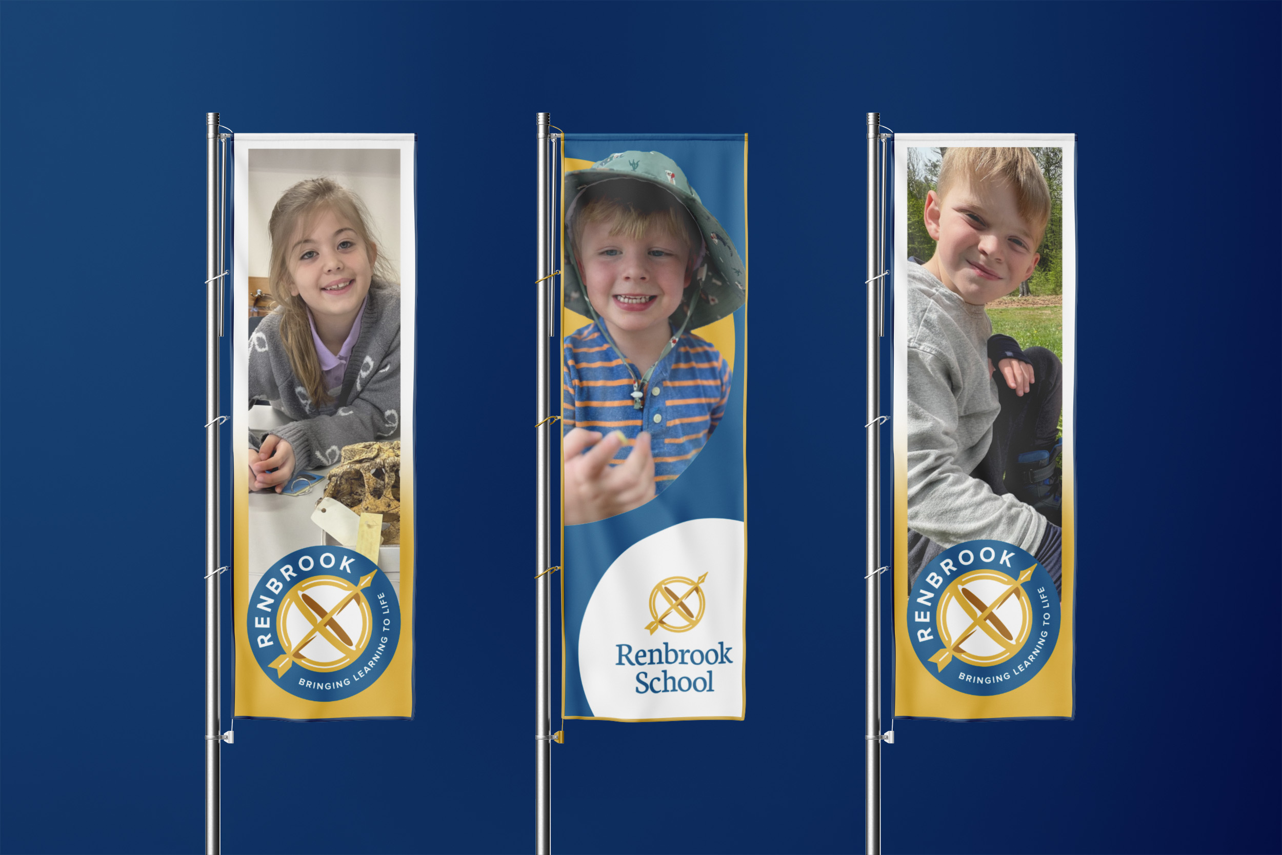
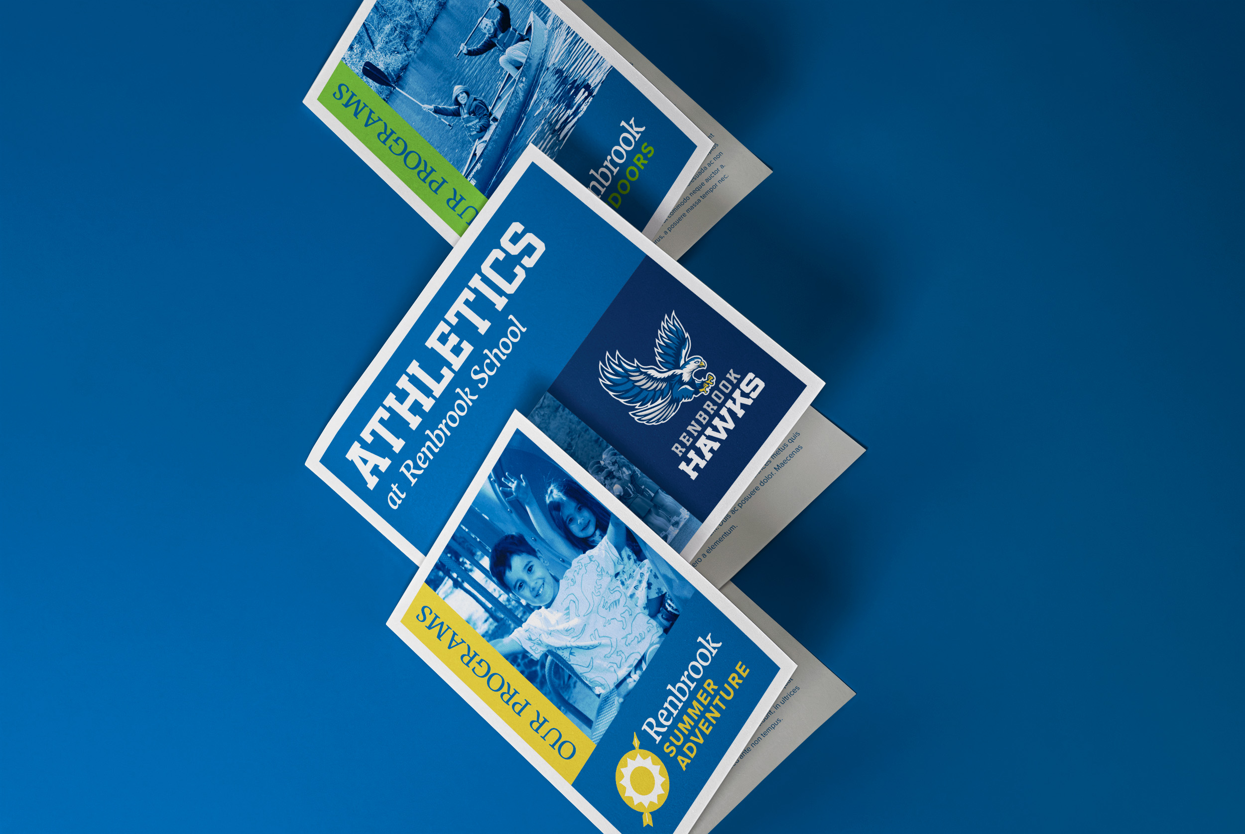
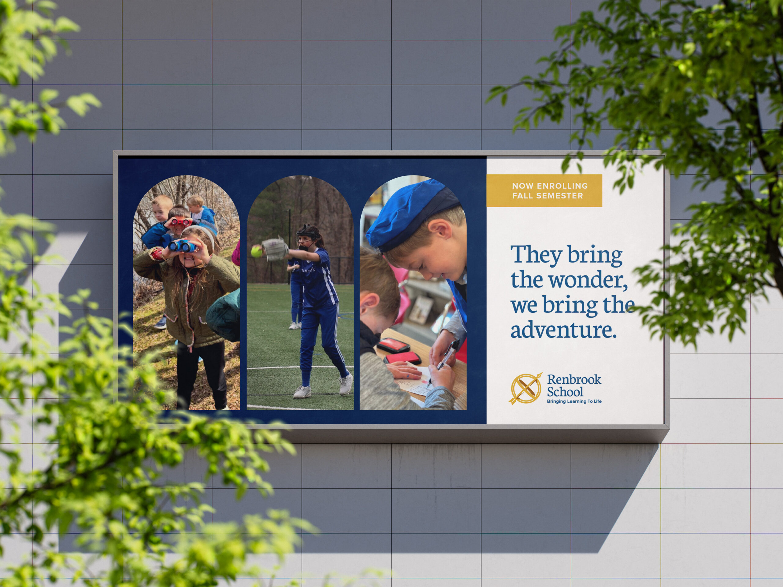
Finally, we took the visual style and applied it to Renbrook’s programs. The astrolabe shape became a through line for the brand, allowing each program to have a hero color and image while still feeling strongly tied to the school’s primary logo.